You are viewing documentation for an older version. For current documentation - click here.

Here, we'll see how to configure the various aspects of bulb gauge chart. We'll see how to:

Let's see them one by one.

Configuring bulb cosmetics

You can customize various aspects of the bulb. To configure its border, you can set:

<chart ... showGaugeBorder='1' gaugeBorderColor='666666' gaugeBorderThickness='2' gaugeBorderAlpha='100' ...>
{"chart": {..."showgaugeborder": "1", "gaugebordercolor":"666666", "gaugeborderthickness":"2", "gaugeborderalpha":"100" ...}}

This results in:

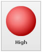
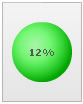
Or, you can also ask the chart to color gauge border in a derivative of its fill color using:

<chart ... gaugeBorderColor='{dark-30}' ...>
{"chart": {... "gaugebordercolor":"(dark-30)" ...}}

Here, we've used one token of the gradient fill mix to color bulb border using 30% darker color than its fill color. It will result in:

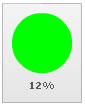
You can customize bulb's origin and radius using:

<chart ... gaugeOriginX='40' gaugeOriginY='40' gaugeRadius='20' ...>
{"chart": {..."gaugeoriginx": "40", "gaugeoriginy":"40", "gaugeradius":"20" ...}}

This results in:

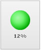
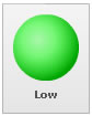
You can opt to render the bulb with a 2D fill using:

<chart ... is3D='0' ...>
{"chart": {... "is3d":"0" ...}}

This results in:

 
Configuring gauge value

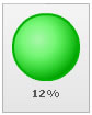
You can opt to show the gauge value inside the gauge using:

<chart .. placeValuesInside='1' ..>
{"chart": {... "placecvaluesinside":"1" ...}}

This results in:

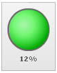
You can also opt to show the color range label of the value, instead of the numerical value using:

<chart .. useColorNameAsValue='1' ..>
{"chart": {... "usecolornameasvalue":"1" ...}}

This results in:

 
Since our value was in the color range with label as "Low", the label is being displayed here. Similarly, had it been a higher value, it will show as under: