|
|
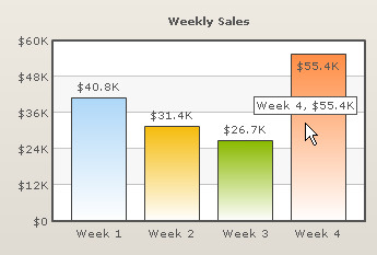
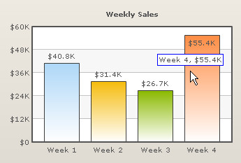
| FusionCharts for FileMaker allows us to customize Tool-tip, the text that pops up on mouse over. FusionCharts displays Tool-tip by default: |
| |
 |
| |
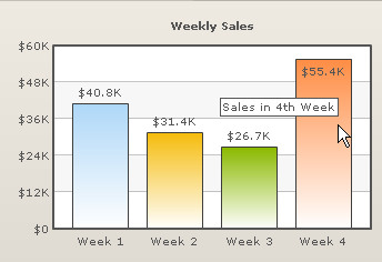
| We can also display customized Tool-tip using toolText attribute of FCQS: |
| |
 |
| |
?v=3
&chart=[chartType=Column2D;chartWidth=350;chartHeight=240]
&chartParams=[caption=Weekly Sales; numberPrefix=$]
&labels=Week 1;Week 2;Week 3;Week 4
&data=40800;31400;26700;55400
&toolText=Sales in 1st Week;Sales in 2nd Week;Sales in 3rd Week;Sales in 4th Week |
| |
| In this section we will explore the parameters that influence the properties of Tool-tip. |
| |
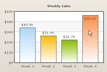
| showToolTip parameter enables us to put off tool-tip option on mouse over. The FusionCharts Querystring below shows how it can be applied. |
| |
?v=3
&chart=[chartType=Column2D;chartWidth=350;chartHeight=240]
&chartParams=[caption=Weekly Sales; numberPrefix=$;showToolTip=0]
&labels=Week 1;Week 2;Week 3;Week 4
&data=40800;31400;26700;55400 |
| |
| Now even on hovering the mouse over the columns we do not see tool-tips. |
| |
 |
| |
| Please note that no Tool-tip is displayed on mouse over. To revert this change, either put shoToolTip=1 or remove the showToolTip parameter. FusionCharts for FileMaker displays Tool-tip by default. |
| |
| Now we will be changing the background color of the Tool-tip text box. toolTipBgColor accepts hexadecimal color code without '#' and filsl this color as the background color of Tool-tip text box. |
| |
| In the example FCQS below we change the background color of the Tool-tip text box to a soothing pink. |
| |
?v=3
&chart=[chartType=Column2D;chartWidth=350;chartHeight=240]
&chartParams=[caption=Weekly Sales; numberPrefix=$;toolTipBgColor=FFCCCC]
&labels=Week 1;Week 2;Week 3;Week 4
&data=40800;31400;26700;55400 |
| |
 |
| |
| The background color of the Tool-tip text box has been changed. |
| |
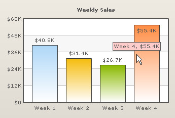
| toolTipBorderColor parameters helps us define the border color of the Tool-tip text box. Here is an example: |
| |
?v=3
&chart=[chartType=Column2D;chartWidth=350;chartHeight=240]
&chartParams=[caption=Weekly Sales; numberPrefix=$;toolTipBorderColor=0000FF]
&labels=Week 1;Week 2;Week 3;Week 4
&data=40800;31400;26700;55400 |
| |
| Now we get Tool-tip with a different look altogether. |
| |
 |
| |
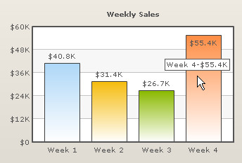
| We use toolTipSepChar to set the character that is used to separate the units and labels within the Tool-tip text box. The separating character is comma (,) by default. Through toolTipSepChar we can change it. Let's see how it works. |
| |
?v=3
&chart=[chartType=Column2D;chartWidth=350;chartHeight=240]
&chartParams=[caption=Weekly Sales;numberPrefix=$;toolTipSepChar=-]
&labels=Week 1;Week 2;Week 3;Week 4
&data=40800;31400;26700;55400 |
| |
| Note that we have selected hyphen (-) as the separator and here is the chart. |
| |
 |
| |
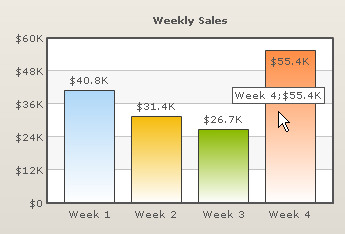
| To use special characters as the Tool-tip separator, we have to put the encoded value of the character as the value of the toolTipSepChar parameter instead of the character itself. For example if we want semicolon (;) as the Tool-tip separater, we must enter %253b as the value of the toolTipSepChar parameter. Let's see this in the example below. |
| |
?v=3
&chart=[chartType=Column2D;chartWidth=350;chartHeight=240]
&chartParams=[caption=Weekly Sales; numberPrefix=$;toolTipSepChar=%253b]
&labels=Week 1;Week 2;Week 3;Week 4
&data=40800;31400;26700;55400 |
| |
 |
| |
| To get the complete list of the encoded forms of special characters go to Advance Charting > Using Special Characters |
| |