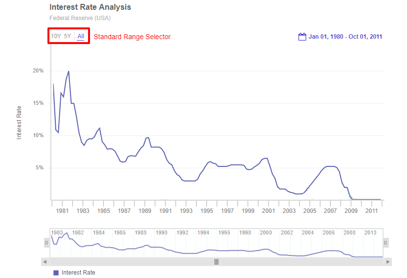
Standard Range Selector
A standard range selector is an extension used to select standard time periods. There are three sections of standard time periods as, ALL, business-friendly dates like year-to-date (YTD), quarter-to-date (QTD) and month-to-date (MTD), and contextual time periods. The options of the contextual time periods will vary based on the atomicity of the data and the current data displayed. Refer to the image below:

The three sections of Standard Range Selector are:
All - Selects all of the available data values.
Contextual time periods - 10Y | 5Y | 3Y | 2Y | 1Y | 6M | 3M | 1M | 15D | etc. - You can select and display data for the last ten years, five years, three years, two years, one year, six months, three months, one month, or 15 days of the currently visible time interval, respectively. The options of the contextual time periods will vary based on the atomicity of the data and the current data displayed.
Business friendly dates - YTD | QTD | MTD | WTD - YTD, QTD, MTD, and WTD display data from the beginning of the last year, quarter, month, or week (respectively) of the total time interval in the data to the present date. These options will apppear only if the data is of the current year, quarter, month and week.
A chart with standard range selector is shown below:
Show/Hide Standard Range Selector
By default, the standard range selector is visible in every chart. However, to turn it off, set the value of the enabled attribute within the standardRangeSelector extension of the extensions object to 0.
Refer to the code below:
{
type: 'timeseries',
dataSource: {
data: fusionTable,
// Show/Hide Standard Range Selector
"extensions": {
"standardRangeSelector": {
"enabled": "0"
}
}
}
}Add styling
Styling can be applied to the buttons of the Standard Range Selector.
You can add style to the Standard Range Selector using style object under standardRangeSelector object.
The
standardRangeSelectorobject should be created underextensionsobject.
Syntax:
new FusionCharts({
type: "timeseries",
dataSource: {
"extensions": {
"standardRangeSelector": {
"style": {
"button-text": {}, //Object | String
"button-background": {}, //Object | String
"button-text:hover": {}, //Object | String
"button-background:hover": {}, //Object | String
"button-text:active": {}, //Object | String
"button-background:active": {}, //Object | String
"separator": {} //Object | String
}
}
}
}
})