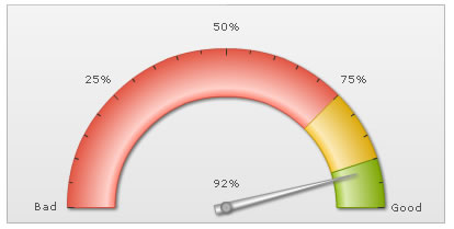
As a first angular gauge, we will be plotting the value of Customer Satisfaction Survey, on a scale of 0 to 100%. The final result will look something as under:
The various tasks involved in building this gauge are:
- Defining the minimum and maximum value which will be plotted on the gauge scale. They are termed as the lower and upper limits of the gauge scale and in this case setting them to 0 and 100 respectively will suit our purpose just fine - as we're plotting the gauge indicating a %, which cannot go below 0 or beyond 100. The limits are displayed at the starting and ending points of the circular scale as in the image above.
- Dividing the gauge scale into 3 regions, the ones shown in red, yellow and green above which convey the Customer Satisfaction Index to be in the bad, satisfactory and good regions respectively.
- Pointing the dial of the angular gauge to a certain value, 92 in the above image.
Since we're plotting customer satisfaction index for a fictional company, let us first define the scales for measuring this index. The scales will look as under in a tabular form:
| Range | What it means? |
Color to be represented in |
| 0-75% | Bad customer satisfaction |
Red |
| 75-90% | Moderate customer satisfaction |
Yellow |
| 90-100% | Good customer satisfaction |
Green |
<chart lowerLimit="0" upperLimit="100" lowerLimitDisplay="Bad" upperLimitDisplay="Good" gaugeStartAngle="180" gaugeEndAngle="0" palette="1" numberSuffix="%" tickValueDistance="20" showValue="1">
  <colorRange>
    <color minValue="0" maxValue="75" code="FF654F"/>
    <color minValue="75" maxValue="90" code="F6BD0F"/>
    <color minValue="90" maxValue="100" code="8BBA00"/>
  </colorRange>
  <dials>
    <dial value="92" rearExtension="10"/>
  </dials>
</chart>
{
  "chart": {
    "lowerlimit": "0",
    "upperlimit": "100",
    "lowerlimitdisplay": "Bad",
    "upperlimitdisplay": "Good",
    "gaugestartangle": "180",
    "gaugeendangle": "0",
    "palette": "1",
    "numbersuffix": "%",
    "tickvaluedistance": "20",
    "showvalue": "1"
  },
  "colorrange": {
    "color": [
      {
        "minvalue": "0",
        "maxvalue": "75",
        "code": "FF654F"
      },
      {
        "minvalue": "75",
        "maxvalue": "90",
        "code": "F6BD0F"
      },
      {
        "minvalue": "90",
        "maxvalue": "100",
        "code": "8BBA00"
      }
    ]
  },
  "dials": {
    "dial": [
      {
        "value": "92",
        "rearextension": "10"
      }
    ]
  }
}
The angular gauge for the above data will look as under:
First comes the <chart> element which is the starting element for any chart/gauge/graph that you create using FusionWidgets XT. Now we define the lower and upper limits of the gauge scale. To define the limits, we use the lowerLimit and upperLimit attributes of the <chart> element. We've asked the gauge to show lower limit text as Bad and upper limit text as Good.
We have also set the gauge angles using the gaugeStartAngle and gaugeEndAngle attributes. The palette attribute is used to set the palette number and the numberSuffix attribute is used to specify the suffix of the numbers (the character which will show up at the end of the numbers).
<chart lowerLimit='0' upperLimit='100' lowerLimitDisplay='Bad' upperLimitDisplay='Good' gaugeStartAngle='180' gaugeEndAngle='0' palette='1' numberSuffix='%' tickValueDistance='20' showValue='1'>
{
  "chart": {
    "lowerlimit": "0",
    "upperlimit": "100",
    "lowerlimitdisplay": "Bad",
    "upperlimitdisplay": "Good",
    "gaugestartangle": "180",
    "gaugeendangle": "0",
    "palette": "1",
    "numbersuffix": "%",
    "tickvaluedistance": "20",
    "showvalue": "1"
  },
  "parsererror": {
    "style": "display: block; white-space: pre; border: 2px solid #c77; padding: 0 1em 0 1em; margin: 1em; background-color: #fdd; color: black",
    "h3": {},
    "div": {
      "style": "font-family:monospace;font-size:12px"
    }
  }
}
There are other attributes of the <chart> element which we will not be delving into now, because of this being a really basic angular gauge.
Next, we need to define our color range. As we had seen earlier, this gauge has 3 color ranges. To define the color range, we use the <colorRange> element, which is an immediate child of the <chart> element. Under each <colorRange> element, we place a <color> element specifying a single color range as shown in the code below. The minValue attribute is used to define the lower limit of the color range and the maxValue attribute is used to define the upper limit of the color range. The label attribute is used to specify a name of the particular color range and the code attribute specifies the color of the range.
<colorRange>
  <color minValue="0" maxValue="75" code="FF654F"/>
  <color minValue="75" maxValue="90" code="F6BD0F"/>
  <color minValue="90" maxValue="100" code="8BBA00"/>
</colorRange>
"colorrange": {
    "color": [
      {
        "minvalue": "0",
        "maxvalue": "75",
        "code": "FF654F"
      },
      {
        "minvalue": "75",
        "maxvalue": "90",
        "code": "F6BD0F"
      },
      {
        "minvalue": "90",
        "maxvalue": "100",
        "code": "8BBA00"
      }
    ]
  }
Now that we've the color ranges in place, we need the dials to point to the desired value (92% in our case). We create the dials using the <dials><dial ...></dials> elements, as shown below.
You can customize the dial's visual properties using the attributes of <dial> element. For example, to change the background color of the dial, the bgColor attribute is used. Similarly, the border color of the dial can be customized using the borderColor attribute. Thus, a <dial> with custom visual properties will look something as under:
FusionWidgets XT angular gauge allows you to have multiple dials on a single gauge. To have multiple dials, just keep on adding <dial...> element within the <dials> tag with the required attributes.
For detailed explanation on JSON data format click here.
Bingo - you just made your first angular gauge. You can now create the HTML container for this page as we had earlier explained under Creating Your First Chart > Your First Chart.