<chart caption='Weekly Percentage' subCaption='In percentage'>

  <rows>
    <row id='Google' label='Google US'/>
    <row id='Yahoo' label='Yahoo US'/>
    <row id='Microsoft' label='Microsoft US'/>
  </rows>

  <columns>
    <column id='MON' label='Monday'/>
    <column id='TUE' label='Tuesday'/>
    <column id='WED' label='Wednesday'/>
    <column id='THU' label='Thursday'/>
    <column id='FRI' label='Friday'/>
  </columns>

<dataset>

     <set rowId='Yahoo' columnId='Mon' value='0' />
     <set rowId='Yahoo' columnId='Tue' value='71'/>
     <set rowId='Yahoo' columnId='Wed' value='70'/>
     <set rowId='Yahoo' columnId='Thu' value='3'/>
     <set rowId='Yahoo' columnId='Fri' value='79' />

     <set rowId='Google' columnId='Mon' value='68'/>
     <set rowId='Google' columnId='Tue' value='5'/>
     <set rowId='Google' columnId='Wed' value='95'/>
     <set rowId='Google' columnId='Thu' value='-10'/>
     <set rowId='Google' columnId='Fri' value='55.98'/>

     <set rowId='Microsoft' columnId='Mon' value='98' />
     <set rowId='Microsoft' columnId='Tue' value='8'/>
     <set rowId='Microsoft' columnId='Wed' value='123'/>
     <set rowId='Microsoft' columnId='Thu' value='79'/>
     <set rowId='Microsoft' columnId='Fri' value='39'/>

 </dataset>

<colorRange mapbypercent='1' gradient='1' minValue='0' code='00CCFF' startLabel='Poor' endLabel='Good'>
    <color code ='66ADD9' maxValue='30' label='BAD'/>
    <color code ='F2CF63' maxValue='70' label='AVERAGE'/>
    <color code ='D99036' maxValue='100' />

</colorRange>

</chart>
{
  "chart":{
    "caption":"Weekly Percentage",
    "subcaption":"In percentage"
  },
  "rows":{
    "row":[{
        "id":"Google",
        "label":"Google US"
      },
      {
        "id":"Yahoo",
        "label":"Yahoo US"
      },
      {
        "id":"Microsoft",
        "label":"Microsoft US"
      }
    ]
  },
  "columns":{
    "column":[{
        "id":"MON",
        "label":"Monday"
      },
      {
        "id":"TUE",
        "label":"Tuesday"
      },
      {
        "id":"WED",
        "label":"Wednesday"
      },
      {
        "id":"THU",
        "label":"Thursday"
      },
      {
        "id":"FRI",
        "label":"Friday"
      }
    ]
  },
  "dataset":[{
      "data":[{
          "rowid":"Yahoo",
          "columnid":"Mon",
          "value":"0"
        },
        {
          "rowid":"Yahoo",
          "columnid":"Tue",
          "value":"71"
        },
        {
          "rowid":"Yahoo",
          "columnid":"Wed",
          "value":"70"
        },
        {
          "rowid":"Yahoo",
          "columnid":"Thu",
          "value":"3"
        },
        {
          "rowid":"Yahoo",
          "columnid":"Fri",
          "value":"79"
        },
        {
          "rowid":"Google",
          "columnid":"Mon",
          "value":"68"
        },
        {
          "rowid":"Google",
          "columnid":"Tue",
          "value":"5"
        },
        {
          "rowid":"Google",
          "columnid":"Wed",
          "value":"95"
        },
        {
          "rowid":"Google",
          "columnid":"Thu",
          "value":"-10"
        },
        {
          "rowid":"Google",
          "columnid":"Fri",
          "value":"55.98"
        },
        {
          "rowid":"Microsoft",
          "columnid":"Mon",
          "value":"98"
        },
        {
          "rowid":"Microsoft",
          "columnid":"Tue",
          "value":"8"
        },
        {
          "rowid":"Microsoft",
          "columnid":"Wed",
          "value":"123"
        },
        {
          "rowid":"Microsoft",
          "columnid":"Thu",
          "value":"79"
        },
        {
          "rowid":"Microsoft",
          "columnid":"Fri",
          "value":"39"
        }
      ]
    }
  ],
  "colorrange":{
    "mapbypercent":"1",
    "gradient":"1",
    "minvalue":"0",
    "code":"00CCFF",
    "startlabel":"Poor",
    "endlabel":"Good",
    "color":[{
        "code":"66ADD9",
        "maxvalue":"30",
        "label":"BAD"
      },
      {
        "code":"F2CF63",
        "maxvalue":"70",
        "label":"AVERAGE"
      },
      {
        "code":"D99036",
        "maxvalue":"100",
      }
    ]
  }
}
 Chart Image
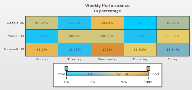