Quick Links (within this page)
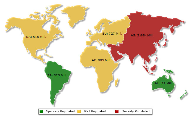
<map animation="0" showBevel="0" numberSuffix=" Mill." includeValueInLabels="1" labelSepChar=": "
    baseFontSize="9" fillAlpha="70" hoverColor="639ACE" borderColor="FFFFFF" legendPosition="BOTTOM">
<colorRange>
        <color minValue="0" maxValue="500" displayValue="Sparsely Populated" color="008200" />
        <color minValue="500" maxValue="1000" displayValue="Well Populated" color="FFCC33" />
        <color minValue="1000" maxValue="5000" displayValue="Densely Populated" color="B80000" />
</colorRange>
<data>
        <entity id="NA" value="515" />
        <entity id="SA" value="373" />
        <entity id="AS" value="3875" />
        <entity id="EU" value="727" />
        <entity id="AF" value="885" />
        <entity id="AU" value="32" />
</data>
</map>
{
  "map": {
    "showbevel": "0",
    "numbersuffix": " Mill.",
    "includevalueinlabels": "1",
    "labelsepchar": ": ",
    "basefontsize": "9",
    "fillalpha": "70",
    "hovercolor": "639ACE",
    "bordercolor": "FFFFFF",
    "legendposition": "BOTTOM"
  },
  "colorrange": {
    "color": [
      { "minvalue": "0", "maxvalue": "500", "displayvalue": "Sparsely Populated", "color": "008200" },
      { "minvalue": "500", "maxvalue": "1000", "displayvalue": "Well Populated", "color": "FFCC33" },
      { "minvalue": "1000", "maxvalue": "5000", "displayvalue": "Densely Populated", "color": "B80000" }
    ]
  },
  "data": [
    { "id": "NA", "value": "515" },
    { "id": "SA", "value": "373" },
    { "id": "AS", "value": "3875"},
    { "id": "EU", "value": "727" },
    { "id": "AF", "value": "885" },
    { "id": "AU", "value": "32"  }
  ]
}
Each map has the following list of defined Objects for direct association with style definitions. For example, the background of the map is termed as BACKGROUND. Similarly, the plot on the map is named as PLOT. This enables you to associate each style to multiple map objects or associate multiple map objects to a particular style.
To know more on how to use Styles in a map read How to Use? in Styles section.
The following list of attributes are applicable to the <map> element of a map XML data. In map JSON data, the same attribute names are used as property names of "map" object.
These attributes let you control a variety of functional elements on the map. For example, you can opt to show/hide data values, labels etc.
| Attribute Name | Type | Range | Description |
| animation | Boolean | 0/1 | This attribute lets you set the configuration whether the map should fade in. If you do not want to animate any part of the map, set this as 0. |
| defaultAnimation | Boolean | 0/1 | By default, each map fades in. If you wish to switch off this default fading effect, you can set this attribute to 0. It can be particularly useful when you want to define your own animation patterns using Style feature. |
| showLabels | Boolean | 0/1 | It sets the configuration whether the entity labels will be displayed or not. |
| includeNameInLabels | Boolean | 0/1 | If you've opted to show map labels, this attributes lets you control whether to show entity names as a part of map labels? |
| includeValueInLabels | Boolean | 0/1 | Whether to show entity values on the map as a part of map label? |
| useSNameInLabels | Boolean | 0/1 | Whether to use the short name of entities in labels or full names? |
| useSNameInToolTip | Boolean | 0/1 | Whether to use the short name of entities in tool-tip or full names? |
| showShadow | Boolean | 0/1 | Whether to drop a shadow effect for the map? |
| showBevel | Boolean | 0/1 | Whether to render a 3D bevel effect to the map? |
| caption
Since v3.2
|
String | Allows you to add a caption of the map. | |
| subCaption
Since v3.2
|
String | Allows you to add a sub caption of the map. | |
| captionPosition
Since v3.2
|
String | top-left, top-right, bottom-left, bottom-right and top-center | Allows you to set the position of the caption and sub caption. You can set the position these either on the top-left corner, top-right corner, bottom-left corner or on the bottom-right corner of the map. The default value is 'top-center'. |
| clickURL | String | The entire map can act as a hotspot. Use this URL to define the hotspot link for the map. The link can be specified in FusionCharts Link Format. | |
| exposeHoverEvent | Boolean | 0/1 | Whenever the user rolls his mouse over a map entity, you can choose to track the details of that entity in your JavaScript/container Flash movie code. Just set this attribute as 1. More details on this is present in FusionMaps XT and JavaScript section.
This attribute is applicable only to Flash maps. In JavaScript maps, this attribute is always set to 1. |
| hoverOnEmpty | Boolean | 0/1 | Whether to show tool tip for those entities whose value has not been defined in the XML data? |
| showPrintMenuItem | Boolean | 0/1 | Whether to show "Print Map " item in the context menu of the map? Even if you opt to hide the item in context menu, you can still opt to invoke print() JavaScript method of the map to print the same. |
| showAboutMenuItem | Boolean | 0/1 | Setting this to 1 shows up a custom context menu in the map, which can be customized to show your text and can be linked to your URL. For e.g., you can set the context menu of the map to include "About your company name" and then link to your company home page. By default, the map shows "About FusionCharts" when right clicked. |
| aboutMenuItemLabel | String | The menu item label for the custom context menu item. | |
| aboutMenuItemLink | String | URL | Link for the custom context menu item. You can specify the link in FusionCharts Link Format to be able to open the same in new window, pop-ups, frames or as JavaScript links. |
| entityLabelsOnTop
Since v3.3.1
|
Boolean | 0/1 | This attribute is used to show the entity labels above or below the markers in the maps. If 0, the entity-labels appear below the marker. By default, it is set to 1 and the entity-labels appear above the markers.
This attribute is supported only by JavaScript maps. In Flash maps, entity labels are always positioned above the markers. |
| Back to top |
|||
The following attributes let you configure map cosmetics like background color, background alpha etc.
| Attribute Name | Type | Range | Description |
| showCanvasBorder | Boolean | 1/0 | Whether to show a border around entire map object. |
| canvasBorderColor | Color | Hex Code | If you've opted to show a border around entire map object, this attribute lets you control the color of the border. |
| canvasBorderThickness | Number | In Pixels | If you've opted to show a border around entire map object, this attribute lets you control the thickness of the border in pixels. |
| canvasBorderAlpha | Number | 0-100 | If you've opted to show a border around entire map object, this attribute lets you control the alpha of the border. |
| bgColor | Color | This attribute sets the background color for the map. You can set any hex color code as the value of this attribute. | |
| bgAlpha | Number | 0-100 | Sets the alpha (transparency) for the background. |
| bgRatio | Number | 0-100 | If you've opted for a gradient background, this attribute lets you set the ratio of each color constituent. |
| bgAngle | Number | 0-360 | Angle of the background color, in case of a gradient. |
| bgImage
or bgSWF - deprecated
|
String | To place any Flash movie as background of the map, enter the (path and) name of the background SWF. It should be in the same domain as the map. | |
| bgImageAlpha
or bgSWFAlpha - deprecated
|
Number | 0-100 | Helps you specify alpha for the loaded background SWF. |
| bgImageDisplayMode
Since v3.2
|
String | stretch, tile, fit, fill, center, none | Helps you specify the mode in which the background image is to be displayed.
|
| bgImageVAlign
Since v3.2
|
String | top, middle, bottom | Helps you to vertically align the background image. |
| bgImageHAlign
Since v3.2
|
String | left, middle, right | Helps you to horizontally align the background image. |
| bgImageScale
Since v3.2
|
Number | 0-300 | Helps you magnify the background image. This attribute will only work when the attribute bgImageDisplayMode is set to none, center or tile. |
| logoURL | String | URL | You can load an external logo (JPEG/PNG/SWF) on the map once it has rendered. This attribute lets you specify the URL of the same. Owing to Flash Player security settings, you can only specify logo that are on the sub-domain as the SWF file of the map. |
| logoPosition | String | TL, TR, BL, BR, CC |
Where to position the logo on the map:
|
| logoAlpha | Number | 0-100 | Once the logo has loaded on the map, you can configure its opacity using this atribute. |
| logoScale | Number | 0-300 | You can also change the scale of externally loaded logo at run-time by specifying a value for this parameter. |
| logoLink | String | URL | If you want to link the logo to an external URL, specify the link in this attribute. The link can be in FusionCharts Link Format, allowing you to link to new windows, pop-ups, frames etc. |
| Back to top |
|||
These attributes let you configure how your entities will appear on the map.
| Attribute Name | Type | Range | Description |
| borderColor | Color | Hex Code | Border Color for map entities |
| borderAlpha | Number | 0-100 | Border alpha for map entities |
| fillColor | Color | Hex Code | Default fill color to use for entities, if no color range has been specified. |
| fillAlpha | Alpha | 0-100 | Alpha to be used for filling entities. |
| useHoverColor | Boolean | 0/1 | Whether to use hover color for the map. If set to yes, whenever the end user hovers his mouse over a map entity, it will change its color to the color defined in attribute below. |
| hoverColor | Color | Hex Code | When the end user hovers his mouse over any map entity, it changes its color. Using this attribute you can define that color. |
| showBorder Since v3.2 |
Boolean | 0/1 | Whether the common entity border will be displayed or not. Default value is 1. |
| emptyEntityColor
Since v3.2
|
Color | Hex Code | The default color for any map entity whose values are not provided in map data. |
| emptyEntityAlpha
Since v3.2
|
Number | 0-100 | The default opacity of any map entity whose values are not provided in map data. |
| showEntityToolTip
Since v3.2
|
Boolean | 0/1 | Whether to show or hide tooltip for all entities present in a map. The default value is 1. |
| labelConnectorColor
Since v3.2
|
Hex code | Specifies the color of the static label connector. This attribute is used when you want to explicitly define the color of the label connector. If not set, the label connector color is taken from connectorColor attribute. | |
| labelConnectorAlpha
Since v3.2
|
Number | 0-100 | Specifies the transparency of the static label connector. This attribute is used when you want to explicitly define the transparency of the label connector. If not set, the label connector alpha is taken from connectorAlpha attribute. |
| Back to top |
|||
Using the attributes below, you can control a myriad of options like:
- Formatting of commas and decimals
- Number prefixes and suffixes
- Decimal places to which the numbers will round to
- Scaling of numbers based on a user defined scale
- Custom number input formats
| Attribute Name | Type | Range | Description |
| formatNumber | Boolean | 0/1 | This configuration determines whether the numbers displayed on the map will be formatted using commas, e.g., 40,000 if formatNumber='1' and 40000 if formatNumber='0' |
| decimals | Number | 0-10 | Number of decimal places to which all numbers on the map will be rounded to. |
| forceDecimals | Boolean | 0/1 | Whether to add 0 padding at the end of decimal numbers. For example, If you limit the maximum number of decimal digits to 2, a number like 55.345 will be rounded to 55.34. This does not mean that all numbers will be displayed with a fixed number of decimal places. For instance 55 will not be displayed as 55.00 and 55.1 will not become 55.10. In order to have fixed number of decimal places attached to all the numbers, set this attribute to 1. |
| numberPrefix | String | Character | Using this attribute, you could add prefix to all the numbers visible on the map. For example, to represent all dollars figure on the map, you could specify this attribute to ' $' to show like $40000, $50000. For more details, please see Advanced Number Formatting section. |
| numberSuffix | String | Character | Using this attribute, you could add suffix to all the numbers visible on the map. For example, to represent all figure quantified as per annum on the map, you could specify this attribute to ' /a' to show like 40000/a, 50000/a. For more details, please see Advanced Number Formatting section. |
| decimalSeparator | String | Character | This option helps you specify the character to be used as the decimal separator in a number. For more details, please see Advanced Number Formatting section. |
| thousandSeparator | String | Character | This option helps you specify the character to be used as the thousands separator in a number. For more details, please see Advanced Number Formatting section. |
| thousandSeparatorPosition
Since v3.2
|
List of comma separated Numbers | This option helps you specify the position of the thousand separator. For more details, read this. | |
| inDecimalSeparator | String | Character | In some countries, commas are used as decimal separators and dots as thousand separators. In XML, if you specify such values, it will give a error while converting to number. So, FusionMaps XT accepts the input decimal and thousand separator from user, so that it can convert it accordingly into the required format. This attribute lets you input the decimal separator. For more details, please see Advanced Number Formatting section. |
| inThousandSeparator | String | Character | In some countries, commas are used as decimal separators and dots as thousand separators. In XML, if you specify such values, it will give a error while converting to number. So, FusionMaps XT accepts the input decimal and thousand separator from user, so that it can convert it accordingly into the required format. This attribute lets you input the thousand separator. For more details, please see Advanced Number Formatting section. |
| formatNumberScale | Boolean | 0/1 | Configuration whether to add K (thousands) and M (millions) to a number after truncating and rounding it - e.g., if formatNumberScale is set to 1, 1043 will become 1.04K (with decimals set to 2 places). Same with numbers in millions - an M will added at the end. For more details, please see Advanced Number Formatting section. |
| defaultNumberScale | String | The default unit of the numbers that you're providing to the map. For more details, please see Advanced Number Formatting section. | |
| numberScaleUnit | String | Unit of each block of the scale. For more details, please see Advanced Number Formatting section. | |
| numberScaleValue | String | Range of the various blocks that constitute the scale. For more details, please see Advanced Number Formatting section. | |
| scaleRecursively
Since v3.2
|
Boolean | 0/1 | Whether to scale the number recursively? For more details, read this. |
| maxScaleRecursion
Since v3.2
|
Number | How many recursions to complete during recursive scaling? -1 completes the entire set of recursion. | |
| scaleSeparator
Since v3.2
|
String | What character to use to separate the scales that are generated after recursion? | |
| Back to top |
|||
| Attribute Name | Type | Range | Description |
| showLegend | Boolean | 0/1 | Whether to show legend for the map? |
| interactiveLegend
Since v3.2
|
Boolean | 0/1 | This attribute lets you interact with the legend in your map. When you click a legend item, the entities associated with that color range are hidden from the map. Re-clicking the legend item causes the entities to reappear. |
| legendAllowDrag | Boolean | 0/1 | The legend can be made drag-able by setting this attribute to 1. End viewers of the map can drag the legend around on the map. |
| legendCaption | String | Lets you add a caption to your legend. | |
| reverseLegend | Boolean | 0/1 | You can reverse the ordering of the legend items in the legend by setting this attribute to 1. |
| legendPosition | String | BOTTOM or RIGHT | The legend can be plotted at two positions on the map - below the map (BOTTOM) and on the RIGHT side of the map. |
| legendIconScale
Since v3.2
|
Number | (0-5) | Sets the magnification of legend icons. The default value is 1 which denotes 100% size. |
| legendShadow | Boolean | 0/1 | Whether to show a shadow for legend? |
| legendBgColor | Color | Hex Code | Background color for the legend. |
| legendBgAlpha | Number | 0-100 | Background alpha for the legend. |
| legendBorderColor | Color | Hex Code | Border Color for the legend. |
| legendBorderThickness | Number | In Pixels | Border thickness for the legend. |
| legendBorderAlpha | Number | 0-100 | Border alpha for the legend. |
| legendScrollBgColor | Color | Hex Code | If you've too many items on the legend, a scroll bar shows up on the same. This attribute lets you configure the background color of the scroll bar. |
| legendScrollBarColor | Color | Hex Code | If you've too many items on the legend, a scroll bar shows up on the same. This attribute lets you configure the bar color of the scroll bar. |
| legendScrollBtnColor | Color | Hex Code | If you've too many items on the legend, a scroll bar shows up on the same. This attribute lets you configure the color of buttons of the scroll bar. |
| interactiveAnimation
Since v3.2
|
Boolean | 0/1 | Whether to apply animation on entities getting hidden or shown due to interactivity through Gradient Legend. The default value is 1. |
| interactiveAnimDuration
Since v3.2
|
Number | The duration (in seconds) of the animation of entities getting hidden or shown due to interactivity through Gradient Legend. The default value is .5 second. | |
| enableSnapLegend
Since v3.2
|
Boolean | 0/1 | Allows you to snap the Gradient Legend pointers exactly on the tick when released on a near by position. |
| snapLegendPointers
Since v3.2
|
Boolean | 0/1 | Allows you to snap the Gradient Legend pointers exactly on the tick when released on a near by position. |
| legendSnapRange
Since v3.2
|
Number | 0-5 | Allows you to set the snapping range of the Gradient Legend pointers. |
| legendPointerWidth
Since v3.2
|
Number | Allows you to set the width of the Gradient Legend pointers. | |
| legendPointerHeight
Since v3.2
|
Number | Allows you to set the height of the Gradient Legend pointers. | |
| legendPointerBgColor
Since v3.2
|
Color | Hex Code | Sets the background color of Gradient Legend pointers. |
| legendPointerBgAlpha
Since v3.2
|
Number | 0-100 | Sets the opacity of the background of Gradient Legend pointers. |
| legendPointerBorderColor
Since v3.2
|
Color | Hex Code | Sets the color of the border of Gradient Legend pointers. |
| legendPointerBorderThickness
Since v3.2
|
Number | Sets the border thickness of Gradient Legend pointers. | |
| legendPointerHighlightColor
Since v3.2
|
Color | Hex Code | Sets the highlight color of Gradient Legend pointers. |
| legendPointerShadowColor
Since v3.2
|
Color | Hex Code | Sets the shadow color of Gradient Legend pointers. |
| legendScaleLineColor
Since v3.2
|
Color | Hex Code | Sets the color of the line showing the numeric scale of Gradient Legend. |
| legendScaleLineAlpha
Since v3.2
|
Number | 0-100 | Sets the opacity of the line showing the numeric scale of Gradient Legend. |
| legendScaleLineThickness
Since v3.2
|
Number | Sets the thickness of the line showing the numeric scale of Gradient Legend. | |
| Back to top |
|||
| Attribute Name | Type | Range | Description |
| markerFont | String | Font Name | This attribute sets the font face for all the defined marker labels. You can over-ride this using STYLES. |
| markerFontSize | Number | 0-72 | This attribute sets the font size for all the defined marker labels on the map. You can over-ride this using STYLES. |
| markerFontColor | Color | This attribute sets the font color for all the defined marker labels on the map. You can over-ride this using STYLES. | |
| showMarkerToolTip | Boolean | 0/1 | Whether to show tool tips for the defined markers? |
| showMarkerLabels | Boolean | 0/1 | You can opt to show/hide label for all the markers on the map using this attribute. |
| markerLabelPadding | Number | Pixels | This attribute lets you set a global label padding between the marker icon and its label. You can later over-ride the label padding for each individual marker too. |
| markerBgColor | Color | This attribute lets you set a common background color for all the defined markers on the map. You can later over-ride individual marker colors by using SHAPE definitions. | |
| markerBorderColor | Color | This attribute lets you set a common border color for all the defined markers on the map. You can later over-ride individual marker border colors by using SHAPE definitions. | |
| markerRadius | Number | Pixels | This attribute lets you set a common radius for all the defined markers on the map. You can later over-ride individual marker border colors by using SHAPE definitions. |
| connectorColor | Color | Hex Code | Sets the color of the marker connectors. Also, if labelConnectorColor is not set in XML/JSON data, the same color is applied to the label connector lines (if any) on the map. |
|
markerConnColor - deprecated
|
Color | Hex Code | Sets the color of the marker connectors.
This attribute is deprecated. Use connectorColor instead. |
| connectorAlpha | Number | 0-100 | Sets the opacity of the marker connectors. Also, if labelConnectorAlpha is not set in XML/JSON data, the same opacity is applied to the label connector lines (if any) on the map. |
|
markerConnAlpha - deprecated
|
Number | 0-100 | Sets the opacity of the marker connectors
This attribute is deprecated. Use connectorAlpha instead. |
| connectorThickness
or markerConnThickness - deprecated
|
Number | Pixels | If you've defined any marker connectors, this attribute lets you set the thickness of all those connectors. |
| showConnectorToolTip
Since v3.2
|
Boolean | 0/1 | Whether to show or hide tooltip for all marker connectors present in a map. The default value is 1. |
| connectorDashed
or markerConnDashed - deprecated
|
Boolean | 0/1 | Whether the marker connector line should appear as dashed? |
| connectorDashLen
or markerConnDashLen - deprecated
|
Number | Pixels | If marker connector line is to appear as dash, this attribute lets you set the dash length of each part of dash. |
| connectorDashGap
or markerConnDashGap - deprecated
|
Number | Pixels | If marker connector line is to appear as dash, this attribute lets you set the dash gap of each part of dash. |
| autoScaleMarkers
Since v3.2 SR-2
| Boolean | 0/1 | This attribute lets you to scale the markers automatically with respect to the map dimensions. By default, this attribute is set to 0. |
| markerFillColor
Since v3.2 SR-2
|
Color | 0/1 | Using this attribute, you can specify the fill color for the marker shape (hex code without #). If you specify a comma separated list of hex codes (without #), FusionMaps XT will use those colors to form a gradient. |
| markerFillAlpha
Since v3.2 SR-2
|
Number | 0-100 | Used to specify the fill alpha. In case of gradients, you'll need to specify a comma separated list of alpha. |
| markerFillRatio
Since v3.2 SR-2
|
Number | 0-100 | If you're using gradient fills for the marker, this attribute lets you set the ratio (on a scale of 0-100) for the gradient component colors. |
| markerFillAngle
Since v3.2 SR-2
|
Number | 0-360 | If you're using gradient fills for the marker, this attribute lets you set the angle for the gradient. |
| markerBorderAlpha
Since v3.2 SR-2
|
Number | 0-100 | Border alpha for the marker shape. |
| Back to top |
|||
| Tool-tip |
These attributes let you control the tool tip. You can set the background color, border color, separator character and few other details. |
| Attribute Name | Type | Range | Description |
| showToolTip | Boolean | 0/1 | Whether to show tool tip on map? When this attribute is set to 0, all the tooltips including entity tooltips, marker toolitps and connector tooltips are disabled. |
| toolTipBgColor | Color | Background Color for tool tip. | |
| toolTipBorderColor | Color | Border Color for tool tip. | |
| toolTipSepChar | String | The character specified as the value of this attribute separates the name and value displayed in tool tip. | |
| showToolTipShadow | Boolean | 0/1 | Whether to show shadow for tool-tips on the map. |
| Back to top |
|||
| Font Properties | ||||||||||||||||||||
Using the attributes below, you can define the generic font properties for the text on the map. |
||||||||||||||||||||
|
||||||||||||||||||||
| Map Padding & Margins | ||||||||||||||||||||
The following attributes help you control map margins and paddings. |
||||||||||||||||||||
| Attribute Name | Type | Range | Description |
| legendPadding | Number | In Pixels | Padding of legend from right/bottom side of map |
| mapLeftMargin | Number | In Pixels | Amount of empty space that you want to put on the left side of your map. Nothing is rendered in this space. |
| mapRightMargin | Number | In Pixels | Amount of empty space that you want to put on the right side of your map. Nothing is rendered in this space. |
| mapTopMargin | Number | In Pixels | Amount of empty space that you want to put on the top of your map. Nothing is rendered in this space. |
| mapBottomMargin | Number | In Pixels | Amount of empty space that you want to put on the bottom of your map. Nothing is rendered in this space. |
| Back to top |
|||
| Attributes to allow exporting of map as image/PDF |
These attributes allow you to control the saving of map as image. |
| Attribute Name | Type | Range | Description |
| exportEnabled
or imageSaveURL- deprecated
|
Boolean | (0/1) | Whether the map will allow exporting to images/PDFs? |
| exportShowMenuItem | Boolean | (0/1) | Whether the menu items related to export (e.g., Save as JPEG etc.) will appear in the context menu of map. |
| exportFormats | String |
List of formats that the map will show in context menu, along with label for each one. The attribute value should be a delimiter separated key-value pair. The delimiter character to be used is '|' (pipe character). The syntax for the attribute value is as follows: Example: The code required to enable PNG, JPG and PDF type of export with custom context-menu message for PNG and PDF. exportType=”PNG=Export as High Quality Image;JPG;PDF=Export as PDF File” |
|
| exportAtClient | Boolean | (0/1) | Whether to use client side export handlers, or server side export handlers |
| exportHandler | String |
In case of server side exporting, this refers to the path of the server-side export handler (the ready-to-use scripts that we provide). In case of client-side exporting, this refers to the DOM-Id of FusionCharts Export component that is embedded in your web page, along with the map. |
|
| exportAction | String | 'save' or 'download' | In case of server-side exporting, the action specifies whether the exported image will be sent back to client as download, or whether it'll be saved on the server. |
| exportTargetWindow | String | '_self' or '_blank' | In case of server-side exporting and when using download as action, this lefts you configure whether the return image/PDF will open in same window (as an attachment for download), or whether it will open in a new window. |
| exportCallback | String |
Name of JavaScript function that'll be called back when export process has finished in case of:
|
|
| exportFileName | String | Using this attribute you can specify the name (excluding the extension) of the output (export) file. | |
| showExportDialog | Boolean | (0/1) | Whether to show the export dialog during capture phase. If not, the map starts capturing process without the dialog visible. |
| exportDialogMessage | String | The message to be shown in the dialog box. The default is "Capturing Data : " | |
| exportDialogColor
or imageSaveDialogColor - deprecated
|
Hex Color | The message to be shown in the dialog box. The default is "Capturing Data : " | |
| exportDialogBorderColor | Hex Color | Border color of dialog box. | |
| exportDialogFontColor
or imageSaveDialogFontColor - deprecated
|
Hex Color | Font color to be used for text in dialog. | |
| exportDialogPBColor | Hex Color | Color of progress bar in dialog. | |
| Back to top |
|||
The <entity> element under <data> element is used to declare properties of the various entities on the map. Each <entity> element under the <data> element can have the following attributes:
| Attribute Name | Type | Range | Description |
| value | Number | Numeric value of the <entity>. | |
| displayValue | String | If you want to display your custom value for each entity (apart from it's long name, short name or value), you can specify it here. | |
| toolText | String | Lets you specify a custom tool text for the entity. | |
| color | Color | Hex Code | Lets you specify a custom color for the entity. If color range is defined, each entity takes its color from the range it belongs to. However, if you need to force a color for an entity (over-riding the range value), you can specify the hex code here. |
| alpha | Number | 0-100 | Custom alpha (transparency) for the entity |
| link | String | If you want to link the entity to a URL, you can specify the URL in FusionCharts format. The link can open in same window, new window, pop-up, frames or as JavaScript functions. Please see the section "Drill Down Maps" to learn more about this. |
|
| font | String | If you want the label of this particular entity to appear in a different font (other from the one defined in STYLES/map element), specify the font face here. | |
| fontSize | String | If you want the label of this particular entity to appear in a different font size (other from the one defined in STYLES/map element), specify the font size here. | |
| fontColor | Boolean | 0/1 | If you want the label of this particular entity to appear in a different font color (other from the one defined in STYLES/map element), specify the font color here. |
| fontBold | Boolean | 0/1 | If you want the label of this particular entity to appear bold (other from the one defined in STYLES/map element), set this as 1. |
| showLabel | Boolean | 0/1 | Whether to show the label for this entity? This attribute over-rides the value specified for showLabels attribute for <map> element. |
| showToolTip
Since v3.2
|
Boolean | 0/1 | Whether to show tooltip for the entity. Default value is 1. |
| labelConnectorColor
Since v3.2
|
Hex code | Sets a color to the label connector line (if any). | |
| labelConnectorAlpha
Since v3.2
|
Number | 0-100 | Specifies the transparency of the label connector line (if any). |
| useHoverColor Since v3.2 |
Boolean | 0/1 | Whether to show hover color when user hovers mouse over entity. Set this attribute to 0 to disable hover color. |
| hoverColor Since v3.2 |
Color | Hex Code | When the end user hovers his mouse over the entity, it changes its color. Using this attribute you can define that color. |
| Back to top |
|||
FusionMaps XT allows user-defined markers on the map. Markers are points that you can define anywhere on the map to represent various locations like cities, junctions, houses, office locations, malls or any other entity that needs a point representation. All data pertinent to markers are defined within the <markers> element under <map> element. The <markers> element may contain the sub-elements <definition> and <application>.
The <definition> element is used to contain the definitions of the various elements. The <definition> tag contains a series of <marker> tags which define the individual markers.
To define a marker, you need to create <marker> element under <definition> element. Each <marker> element under <definition> element can have the following properties:
| Attribute Name | Type | Range | Description |
| x | Number | Relative X-position of the marker. | |
| y | Number | Relative Y-position of the marker. | |
| id | Alphanumeric | Unique Id for the marker (alphanumeric). Each marker needs to be allotted a unique ID, by which it can be referenced in <application> element. ID of each marker can contain only alphabets and numbers. Special characters are not allowed. | |
| label | String | Label that you want to display for the marker. This label will be shown along side the marker on the map. | |
| labelPos | String | LEFT, RIGHT, CENTER, TOP, BOTTOM | Where the label for this marker should appear, w.r.t. marker position - left, right, center, top or bottom? |
| shapeId
Since v3.2 SR-2
|
String | Using this attribute, you can set the shape that this marker will assume on the map. FusionMaps XT offers 4 default shapes - circle, arc, triangle or diamond. You can also define your custom shapes and then refer to those. | |
| radius
Since v3.2 SR-2
|
number | In pixels | In case of arc, circle or polygon, this attribute lets you set the radius of the same. The value of the radius attribute in <shape> element overrides the value of this attribute. |
| Back to top |
|||
The <application> element is used to show defined markers on the map. The <application> tag contains a series of <marker> tags which show individual marker on the map.
The <apply> element is shows individual markers using the following attributes.
| Attribute Name | Type | Range | Description |
| id | Alphanumeric | ID that matches the marker application to its definition. If you specify an ID which has not been defined previously, you'll see an error in the debug window. | |
| shapeId | String | Using this attribute, you can set the shape that this marker will assume on the map. FusionMaps XT offers 4 default shapes - circle, arc, triangle or diamond. You can also define your custom shapes and then refer to those. | |
| label | String | You can over-ride the labels for each marker during its application. This label will over-ride the label specified during definition. | |
| labelPos | String | LEFT, RIGHT, CENTER, TOP, BOTTOM | Like label, you can also over-ride the label position for each marker during its application. |
| toolText | String | If you need to provide custom tool text for a marker, you can do so using this attribute. | |
| link | String | If you need your marker to link to other pages, when clicked, define the link here. The link can open in same window, new window, pop-up, frames, throw events etc. Please see "Drill Down Maps" section for more information on link format. | |
| scale | Number | 0-5 | If you're using the same shape (shapeId) to represent multiple markers on the map, you can have them differ in size using this attribute. This attributes set the scaling of a particular marker. Valid values are floating numbers between 0 and 5. |
| Back to top |
|||
The <shape> element is used to declare custom shapes. It can have a lot of attributes as explained below.
| Attribute Name | Type | Range | Description |
| id | Alphanumeric | Each shape needs to be given a unique Id. During application, you'll directly refer to the ID of each shape to plot it on the map. | |
| type | String | CIRCLE, ARC, POLYGON, IMAGE | Type specifies what kind of shape the marker will draw as. Valid values are circle, arc, polygon or image. So, if you want to create a pentagon, select polygon for this attribute and then later set sides to 5. |
| url | String | URL | If you're using an image marker shape, you necessarily need to specify it's URL. FusionMaps XT can load GIF, JPEG and PNG files from the same sub-domain only (owing to cross browser security restrictions). |
| sides | Number | 3-20 | If you've opted to plot a polygon shaped marker, you can specify the number of sides the polygon will have, using this attribute. Valid values are 3-20. |
| alpha | Number | 0-100 | This attribute lets you configure the alpha of the entire marker. |
| labelPadding | Number | In Pixels | This attribute lets you set the distance (in pixels) between your marker shape and the marker label. |
| fillColor | Color | In Pixels | Using this attribute, you can specify the fill color for the marker shape (hex code without #). If you specify a comma separated list of hex codes (without #), FusionMaps XT will use those colors to form a gradient. |
| fillAlpha | Number | 0-100 | Used to specify the fill alpha. In case of gradients, you'll need to specify a comma separated list of alpha. |
| fillRatio | Number | 0-100 | If you're using gradient fills for the marker, this attribute lets you set the ratio (on a scale of 0-100) for the gradient component colors. |
| fillAngle | Number | 0-360 | If you're using gradient fills for the marker, this attribute lets you set the angle for the gradient. |
| fillPattern | String | LINEAR, RADIAL | If you're using gradient fills for the marker, this attribute lets you set the pattern for gradient - valid values are "linear" or "radial". |
| showBorder | Boolean | 0/1 | Whether to show border for the marker shape? |
| borderColor | Color | Hex Code | Border color for the marker shape. |
| borderThickness | Number | In Pixels | Border thickness for the marker shape. |
| borderAlpha | Number | 0-100 | Border alpha for the marker shape. |
| radius | Number | In Pixels | In case of arc, circle or polygon, this attribute lets you set the radius of the same. |
| innerRadius | Number | In Pixels | In case of arc, this attribute lets you set the inner radius of the same. |
| startAngle | Number | 0-360 | In case of arc or polygon, this attribute lets you set the starting draw angle. |
| endAngle | Number | 0-360 | In case of arc, this attribute lets you set the ending draw angle. |
| xScale | Number | 0-1000 | This attribute lets you dynamically re-scale the x-scale of your images after they've been loaded. Valid range is 0-1000. |
| yScale | Number | 0-1000 | This attribute lets you dynamically re-scale the y-scale of your images after they've been loaded. Valid range is 0-1000. |
| vAlign | String | TOP, MIDDLE, BOTTOM | When using an image marker, you can specify how the image will vertically align with respect to the marker's y position using this attribute. Valid values are "top", "middle" and "bottom". For markers which are simple icons, you can use the middle vertical align. In that case, the image will vertically be at the center position of the marker. However, if you've an image icon like a pin-point or a needle with its pointer faced downwards, you'll need to set the vertical alignment position to "top", so that the pointer exactly points to the given marker location. Horizontally, the images are always aligned centrally. |
| Back to top |
|||
The <connector> element is used to connect two different marker points on the map. The <connector> element has the following attributes.
| Attribute Name | Type | Range | Description |
| from | String | Id of the marker from where the connector will start. | |
| to | String | Id of the marker where the connector will end. | |
| link | String | Each connector can also link to an external URL. For this attribute, you can specify the link for the connector in FusionCharts Link format. | |
| label | String | Each connector can have a visible text label. This attribute lets you set the text. | |
| toolText | String | If you want to set a custom tool text for the connectors, this attribute lets you do so. | |
| thickness | Number | 0-10 | Thickness of the connector line. |
| color | Color | Hex Code | Color of the connector line. |
| alpha | Number | 0-100 | Alpha (transparency) of the connector line. |
| dashed | Boolean | 0/1 | Whether the connector line should appear as dashed? |
| dashLen | Number | 0-10 | If the connector line is to appear as dashed, this attribute defines the length of each dashed line. |
| dashGap | Number | 0-10 | If the connector line is to appear as dashed, this attribute defines the gap between each dashed line. |
| showToolTip
Since v3.2
|
Boolean | 0/1 | Whether to show tooltip for the connector. Default value is 1. |
| Back to top |
|||
FusionMaps XT allows you to re-define the IDs of all the entities of the map. Apart from re-defining identities, it can also re-define the short name and long name of each identity. These re-definitions are contained within the <entityDef> element.
To re-define the marker, you need to create <entity> element under <entityDef> element. Each <entity> element under <entityDef> element can have the following attributes:
| Attribute Name | Type | Range | Description |
| internalId | String | The internal and default ID of any entity of the map. | |
| newId | String | The new ID of any entity of the map which overrides the internal ID. | |
| sName | String | The short descriptive name of an entity. | |
| lName | String | The long descriptive name of an entity. | |
| Back to top |
|||
The <colorRange> element within the <map> element helps to distinguish various entities based on their data. Essentially, the <colorRange> element is used to contain the various range definitions.
| Attribute Name | Type | Range | Description |
| gradient
Since v3.2
|
Boolean | 0/1 | Whether to show Gradient Legend. Default value is 0. |
| minValue
Since v3.2
|
Number | Sets the minimum value or the lower limit of the numeric range and Gradient Legend. | |
| code
Since v3.2
|
Color | Hex Code | Specifies the starting color of the lower limit of Gradient Legend. |
| alpha
Since v3.2
|
Number | 0-100 | Starting opacity of Gradient Legend. Default value is 100. |
| startLabel
Since v3.2
|
String | Specifies the label for the lower limit of Gradient Legend. | |
| endLabel
Since v3.2
|
String | Specifies the label for the upper limit of Gradient Legend. |
The <color> element under <colorRange> element is used to define a single range. Each <color> element under the <colorRange> element can have the following attributes:
| Attribute Name | Type | Range | Description |
| minValue | Number | Lower limit of range. | |
| maxValue | Number | Upper limit of range. | |
| displayValue | String | Text representation of range (to be shown in legend). | |
| code
Since v3.2 or color - deprecated
|
Color | Hex Code | Hex color code (without #) for the range. |
| alpha | Number | 0-100 | Transparency (0-100) for the entities belonging to that range. |
| Back to top |
|||
The maps also accepts the following features, which have not been discussed here:
- Exporting Map Data: All the attributes pertinent to exporting of map data are discussed in the Exporting Map Data section.
- Styles: All the attributes pertinent to Styles are discussed in the Using Styles section.