Often, in your chart data, you might have long data labels (category names). Fitting them on a small chart space often becomes cumbersome, as they make the chart look cluttered. FusionCharts XT offers a myriad of options to help you gain control over long or too many x-axis/data labels. Here, we have explained a few such methods including:
- Auto mode (Default mode) - chart automatically selects the best mode of display (between rotate and wrap)
- Using wrap mode
- Using rotated and slanted mode
- Using staggered mode and setting staggered lines
- Showing every n-th label
- Displaying short label on axis and showing full name as ToolTip
- Additional label management method applied to all Line and Area charts
- All the x-axis labels should get centrally aligned to the respective dataplots (columns, points on line charts etc.)
- The x- axis labels should not overlap each other
- The x- axis labels should not overlap with other chart objects such as legends or x-axis name
- Long labels should not go outside the chart
- Optimized truncation of longer labels and putting ellipses at the end
Note: Bar, Pie, Doughnut, Marimekko, Zoom Line and Multi-series Combination 3D charts do not apply the advanced label management rules mentioned above. Also, you can opt not to apply the advanced label management to the x-axis labels. For this, you need to set the attribute labelDisplay='none' in <chart> element.
Now, let us us take a detailed look at each of them.
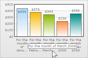
In AUTO mode the chart automatically chooses the most appropriate layout for data labels - depending on the availability of space. So, if the number of data labels is greater than what can be accommodated in the available space, then the data labels are either truncated (with ellipses to indicate truncation), wrapped or rotated. ToolTips showing full data label appears when the user hovers over a truncated data label, as shown under. The AUTO mode is active by default, and can be disabled by switching to an alternative label display mode.
 |
 |
The WRAP mode enables you to wrap the long x-axis or data labels of your chart in multiple lines, as shown below. To enable WRAP mode, all you need to do is set :
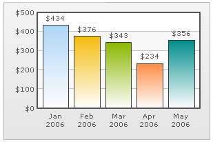
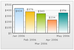
You can opt to rotate the x-axis or data labels by using <chart labelDisplay='Rotate' ...>.
Consider the XML below:
<chart numberPrefix='$' labelDisplay='ROTATE'>
    <set label='Jan 2006' value='434' />
    <set label='Feb 2006' value='376' />
    <set label='Mar 2006' value='343' />
    <set label='Apr 2006' value='234' />
    <set label='May 2006' value='356' />
</chart>
{
  "chart":{
    "numberprefix":"$",
    "labeldisplay":"ROTATE"
  },
  "data":[{
      "label":"Jan 2006",
      "value":"434"
    },
    {
      "label":"Feb 2006",
      "value":"376"
    },
    {
      "label":"Mar 2006",
      "value":"343"
    },
    {
      "label":"Apr 2006",
      "value":"234"
    },
    {
      "label":"May 2006",
      "value":"356"
    }
  ]
}
It gives us the following chart:
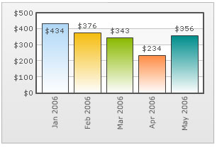
You can also slant the labels at 45 degrees by using <chart labelDisplay='Rotate' slantLabels='1' ...> which gives the following visual output:

Note: In case of Scatter and Bubble charts, when the attribute xAxisLabelMode is set to auto slanting of the x-axis labels is not applicable.
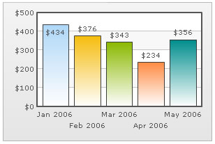
FusionCharts XT allows you to set the stagger mode for labels. Staggering basically distributes labels into multiple lines (by default 2). To enable stagger mode, just set <chart labelDisplay='Stagger' ...>. It will yield the following:
You can also choose how many lines to stagger the labels to by setting the number in <chart labelDisplay='Stagger' staggerLines='n' ...> where n is the number of lines. Shown below is an example with staggerLines set to 3.
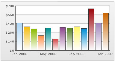
If your x-axis or data labels represent a continuous quantity like time, date etc. which are incremental in nature, you can opt to show every n-th label instead of all the labels. This enhances the visual clarity of the chart. Consider the XML below:
<chart numberPrefix='$' labelStep='4' showValues='0'>
    <set label='Jan 2006' value='434' />
    <set label='Feb 2006' value='376' />
    <set label='Mar 2006' value='343' />
    <set label='Apr 2006' value='234' />
    <set label='May 2006' value='356' />
    <set label='Jun 2006' value='183' />
    <set label='Jul 2006' value='365' />
    <set label='Aug 2006' value='357' />
    <set label='Sep 2006' value='375' />
    <set label='Oct 2006' value='345' />
    <set label='Nov 2006' value='655' />
    <set label='Dec 2006' value='435' />
    <set label='Jan 2007' value='586' />
</chart>
{
  "chart":{
    "numberprefix":"$",
    "labelstep":"4",
    "showvalues":"0"
  },
  "data":[{
      "label":"Jan 2006",
      "value":"434"
    },
    {
      "label":"Feb 2006",
      "value":"376"
    },
    {
      "label":"Mar 2006",
      "value":"343"
    },
    {
      "label":"Apr 2006",
      "value":"234"
    },
    {
      "label":"May 2006",
      "value":"356"
    },
    {
      "label":"Jun 2006",
      "value":"183"
    },
    {
      "label":"Jul 2006",
      "value":"365"
    },
    {
      "label":"Aug 2006",
      "value":"357"
    },
    {
      "label":"Sep 2006",
      "value":"375"
    },
    {
      "label":"Oct 2006",
      "value":"345"
    },
    {
      "label":"Nov 2006",
      "value":"655"
    },
    {
      "label":"Dec 2006",
      "value":"435"
    },
    {
      "label":"Jan 2007",
      "value":"586"
    }
  ]
}
In the above chart, we are plotting consecutive months on the chart. So, if we show all the months, the x-axis or data labels of the chart could get cluttered. To avoid this, we have set labelStep as 4, so that every 4th x-axis label is only shown.
When you view the chart, you will get following output:
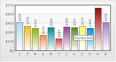
If you are working on a small chart size, you can also opt to show abbreviated names on x-axis, but show full names as ToolTip. Consider the XML below:
<chart numberPrefix='$' rotateValues='1'>
    <set label='J' toolText='January' value='434' />
    <set label='F' toolText='February' value='376' />
    <set label='M' toolText='March' value='343' />
    <set label='A' toolText='April' value='234' />
    <set label='M' toolText='May' value='356' />
    <set label='J' toolText='June' value='183' />
    <set label='J' toolText='July' value='365' />
    <set label='A' toolText='August' value='357' />
    <set label='S' toolText='September' value='375' />
    <set label='O' toolText='October' value='345' />
    <set label='N' toolText='November' value='655' />
    <set label='D' toolText='December' value='435' />
</chart>
{
  "chart":{
    "numberprefix":"$",
    "rotatevalues":"1"
  },
  "data":[{
      "label":"J",
      "tooltext":"January",
      "value":"434"
    },
    {
      "label":"F",
      "tooltext":"February",
      "value":"376"
    },
    {
      "label":"M",
      "tooltext":"March",
      "value":"343"
    },
    {
      "label":"A",
      "tooltext":"April",
      "value":"234"
    },
    {
      "label":"M",
      "tooltext":"May",
      "value":"356"
    },
    {
      "label":"J",
      "tooltext":"June",
      "value":"183"
    },
    {
      "label":"J",
      "tooltext":"July",
      "value":"365"
    },
    {
      "label":"A",
      "tooltext":"August",
      "value":"357"
    },
    {
      "label":"S",
      "tooltext":"September",
      "value":"375"
    },
    {
      "label":"O",
      "tooltext":"October",
      "value":"345"
    },
    {
      "label":"N",
      "tooltext":"November",
      "value":"655"
    },
    {
      "label":"D",
      "tooltext":"December",
      "value":"435"
    }
  ]
}
In the above XML, we are showing only the first character of each month name on x-axis. The rest of information is shown as ToolTip as below:
In this section, we have just given you a brief idea of your control over the x-axis or data labels. You may mix and match these ideas to effectively get much better control over the x-axis or data labels.
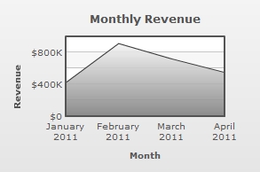
Starting FusionCharts XT, all Line and Area charts apply an additional label management method to render x-axis labels.
All the Line and Area charts automatically adjust the canvas padding (the space between the canvas border and the position where the Line or Area chart begins and ends) to accommodate long labels. This ensures that the first and last x-axis labels are not rendered outside the canvas border and the labels never overlap each other. A line and an Area chart where the canvas padding gets automatically calculated and applied due to long labels look as under:
 |
 |
| Line chart with automated canvas padding | Area chart with automated canvas padding |
 |
 |
| Line chart with canvasPadding='0' | Area chart with canvasPadding='0' |