Combination charts are helpful when you want to plot multiple chart types on the same chart or use two different scales for two different axes. FusionCharts XT offers two categories of Combination Charts:
- Single Y Axis Combination Chart: In these charts, there is only one y-axis and all the data sets are plotted against this axis.
- Dual Y Axis Combination Chart: In these charts, there are two y-axes, which can represent different scales (e.g., revenue and quantity or visits and downloads etc.). The axis on the left of the chart is called primary axis and the one on right is called secondary axis (though, you can reverse this in few charts by configuring the JSON).
Note that the basic JSON structure of Combination charts is same as multi-series chart
FusionCharts XT has both 2D and 3D combination charts. Shown below is a 2D Single Y Combination Chart.
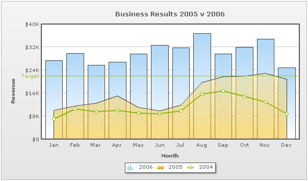
In the above chart, all the data-series are plotted against the same (primary) y-axis. Each dataset has an attribute renderAs that specifies whether the series has to be rendered as column, line, or area.
The JSON for the above chart looks as under:
{
  "chart":{
    "caption":"Business Results 2005 v 2006",
    "xaxisname":"Month",
    "yaxisname":"Revenue",
    "showvalues":"0",
    "numberprefix":"$"
  },
  "categories":[{
      "category":[{
          "label":"Jan"
        },
        {
          "label":"Feb"
        },
        {
          "label":"Mar"
        },
        {
          "label":"Apr"
        },
        {
          "label":"May"
        },
        {
          "label":"Jun"
        },
        {
          "label":"Jul"
        },
        {
          "label":"Aug"
        },
        {
          "label":"Sep"
        },
        {
          "label":"Oct"
        },
        {
          "label":"Nov"
        },
        {
          "label":"Dec"
        }
      ]
    }
  ],
  "dataset":[{
      "seriesname":"2006",
      "data":[{
          "value":"27400"
        },
        {
          "value":"29800"
        },
        {
          "value":"25800"
        },
        {
          "value":"26800"
        },
        {
          "value":"29600"
        },
        {
          "value":"32600"
        },
        {
          "value":"31800"
        },
        {
          "value":"36700"
        },
        {
          "value":"29700"
        },
        {
          "value":"31900"
        },
        {
          "value":"34800"
        },
        {
          "value":"24800"
        }
      ]
    },
    {
      "seriesname":"2005",
      "renderas":"Area",
      "data":[{
          "value":"10000"
        },
        {
          "value":"11500"
        },
        {
          "value":"12500"
        },
        {
          "value":"15000"
        },
        {
          "value":"11000"
        },
        {
          "value":"9800"
        },
        {
          "value":"11800"
        },
        {
          "value":"19700"
        },
        {
          "value":"21700"
        },
        {
          "value":"21900"
        },
        {
          "value":"22900"
        },
        {
          "value":"20800"
        }
      ]
    },
    {
      "seriesname":"2004",
      "renderas":"Line",
      "data":[{
          "value":"7000"
        },
        {
          "value":"10500"
        },
        {
          "value":"9500"
        },
        {
          "value":"10000"
        },
        {
          "value":"9000"
        },
        {
          "value":"8800"
        },
        {
          "value":"9800"
        },
        {
          "value":"15700"
        },
        {
          "value":"16700"
        },
        {
          "value":"14900"
        },
        {
          "value":"12900"
        },
        {
          "value":"8800"
        }
      ]
    }
  ],
  "trendlines":{
    "line":[{
        "startvalue":"22000",
        "color":"91C728",
        "displayvalue":"Target",
        "showontop":"1"
      }
    ]
  },
  "styles": {
    "definition": [
      {
        "name": "CanvasAnim",
        "type": "animation",
        "param": "_xScale",
        "start": "0",
        "duration": "1"
      }
    ],
    "application": [
      {
        "toobject": "Canvas",
        "styles": "CanvasAnim"
      }
    ]
  }
}
An example of a 2D Dual Y Combination Chart looks as under:
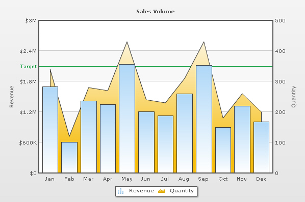
As you can see in the image above, we are plotting sales and quantity on the chart. The chart has two y-axes:
- The primary y-axis (left) representing sales. The columns which represent sales are plotted against the primary y-axis
- The secondary y-axis (right) representing quantity. The area plot which represents quantity is plotted against the secondary y-axis
For Dual Y Axis combination charts, it is necessary to provide at least two datasets - one for the primary axis and the other for the secondary axis. If you do not provide this, the chart will not render properly.
The JSON for the above Dual Y Axis chart looks as under:
{
  "chart":{
    "caption":"Sales Volume",
    "pyaxisname":"Revenue",
    "syaxisname":"Quantity",
    "showvalues":"0",
    "numberprefix":"$"
  },
  "categories":[{
      "category":[{
          "label":"Jan"
        },
        {
          "label":"Feb"
        },
        {
          "label":"Mar"
        },
        {
          "label":"Apr"
        },
        {
          "label":"May"
        },
        {
          "label":"Jun"
        },
        {
          "label":"Jul"
        },
        {
          "label":"Aug"
        },
        {
          "label":"Sep"
        },
        {
          "label":"Oct"
        },
        {
          "label":"Nov"
        },
        {
          "label":"Dec"
        }
      ]
    }
  ],
  "dataset":[{
      "seriesname":"Revenue",
      "parentyaxis":"P",
      "data":[{
          "value":"1700000"
        },
        {
          "value":"610000"
        },
        {
          "value":"1420000"
        },
        {
          "value":"1350000"
        },
        {
          "value":"2140000"
        },
        {
          "value":"1210000"
        },
        {
          "value":"1130000"
        },
        {
          "value":"1560000"
        },
        {
          "value":"2120000"
        },
        {
          "value":"900000"
        },
        {
          "value":"1320000"
        },
        {
          "value":"1010000"
        }
      ]
    },
    {
      "seriesname":"Quantity",
      "parentyaxis":"S",
      "data":[{
          "value":"340"
        },
        {
          "value":"120"
        },
        {
          "value":"280"
        },
        {
          "value":"270"
        },
        {
          "value":"430"
        },
        {
          "value":"240"
        },
        {
          "value":"230"
        },
        {
          "value":"310"
        },
        {
          "value":"430"
        },
        {
          "value":"180"
        },
        {
          "value":"260"
        },
        {
          "value":"200"
        }
      ]
    }
  ],
  "trendlines":{
    "line":[{
        "startvalue":"2100000",
        "color":"009933",
        "displayvalue":"Target"
      }
    ]
  },
  "styles": {
    "definition": [
      {
        "name": "CanvasAnim",
        "type": "animation",
        "param": "_xScale",
        "start": "0",
        "duration": "1"
      }
    ],
    "application": [
      {
        "toobject": "Canvas",
        "styles": "CanvasAnim"
      }
    ]
  }
}The JSON structure for a combination chart is very similar to that of multi-series chart. So, we will not discuss it all over again. Rather, we will discuss the differences.
Single Y Axis Combination Charts allow you to plot multiple datasets as different types of plots (columns, lines or areas), but against the same y-axis (primary). Since all the datasets belong to the same primary axis, the number formatting properties do not change across them.
To select which dataset should be rendered as what plot type, you use the renderAs property as under:
"seriesname":"2005",  "renderas":"Area"
"seriesname":"2006",  "renderas":"line"
"seriesname":"2007",  "renderas":"column"
In Dual Y Axis Combination Charts, you have two y-axes. Each y-axis can have its own scale and number formatting properties. You can also explicitly set the y-axis lower and upper limits for both the axes.
You can choose the axis of each dataset using the parentYAxis property in the dataset object. This attribute can take a value of P or S. P denotes primary axis and S denotes secondary axis.
  "dataset":[{
      "seriesname":"Revenue",
      "parentyaxis":"P",
...
and the Quantity dataset on secondary axis:
  "dataset":[{
      "seriesname":"Quantity",
      "parentyaxis":"S",
...
In Dual Y 3D Combination Charts, the column chart by default plots on the primary axis and lines on the secondary. To switch this, you can specify the property "primaryAxisOnLeft":"0" in the chart object. You can have more than one primary or secondary datasets but at least one of each is required.
Each trend-line has to be associated with an axis, against which it will be plotted. Example:
 "trendlines":{
    "line":[{
        "startvalue":"2100000",
        "parentYAxis": "S",
        "color":"009933",
        "displayvalue":"Target"
      }
    ]
  },
By default, they conform to the primary axis.
Thereafter, you can define Styles elements similar to what we discussed in the Single Series JSON format page.