Multi-series charts are charts where you compare multiple series of data.
In our previous example, we had seen how to plot a chart indicating Monthly Sales Summary for 1 year. This data belonged to one particular series, which is for the year say, 2005. Now, if you need to compare the data for two or more years, you will have to use multi-series charts. Using multi-series charts, you can compare data for two or more number of series.
A simple 2D multi-series chart looks as under:
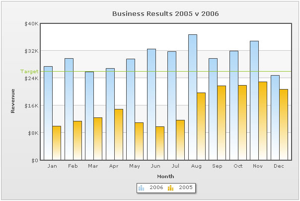
As you can see above, here we are comparing data for both 2006 and 2005.
The JSON for this chart looks as under:
{
  "chart":{
    "caption":"Business Results 2005 v 2006",
    "xaxisname":"Month",
    "yaxisname":"Revenue",
    "showvalues":"0",
    "numberprefix":"$"
  },
  "categories":[{
      "category":[{
          "label":"Jan"
        },
        {
          "label":"Feb"
        },
        {
          "label":"Mar"
        },
        {
          "label":"Apr"
        },
        {
          "label":"May"
        },
        {
          "label":"Jun"
        },
        {
          "vline":"true",
          "color":"FF5904",
          "thickness":"2"
        },
        {
          "label":"Jul"
        },
        {
          "label":"Aug"
        },
        {
          "label":"Sep"
        },
        {
          "label":"Oct"
        },
        {
          "label":"Nov"
        },
        {
          "label":"Dec"
        }
      ]
    }
  ],
  "dataset":[{
      "seriesname":"2006",
      "data":[{
          "value":"27400"
        },
        {
          "value":"29800"
        },
        {
          "value":"25800"
        },
        {
          "value":"26800"
        },
        {
          "value":"29600"
        },
        {
          "value":"32600"
        },
        {
          "value":"31800"
        },
        {
          "value":"36700"
        },
        {
          "value":"29700"
        },
        {
          "value":"31900"
        },
        {
          "value":"34800"
        },
        {
          "value":"24800"
        }
      ]
    },
    {
      "seriesname":"2005",
      "data":[{
          "value":"10000"
        },
        {
          "value":"11500"
        },
        {
          "value":"12500"
        },
        {
          "value":"15000"
        },
        {
          "value":"11000"
        },
        {
          "value":"9800"
        },
        {
          "value":"11800"
        },
        {
          "value":"19700"
        },
        {
          "value":"21700"
        },
        {
          "value":"21900"
        },
        {
          "value":"22900"
        },
        {
          "value":"20800"
        }
      ]
    }
  ],
  "trendlines":{
    "line":[{
        "startvalue":"26000",
        "color":"91C728",
        "displayvalue":"Target",
        "showontop":"1"
      }
    ]
  },
   "styles": {
    "definition": [
      {
        "name": "CanvasAnim",
        "type": "animation",
        "param": "_xScale",
        "start": "0",
        "duration": "1"
      }
    ],
    "application": [
      {
        "toobject": "Canvas",
        "styles": "CanvasAnim"
      }
    ]
  }
}If you have already gone through the single series JSON structure, you will find notable differences between the two JSON structures. There are new categories, category and dataset objects. Additionally, the dataset object now just contains the value attribute.
Each category item represents a label on the x-axis. The category elements need to be defined for all the multi-series charts before you can define the data. For example, in our chart, the categories are the month names (Jan, Feb, Mar .... ) as we are plotting a chart to show monthly sales summary for two consecutive years.
Between category elements, we can create a vLine object. From JSON perspective, a vLine is essentially a category element with key "vLine" and its value "true", along with other properties.
{ "vline":"true", "color":"FF5904", "thickness":"2" }
Now, in a multi-series chart, each series of data (that is, each set of data) must be contained in a dataset object. Depending on the chart type, there are a number of properties which you can define for each dataset object, which you can see in "Chart XML Sheet" of that chart. Please note that the XML attributes are same as JSON properties.
Moving on, each element in dataset array represents a set of data which is to be plotted on the graph and determines a set of data which will appear on the graph.
Thereafter, you can define trend-lines and the Styles elements similar to what we discussed in the Single Series JSON format page.