Data labels refer to the names for the data points which appear on the x-axis.
In the chart shown above, Jan 2006, Feb 2006 etc are the data labels for the chart. By default, they get wrapped and show ellipses, along with tool-tips, when there is not enough space on the chart.
You can choose not to show the data labels by using <chart showLabels='0'>. By default, they're visible.
The data labels can be displayed on the charts in the following ways:
- Auto mode - Default mode, where the chart automatically selects the best mode of display (between rotate and wrap)
- Wrap mode
- Rotated and slanted mode
- Staggered mode with customizable staggered lines
- Every n-th label
- All the X axis labels should get centrally aligned to the respective data-plots (columns, points on line charts etc.)
- X axis labels should not overlap each other
- X axis labels should not overlap with other chart objects such as legends or X axis name
- Long labels should not go outside the chart
- Optimized truncation of longer labels and putting ellipses at the end
Note: Bar, Pie, Doughnut, Marimekko, Zoom Line and Multi-series Combination 3D charts do not apply the advanced label management rules mentioned above. Also, you can opt not to apply the advanced label management to the X axis labels. For this, you need to set the attribute labelDisplay='none' in <chart> element.
Now, let's take a detailed look at each of them.
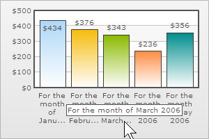
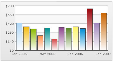
In auto mode the chart automatically chooses the most appropriate display mode for data labels - depending on availability of space. So, if the number of data labels is greater than what can be accommodated in the available space, then the data labels are either truncated (with ellipses to indicate truncation), wrapped, or rotated. Tooltips showing full label text appears when the user hovers over a truncated data label. The auto mode is active by default, and can be disabled by switching to an alternative label display mode.
 |
 |
In auto mode, you can set whether the long data labels be truncated by adding ellipses using the useEllipsesWhenOverflow attribute. By default, this attribute is set to 1 in order to prevent the long labels from overflowing the chart background. But, if you do not wish to show ellipses at the end, set this attribute in the following way:
<chart labelDisplay='AUTO' useEllipsesWhenOverflow='0'>
The wrap mode enables you to wrap your long x-axis labels in multiple lines as shown below. To enable wrap mode, all you need to do is set :
<chart labelDisplay='WRAP'>
If enough space is not available on chart, the wrapped mode will automatically trim labels, add ellipses (...) at the end of them and will show tool-tips for such labels. Shown below is an example:
In all the horizontal bar charts, you can specify the maximum % of available width that you wish to allot for data labels. By default, the best fit is calculated.
The attribute is:
<chart ... maxLabelWidthPercent='50'>
This attribute takes a value between 5 and 80. Shown below are 2 examples of bar chart with this attribute:
 |
 |
| Bar chart with maxLabelWidthPercent='15' | Bar chart with maxLabelWidthPercent='65' |
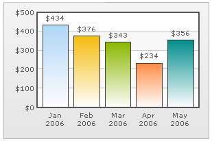
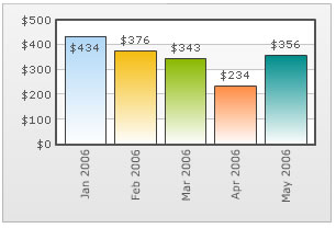
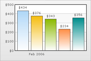
You can opt to rotate the x-axis labels by using <chart labelDisplay='Rotate' ..>.
Consider the data below:
<chart numberPrefix='$' labelDisplay='ROTATE'>
  <set label='Jan 2006' value='434' />
  <set label='Feb 2006' value='376' />
  <set label='Mar 2006' value='343' />
  <set label='Apr 2006' value='234' />
  <set label='May 2006' value='356' />
</chart>
{
  "chart":{
    "numberprefix":"$",
    "labeldisplay":"ROTATE"
  },
  "data":[{
      "label":"Jan 2006",
      "value":"434"
    },
    {
      "label":"Feb 2006",
      "value":"376"
    },
    {
      "label":"Mar 2006",
      "value":"343"
    },
    {
      "label":"Apr 2006",
      "value":"234"
    },
    {
      "label":"May 2006",
      "value":"356"
    }
  ]
}
It yields the following chart:
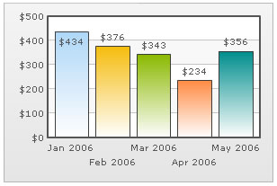
You can also slant the labels at 45 degree by using <chart labelDisplay='Rotate' slantLabels='1' ..> to achieve the following results:

Note: In case of Scatter and Bubble charts, when the attribute xAxisLabelMode is set to auto slanting of the X axis labels is not applicable.
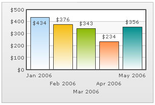
FusionCharts XT introduces the stagger mode for labels. Staggering basically distributes labels into multiple lines (by default 2). To enable stagger mode, just set:
<chart labelDisplay='Stagger' ..>
It will yield the following:
You can also choose how many lines to stagger the labels to, by setting the number in < chart labelDisplay='Stagger' staggerLines='n' ..> where n is the number of lines. Shown below is an example with staggerLines set to 3.
If your x-axis labels represent a continuous quantity like time, date etc. which are incremental in nature, you can opt to show every n-th label instead of all the labels. This enhances the clarity of the chart. Consider the data below:
<chart numberPrefix='$' labelStep='4' showValues='0'>
  <set label='Jan 2006' value='434' />
  <set label='Feb 2006' value='376' />
  <set label='Mar 2006' value='343' />
  <set label='Apr 2006' value='234' />
  <set label='May 2006' value='356' />
  <set label='Jun 2006' value='183' />
  <set label='Jul 2006' value='365' />
  <set label='Aug 2006' value='357' />
  <set label='Sep 2006' value='375' />
  <set label='Oct 2006' value='345' />
  <set label='Nov 2006' value='655' />
  <set label='Dec 2006' value='435' />
  <set label='Jan 2007' value='586' />
</chart>
{
  "chart":{
    "numberprefix":"$",
    "labelstep":"4",
    "showvalues":"0"
  },
  "data":[{
      "label":"Jan 2006",
      "value":"434"
    },
    {
      "label":"Feb 2006",
      "value":"376"
    },
    {
      "label":"Mar 2006",
      "value":"343"
    },
    {
      "label":"Apr 2006",
      "value":"234"
    },
    {
      "label":"May 2006",
      "value":"356"
    },
    {
      "label":"Jun 2006",
      "value":"183"
    },
    {
      "label":"Jul 2006",
      "value":"365"
    },
    {
      "label":"Aug 2006",
      "value":"357"
    },
    {
      "label":"Sep 2006",
      "value":"375"
    },
    {
      "label":"Oct 2006",
      "value":"345"
    },
    {
      "label":"Nov 2006",
      "value":"655"
    },
    {
      "label":"Dec 2006",
      "value":"435"
    },
    {
      "label":"Jan 2007",
      "value":"586"
    }
  ]
}
In the above chart, we're plotting consecutive months on the chart. So, if we show all the months, the chart gets cluttered. To avoid this, we've set labelStep as 4, so that every 4th x-axis label is only shown.
When you view the chart, you'll get the following output:
You can opt to show only specific data labels by using <chart showLabels='0'> and then setting showLabel='1' for the set you want to show the label. A chart having the same looks as under:
The XML/JSON going into the same is:
<chart numberPrefix='$' showLabels='0'>
  <set label='Jan 2006' value='434' />
  <set label='Feb 2006' value='376' showLabel='1'/>
  <set label='Mar 2006' value='343' />
  <set label='Apr 2006' value='234' />
  <set label='May 2006' value='356' />
</chart>
{
  "chart":{
    "numberprefix":"$",
    "showlabels":"0"
  },
  "data":[{
      "label":"Jan 2006",
      "value":"434"
    },
    {
      "label":"Feb 2006",
      "value":"376",
      "showlabel":"1"
    },
    {
      "label":"Mar 2006",
      "value":"343"
    },
    {
      "label":"Apr 2006",
      "value":"234"
    },
    {
      "label":"May 2006",
      "value":"356"
    }
  ]
}
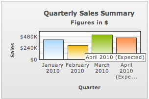
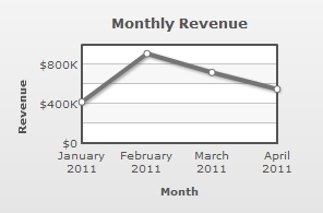
Starting FusionCharts XT, all line and area charts apply an additional label management method to render X axis labels.
All the line and area charts automatically adjust the canvas padding (the space between the canvas border and the position where the line/area chart begins and ends) to accommodate long labels. This ensures that the first and last X axis labels are not rendered outside the canvas border and the labels never overlap each other. A line and an area chart where the canvas padding gets automatically calculated and applied due to long labels look as under:
 |
 |
| Line chart with automated canvas padding | Area chart with automated canvas padding |
 |
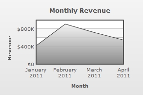 |
| Line chart with canvasPadding='0' | Area chart with canvasPadding='0' |
Using a single font property for all the labels
If you want to specify a single font property for all the text outside canvas area, you can use outCnvBaseFont attribute group. The font properties specified as a part of this attribute group will be applied to Caption, Sub-Caption, X-Axis & Y-Axis names, Data Labels, Divisional Line and Trendline values.
The following attributes are a part of this group:
| Attribute Name | Description | Example |
| outCnvbaseFont | Lets you define the font family e.g., Arial, Verdana etc | outCnvBaseFont='Verdana' |
| outCnvbaseFontSize | Lets you define the font size (8-72) | outCnvbaseFontSize='10' |
| outCnvbaseFontColor | Lets you define the font color. Use hex code for the color without #. E.g., 000000 or 009933 or 999999 | outCnvbaseFontColor='009933' |
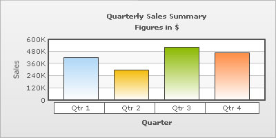
Example data:
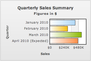
<chart caption='Quarterly Sales Summary' subcaption='Figures in $' xAxis='Quarter' yAxisName='Sales' outCnvBaseFont='Arial' outCnvBaseFontSize='12' outCnvBaseFontColor='333333'>
    <set label='Quarter 1' value='420500' />
    <set label='Quarter 2' value='295400' />
    <set label='Quarter 3' value='523400' />
    <set label='Quarter 4' value='465400' />
</chart>
{
"chart":{
"caption":"Quarterly Sales Summary",
"subcaption":"Figures in $",
"xaxis":"Quarter",
"yaxisname":"Sales",
"outcnvbasefont":"Arial",
"outcnvbasefontsize":"12",
"outcnvbasefontcolor":"333333"
},
"data":[{
"label":"Quarter 1",
"value":"420500"
},
{
"label":"Quarter 2",
"value":"295400"
},
{
"label":"Quarter 3",
"value":"523400"
},
{
"label":"Quarter 4",
"value":"465400"
}
]
}
Output:
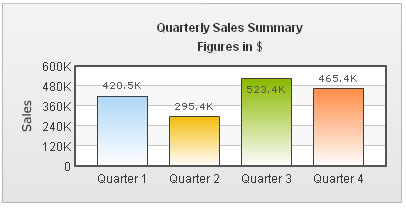
As you can see above, all the text outside chart canvas has assumed the font properties specified as part of that attribute group.
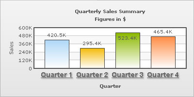
If you do not want all the text on your chart to have similar font properties, you can use Styles to define individual font properties for different text on the chart. Using Styles, you can specify a different font name, size, color, background & border color and also make the text bold or italicized.
Shown below is a change in the basic font properties of the data labels.
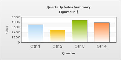
The XML/JSON for this chart is as under. To read more on Styles, please refer to FusionCharts XT Styles.
<chart caption='Quarterly Sales Summary' subcaption='Figures in $' xAxisName='Quarter' yAxisName='Sales' showValues='0' >
    <set label='Qtr 1' value='420500' />
    <set label='Qtr 2' value='295400' />
    <set label='Qtr 3' value='523400' />
    <set label='Qtr 4' value='465400' />
    <styles>
       <definition>
          <style name='myLabelsFont' type='font' font='Arial' size='14' color='666666' bold='1' underline='1'/>
       </definition>
       <application>
          <apply toObject='DataLabels' styles='myLabelsFont' />
       </application>
    </styles>
</chart>
{
"chart":{
"caption":"Quarterly Sales Summary",
"subcaption":"Figures in $",
"xaxisname":"Quarter",
"yaxisname":"Sales",
"showvalues":"0"
},
"data":[{
"label":"Qtr 1",
"value":"420500"
},
{
"label":"Qtr 2",
"value":"295400"
},
{
"label":"Qtr 3",
"value":"523400"
},
{
"label":"Qtr 4",
"value":"465400"
}
],
"styles": {
"definition": [
{
"name": "myLabelsFont",
"type": "font",
"font": "Arial",
"size": "14",
"color": "666666",
"bold": "1",
"underline": "1"
}
],
"application": [
{
"toobject": "DataLabels",
"styles": "myLabelsFont"
}
]
}
}
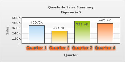
You can also define a background and border color for the data labels using Styles.
<chart caption='Quarterly Sales Summary' subcaption='Figures in $' xAxisName='Quarter' yAxisName='Sales' showValues='0' >
      <set label='Qtr 1' value='420500' />
      <set label='Qtr 2' value='295400' />
      <set label='Qtr 3' value='523400' />
      <set label='Qtr 4' value='465400' />
      <styles>
        <definition>
           <style name='myLabelsFont' type='font' bgColor='FFFFFF' borderColor='666666'/>
        </definition>
        <application>
           <apply toObject='DataLabels' styles='myLabelsFont' />
        </application>
      </styles>
</chart>
{
"chart":{
"caption":"Quarterly Sales Summary",
"subcaption":"Figures in $",
"xaxisname":"Quarter",
"yaxisname":"Sales",
"showvalues":"0"
},
"data":[{
"label":"Qtr 1",
"value":"420500"
},
{
"label":"Qtr 2",
"value":"295400"
},
{
"label":"Qtr 3",
"value":"523400"
},
{
"label":"Qtr 4",
"value":"465400"
}
],
"styles": {
"definition": [
{
"name": "myLabelsFont",
"type": "font",
"bgcolor": "FFFFFF",
"bordercolor": "666666"
}
],
"application": [
{
"toobject": "DataLabels",
"styles": "myLabelsFont"
}
]
}
}
You can also apply effects (shadow, glow, blur, bevel etc.) to the chart titles using Styles. Shown below is an example:
Here, we've changed the font properties of the data labels and applied a shadow to it. The data can be listed as under:
<chart caption='Quarterly Sales Summary' subcaption='Figures in $' xAxisName='Quarter' yAxisName='Sales' showValues='0' >
    <set label='Quarter 1' value='420500' />
    <set label='Quarter 2' value='295400' />
    <set label='Quarter 3' value='523400' />
    <set label='Quarter 4' value='465400' />
    <styles>
       <definition>
           <style name='myLabelsFont' type='font' font='Arial' size='14' color='666666' bold='1' underline='1'/>
           <style name='myShadow' type='Shadow' color='999999' angle='45'/>
       </definition>
       <application>
           <apply toObject='DataLabels' styles='myLabelsFont,myShadow' />
       </application>
    </styles>
</chart>
{
"chart":{
"caption":"Quarterly Sales Summary",
"subcaption":"Figures in $",
"xaxisname":"Quarter",
"yaxisname":"Sales",
"showvalues":"0"
},
"data":[{
"label":"Quarter 1",
"value":"420500"
},
{
"label":"Quarter 2",
"value":"295400"
},
{
"label":"Quarter 3",
"value":"523400"
},
{
"label":"Quarter 4",
"value":"465400"
}
],
"styles": {
"definition": [
{
"name": "myLabelsFont",
"type": "font",
"font": "Arial",
"size": "14",
"color": "666666",
"bold": "1",
"underline": "1"
},
{
"name": "myShadow",
"type": "Shadow",
"color": "999999",
"angle": "45"
}
],
"application": [
{
"toobject": "DataLabels",
"styles": "myLabelsFont,myShadow"
}
]
}}
We can also apply a glow to the data labels as under:
Here, we've changed the font properties of the data labels and applied a shadow to it. The data can be listed as under:
<chart caption='Quarterly Sales Summary' subcaption='Figures in $' xAxisName='Quarter' yAxisName='Sales' showValues='0' >
    <set label='Quarter 1' value='420500' />
    <set label='Quarter 2' value='295400' />
    <set label='Quarter 3' value='523400' />
    <set label='Quarter 4' value='465400' />
    <styles>
        <definition>
            <style name='myLabelsFont' type='font' font='Arial' size='14' color='666666' bold='1' underline='1'/>
            <style name='myGlow' type='Glow' color='FF5904'/>
        </definition>
        <application>
            <apply toObject='DataLabels' styles='myLabelsFont,myGlow' />
        </application>
    </styles>
</chart>
{
"chart":{
"caption":"Quarterly Sales Summary",
"subcaption":"Figures in $",
"xaxisname":"Quarter",
"yaxisname":"Sales",
"showvalues":"0"
},
"data":[{
"label":"Quarter 1",
"value":"420500"
},
{
"label":"Quarter 2",
"value":"295400"
},
{
"label":"Quarter 3",
"value":"523400"
},
{
"label":"Quarter 4",
"value":"465400"
}
],
"styles": {
"definition": [
{
"name": "myLabelsFont",
"type": "font",
"font": "Arial",
"size": "14",
"color": "666666",
"bold": "1",
"underline": "1"
},
{
"name": "myGlow",
"type": "Glow",
"color": "FF5904"
}
],
"application": [
{
"toobject": "DataLabels",
"styles": "myLabelsFont,myGlow"
}
]
}
}
You can also apply animation effects to the data labels using Styles. Shown below is an example which animates the x-position of the data labels from the center of the chart canvas to their respective positions.
<chart caption='Quarterly Sales Summary' subcaption='Figures in $' xAxisName='Quarter' yAxisName='Sales'>
    <set label='Quarter 1' value='420500' />
    <set label='Quarter 2' value='295400' />
    <set label='Quarter 3' value='523400' />
    <set label='Quarter 4' value='465400' />
    <styles>
       <definition>
          <style name='myAnim' type='animation' param='_x' start='$canvasCenterX' duration='1' />
       </definition>
       <application>
          <apply toObject='DataLabels' styles='myAnim' />
       </application>
    </styles>
</chart>
{
  "chart":{
    "caption":"Quarterly Sales Summary",
    "subcaption":"Figures in $",
    "xaxisname":"Quarter",
    "yaxisname":"Sales",
    "showvalues":"0"
  },
  "data":[{
      "label":"Quarter 1",
      "value":"420500"
    },
    {
      "label":"Quarter 2",
      "value":"295400"
    },
    {
      "label":"Quarter 3",
      "value":"523400"
    },
    {
      "label":"Quarter 4",
      "value":"465400"
    }
  ],
  "styles": {
    "definition": [
      {
        "name": "myAnim",
        "type": "animation",
        "param": "_x",
        "start": "$canvasCenterX",
        "duration": "1"
      }
    ],
    "application": [
      {
        "toobject": "DataLabels",
        "styles": "myAnim"
      }
    ]
  }
}