 Chart Image Chart Objects Functional Attributes Chart Captions Chart Cosmetics Period Block properties Sample XML Data Data Plot (column) Properties <set> element Font Properties Paddings and Margins Tooltip
 | Quick Links (within this page) |
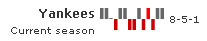
| Spark Win/Loss Chart looks as under: |
 |
| Sample XML / JSON for Spark Win/Loss Chart: |
<chart caption="Yankees" subcaption="Current season"> {
"chart": {
"caption": "Yankees",
"subcaption": "Current season"
},
"dataset": [
{
"data": [
{
"value": "W"
},
{
"value": "W"
},
{
"value": "D"
},
{
"value": "L"
},
{
"value": "W"
},
{
"value": "W"
},
{
"value": "L"
},
{
"value": "L"
},
{
"value": "W"
},
{
"value": "L"
},
{
"value": "W",
"scoreless": "1"
},
{
"value": "L"
},
{
"value": "W"
},
{
"value": "W"
}
]
}
]
} |
Back to top 
|
| Chart Objects | |||
|
Custom defined Styles can be applied to the chart objects listed below. The table contains the names of the chart objects, short descriptions, list of supported Styles and list of supported animation parameters. |
|||
| Object Name | Description | Features Supported | Animation Parameters Supported |
| BACKGROUND | Background refers to the background for entire chart. |
|
|
| CAPTION | Caption of the chart. |
|
|
| SUBCAPTION | Sub-caption of the chart. |
|
|
| PLOT | Column plots on the chart |
|
|
| VALUE | Textfield indicating the value of the chart. |
|
|
|
Back to top |
|||
| <chart> element |
| Functional Attributes |
|
These attributes let you control a variety of functional elements on the chart. For example, you can opt to show/hide data labels, data values, y-axis values. You can also set chart limits and extended properties. |
| Attribute Name | Type | Description | |
| animation | Boolean (0/1) | This attribute lets you set the configuration whether the chart should appear in an animated fashion. If you do not want to animate any part of the chart, set this as 0. | |
| defaultAnimation | Boolean (0/1) | By default, each chart animates some of its elements. If you wish to switch off the default animation patterns, you can set this attribute to 0. It can be particularly useful when you want to define your own animation patterns using the Styles feature. | |
| clickURL | URL in FusionCharts format | The entire chart can now act as a hotspot. Use this URL to define the hotspot link for the chart. The link can be specified in FusionCharts Link Format. | |
| palette | Number (1-5) | Each chart has 5 pre-defined color palettes which you can choose from. Each palette renders the chart in a different color theme. Valid values are 1-5. | |
| paletteThemeColor | Color Code | If you want your own palette derived from a particular hex color, you can specify the same here. All other colors on the chart will automatically derive from that palette. | |
| annRenderDelay | Number (seconds) | If you've defined any annotation groups over chart, using this attribute you can set the duration after which they'll render on the chart. The timer starts from the time the chart has initialized. | |
| showValue | Boolean (0/1) | Whether to show the value of chart? | |
| showPrintMenuItem | Boolean (0/1) | Whether to show "Print Chart" item in the context menu of the chart? Even if you opt to hide the item in context menu, you can still opt to invoke print() JavaScript method of the chart to print the same. | |
| showAboutMenuItem | Boolean (0/1) | Setting this to 1 displays a custom context menu in the chart; this can be customized to show your text and can be linked to your URL. For e.g., you can set the context menu of the chart to include "About your company name" and then link to your company home page. By default, the chart shows "About FusionCharts" when right clicked. | |
| aboutMenuItemLabel | String | The menu item label for the custom context menu item. | |
| aboutMenuItemLink | String | Link for the custom context menu item. You can specify the link in FusionCharts link format to be able to open the same in new window, pop-ups, frames or as JavaScript links. | |
| useRoundEdges Since v 3.2 |
Boolean (0/1) | If you wish to plot columns with round edges and fill them with a glass effect gradient, set this attribute to 1.
showShadow attribute doesn't work anymore when this attribute is set to 1. |
|
| showShadow Since v 3.2 |
Boolean (0/1) | Whether to show win/loss column shadows. | |
| manageResize Since v 3.2 |
Boolean (0/1) | Setting this attribute to 1, you can allow the chart to automatically resize itself when the parent container of the chart is resized. | |
| useEllipsesWhenOverflow Since v 3.2
|
Boolean (0/1) | When enabled in auto mode, long data labels are truncated by adding ellipses to prevent them from overflowing the chart background. The default value is 1. | |
|
Back to top |
|||
| Chart captions | ||
|
Using these attributes, you can set the various headings and titles of chart like caption, sub-caption. |
||
| Attribute Name | Type | Description | |
| caption | String | Caption of the chart. | |
| subCaption | String | Sub-caption of the chart. | |
|
Back to top |
|||
| Data Plot (win/loss bar) properties |
|
These attributes let you configure how your plot (win/loss bars) will appear on the chart. |
| Attribute Name | Type | Description | |
| winColor | Color Code | Fill colors for bar indicating win | |
| lossColor | Color Code | Fill colors for bar indicating loss | |
| drawColor | Color Code | Fill colors for bar indicating draw | |
| scoreLessColor | Color Code | Fill colors for bar indicating scoreless matches | |
|
Back to top |
|||
| Period block properties |
|
Period blocks are alternate colored bands to easily interpret periods on the chart. The following attributes helps in configuring Period blocks. |
| Attribute Name | Type | Description | |
| periodLength | Number | How many data points will each period block encapsulate? | |
| periodColor | Color Code | Color for the period block. | |
| periodAlpha | Number (0-100) | Alpha for the period block. | |
|
Back to top |
|||
| Chart Cosmetics |
|
The following attributes let you configure chart cosmetics like background color, background alpha, canvas color & alpha etc. |
| Attribute Name | Type | Description | |
| bgColor | Color Code | This attribute sets the background color for the chart. You can set any hex color code as the value of this attribute. To specify a gradient as background color, separate the hex color codes of each color in the gradient using comma. Example: FF5904, FFFFFF. Remember to remove # and any spaces in between. For more details see Using Gradients. | |
| bgAlpha | Number (0-100) | Sets the alpha (transparency) for the background. If you've opted for gradient background, you need to set a list of alpha(s) separated by comma. For more details see Using Gradients. | |
| bgRatio | Numbers separated by comma | If you've opted for a gradient background, this attribute lets you set the ratio of each color constituent. For more details see Using Gradients. | |
| bgAngle | Number (0-360) | Angle of the background color, in case of a gradient. For more details see Using Gradients. | |
| showBorder | Boolean (0/1) | Whether to show a border around the chart or not? | |
| borderColor | Color Code | Border color of the chart. | |
| borderThickness | Number (Pixels) | Border thickness of the chart. | |
| borderAlpha | Number (0-100) | Border alpha of the chart. | |
| bgImage
or bgSWF - deprecated
|
String |
To place any image (JPG/PNG/GIF) or Flash movie (SWF) as background of the chart, enter the (path and) name of the background image or SWF file. It should be in the same domain as the chart. Loading of Flash movie is deprecated and is not supported by JavaScript charts. |
|
| bgImageAlpha
or bgSWFAlpha - deprecated
|
Number (0-100) |
Helps you specify the opacity for the loaded background image or Flash movie. Loading of Flash movie is deprecated and is not supported by JavaScript charts. |
|
|
bgImageDisplayMode Since v3.2 |
String (stretch, tile, fit, fill, center, none) |
Helps you specify the mode in which the background image is to be displayed.
|
|
|
bgImageVAlign Since v3.2 |
String (top, middle, bottom) | Helps you to vertically align the background image. | |
|
bgImageHAlign Since v3.2 |
String (left, middle, right) | Helps you to horizontally align the background image. | |
|
bgImageScale Since v3.2 |
Number (0-300) | Helps you magnify the background image. This attribute will only work when the attribute bgImageDisplayMode is set to none, center or tile. | |
| logoURL | String | You can load an external logo (JPEG/PNG/SWF) on the chart once it has rendered. This attribute lets you specify the URL of the same. Owing to Flash Player security settings, you can only specify logos that are on the sub-domain as the SWF file of the chart. | |
| logoPosition | String ( TL, TR, BL, BR, CC ) | Where to position the logo on the chart:
|
|
| logoAlpha | Number (0-100) | Once the logo has loaded on the chart, you can configure its opacity using this attribute. | |
| logoScale | Number (0-100) | You can also change the size of externally loaded logo at run-time by specifying a value for this parameter. | |
| logoLink | String | If you want to link the logo to an external URL, specify the link in this attribute. The link can be in FusionCharts link format, allowing you to link to new windows, pop-ups, frames etc. | |
|
Back to top |
|||
| Font Properties |
|
Using the attributes below, you can define the generic font properties for all the text on the chart. These attributes allow you a high level control over font properties. If you intend to specify font properties for individual chart elements (like Caption, sub-caption etc.), you'll need to use the Styles feature. Using Styles, you can also specify advanced font properties like Bold, Italics, HTML Mode etc. Using Styles you can also configure real-time values. |
| Attribute Name | Type | Description | |
| baseFont | Font Name | This attribute lets you set the font face (family) of all the text (data labels, values etc.) on chart. If you specify outCnvBaseFont attribute also, then this attribute controls only the font face of text within the chart canvas bounds. | |
| baseFontSize | Number | This attribute sets the base font size of the chart i.e., all the values and the names in the chart which lie on the canvas will be displayed using the font size provided here. | |
| baseFontColor | Color Code | This attribute sets the base font color of the chart i.e., all the values and the names in the chart which lie on the canvas will be displayed using the font color provided here. | |
|
Back to top |
|||
| Tooltip properties |
|
These attributes let you control the tooltip. You can set the background color, border color, separator character and few other details. |
| Attribute Name | Type | Description | |
| showToolTip | Boolean (0/1) | Whether to show tooltip for the annotations? | |
| toolTipBgColor | Color Code | Background color for the tooltip | |
| toolTipBorderColor | Color Code | Border Color for the tooltip. | |
| showToolTipShadow | Boolean (0/1) | Whether to show shadow for tooltips. | |
|
Back to top |
|||
| Chart Paddings & Margins |
The following attributes help you control chart margins and paddings. FusionWidgets XT allows you manually customize the padding of various elements on the chart to allow advanced manipulation and control over chart visualization. Padding in FusionWidgets XT is always defined in pixels, unless the attribute itself suggests some other scale (like plotSpacePercent). You can also define the chart margins. Chart Margins refer to the empty space left on the top, bottom, left and right of the chart. It's not necessary for you to specify any padding/margin values. FusionWidgets XT automatically assumes the best values for the same, if you do not specify the same. |
| Attribute Name | Type | Description | |
| captionPadding | Number (Pixels) | This attribute lets you control the horizontal space (in pixels) between the caption and left side of chart canvas. | |
| valuePadding | Number (Pixels) | Horizontal distance between the chart and value | |
| plotSpacePercent | Number (Percent) | This attribute defines the space between two columns. If you intend to increase or decrease the spacing between columns, you can do so using this attribute. For example, if you wanted all columns to stick to each other without any space in between, you can set plotSpacePercent to 0. Similarly, if you want very thin columns, you can set plotSpacePercent to its max value of 80. | |
| chartLeftMargin | Number (Pixels) | Amount of empty space that you want to put on the left side of your chart. Nothing is rendered in this space. | |
| chartRightMargin | Number (Pixels) | Amount of empty space that you want to put on the right side of your chart. Nothing is rendered in this space. | |
| chartTopMargin | Number (Pixels) | Amount of empty space that you want to put on the top of your chart. Nothing is rendered in this space. | |
| chartBottomMargin | Number (Pixels) | Amount of empty space that you want to put on the bottom of your chart. Nothing is rendered in this space. | |
| canvasLeftMargin | Number (Pixels) | Left margin of canvas. Canvas will start from that position. | |
| canvasRightMargin | Number (Pixels) | Right margin of canvas. Canvas will end at that position. | |
|
Back to top |
|||
| <set> element |
Each <set> element (child of <chart>element) represents a set of data which is to be plotted on the chart and determines a set of data which will appear on the chart. |
| Attribute Name | Type | Description | |
| value | W, L or D | Value for the column. W indicates win, L indicates loss and D indicates draw. | |
| scoreless | Boolean (0/1) | Whether the match was scoreless? The column can then be colored using a different color. | |
|
Back to top |
|||
The XML API for the following features have not been discussed here:
|