You can also configure various properties of the pyramid chart. Here, we'll see a few of them:
- Drawing 2D pyramid with customized border properties
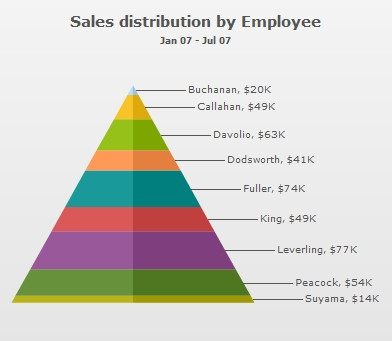
- Applying shadow to 2D pyramid
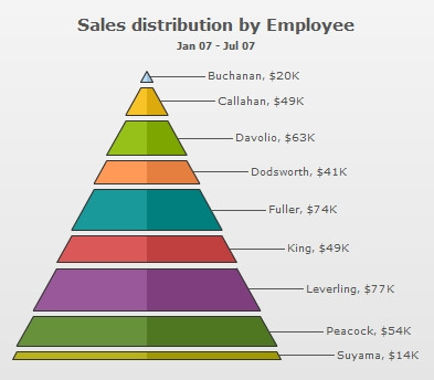
- Showing labels at center
- Showing labels in legend
- Showing values as percentage
- Slicing out individual pyramid slices
Now, see each one of them one by one.
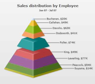
When you draw a normal pyramid chart, it renders as 3D, with a context menu allowing you to switch between 2D & 3D mode. However, if you intend to render the pyramid as 2D itself, you can set:
This will result in:
When in 2D mode, you can customize the border properties of the pyramid using:
This will result in:
<chart caption="Sales distribution by Employee" subCaption="Jan 07 - Jul 07" numberPrefix="$" is2D="1" isSliced="1" showPlotBorder="1" plotBorderThickness="1" plotBorderAlpha="100" plotBorderColor="FFFFFF">
  <set label="Buchanan" value="50000"/>
  <set label="Callahan" value="49000"/>
  <set label="Davolio" value="63000"/>
  <set label="Dodsworth" value="41000"/>
  <set label="Fuller" value="74000"/>
  <set label="King" value="49000"/>
  <set label="Leverling" value="77000"/>
  <set label="Peacock" value="54000"/>
  <set label="Suyama" value="14000"/>
  <styles>
    <definition>
      <style type="shadow" name="myShadow"/>
    </definition>
    <application>
      <apply toObject="DATAPLOT" styles="myShadow"/>
    </application>
  </styles>
</chart>
{
  "chart": {
    "caption": "Sales distribution by Employee",
    "subcaption": "Jan 07 - Jul 07",
    "numberprefix": "$",
    "is2d": "1",
    "issliced": "1",
    "showplotborder": "1",
    "plotborderthickness": "1",
    "plotborderalpha": "100",
    "plotbordercolor": "FFFFFF"
  },
  "data": [
    {
      "label": "Buchanan",
      "value": "50000"
    },
    {
      "label": "Callahan",
      "value": "49000"
    },
    {
      "label": "Davolio",
      "value": "63000"
    },
    {
      "label": "Dodsworth",
      "value": "41000"
    },
    {
      "label": "Fuller",
      "value": "74000"
    },
    {
      "label": "King",
      "value": "49000"
    },
    {
      "label": "Leverling",
      "value": "77000"
    },
    {
      "label": "Peacock",
      "value": "54000"
    },
    {
      "label": "Suyama",
      "value": "14000"
    }
  ],
  "styles": {
    "definition": [
      {
        "type": "shadow",
        "name": "myShadow"
      }
    ],
    "application": [
      {
        "toobject": "DATAPLOT",
        "styles": "myShadow"
      }
    ]
  }
}

In 2D pyramid chart, you can opt to show the pyramid labels at center of the chart using:
This will result in (with shadow filter applied to data labels):
Starting FusionWidgets XT, you can choose to place the labels in a separate legend box. You can click on the legend items to slice in and slice-out the respective pyramid item as shown below:
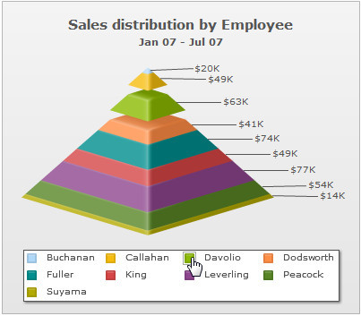
To show the legend (and hide the labels beside the pyramid) set:
<chart .. showLegend='1' showLabels='0'...>
{ "chart" : {... "showlegend" : "1", "showlabels": "0" ... } }
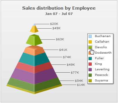
You can also place the legend at the right by setting the value of the legendPosition attribute to RIGHT:
<chart .. showLegend='1' legendPosition='RIGHT' showLabels='0'...>
{ "chart" : {... "showlegend" : "1", "legendposition": "RIGHT", "showlabels": "0" ... } }
The legend will be placed on the right as shown below:
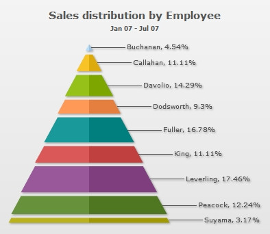
You can opt to show the values in pyramid chart as percentage by setting:
This will result in:
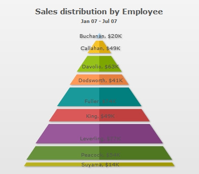
You can slice out individual pyramid slices by setting:
This will result in (here, we've sliced Fuller's slice):