A linear gauge chart can consist of the following elements:
- Horizontal scale (Color Range)
- Pointers (Data Value Indicator)
- Tick Marks & Values
- Trend points & Trend zones
- Annotations
Here we’ll see each of them in detail. Let’s first have a look at a standard linear gauge chart enlisting the various basic components:
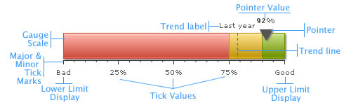
Note: Each color range should have its own unique range value. That is say, if a range is defined as 0-2, the next range should have the minimum value as 2 necessarily. It cannot have anything other than this. Similarly, if the upper limit of the chart is 9, the last range should have max value as 9.
Data pointer is the data indicator on the chart on the linear gauge charts. You can define the number of sides (polygonal shape) of the pointer, its border and background color and its radius. You can also define multiple pointers with different values and cosmetics for each one of them. Tick marks are the calibration marks on the horizontal scale to help interpret the reading. There are two types of tick marks which can be drawn on the chart:- Major Tick Marks – These are the bigger lines below the scale.
- Minor Tick Marks – These are the smaller lines enclosed within the bigger lines.
For all the tick marks, you can specify the color and the height. You can also opt to show/hide the tick mark values.
The linear gauge chart allows you to define trend points on the chart. For example, if you wish to highlight a certain value (say like last year’s average), you could use the trend point feature to do so. Annotations allow you to draw your own custom shapes, text, or load images on the chart.Now that we are aware of the basic components that make up a linear gauge, let's go ahead to build a sample linear gauge.