|
Object Name |
Description |
Features Supported |
Animation Parameters Supported |
| BACKGROUND |
Background refers to the background for entire chart. |
- Animation
- Shadow
- Glow
- Bevel
- Blur
|
- _alpha
- _x
- _y
- _xScale
- _yScale
|
| CANVAS |
The entire area inside which the chart is plotted. |
- Animation
- Shadow
- Glow
- Bevel
- Blur
|
- _alpha
- _x
- _y
- _xScale
- _yScale
|
| CAPTION |
Caption of the chart. |
- Animation
- Font
- Shadow
- Glow
- Bevel
- Blur
|
|
| SUBCAPTION |
Sub-caption of the chart. |
- Animation
- Font
- Shadow
- Glow
- Bevel
- Blur
|
|
| DATALABELS |
Funnel labels. |
|
|
| DATAPLOT |
Funnel slices. |
- Animation
- Shadow
- Glow
- Bevel
- Blur
|
- _alpha
- _x
- _y
- _xScale
- _yScale
|
| TOOLTIP |
Tooltip for the chart. |
|
|
Back to top  |
|
Attribute Name |
Type |
Description |
| animation |
Boolean (0/1) |
This attribute lets you set the configuration whether the chart should appear in an animated fashion. If you do not want to animate any part of the chart, set this as 0. |
| defaultAnimation |
Boolean (0/1) |
By default, each chart animates some of its elements. If you wish to switch off the default animation patterns, you can set this attribute to 0. It can be particularly useful when you want to define your own animation patterns using the Styles feature. |
| clickURL |
URL in FusionCharts format |
The entire chart can now act as a hotspot. Use this URL to define the hotspot link for the chart. The link can be specified in FusionCharts Link Format. |
| palette |
Number (1-5) |
Each chart has 5 pre-defined color palettes which you can choose from. Each palette renders the chart in a different color theme. Valid values are 1-5. |
| paletteThemeColor |
Color Code |
If you want your own palette derived from a particular hex color, you can specify the same here. All other colors on the chart will automatically derive from that palette. |
| annRenderDelay |
Number (seconds) |
If you've defined any annotation groups over chart, using this attribute you can set the duration after which they'll render on the chart. The timer starts from the time the chart has initialized. |
| showPrintMenuItem |
Boolean (0/1) |
Whether to show "Print Chart" item in the context menu of the chart? Even if you opt to hide the item in context menu, you can still opt to invoke print() JavaScript method of the chart to print the same. |
| showAboutMenuItem |
Boolean (0/1) |
Setting this to 1 displays a custom context menu in the chart, which can be customized to show your text and can be linked to your URL. For e.g., you can set the context menu of the chart to include "About your company name" and then link to your company home page. By default, the chart shows "About FusionCharts" when right clicked. |
| aboutMenuItemLabel |
String |
The menu item label for the custom context menu item. |
| aboutMenuItemLink |
String |
Link for the custom context menu item. You can specify the link in FusionCharts link format to be able to open the same in new window, pop-ups, frames or as JavaScript links. |
| manageResize Since v 3.2 |
Boolean (0/1) |
Setting this attribute to 1, you can allow the chart to automatically resize itself when the parent container of the chart is resized. |
| useEllipsesWhenOverflow Since v 3.2
|
Boolean (0/1) |
When enabled in AUTO mode, long data labels are truncated by adding ellipses to prevent them from overflowing the chart background. The default value is 1. |
|
Back to top |
| showLabels |
Boolean (0/1) |
Allows you to show/hide the labels of a funnel chart. |
| showLabelsAtCenter |
Boolean (0/1) |
Whether to show the labels of each funnel at its side or at the center? This attribute is only applicable for 2D Pyramid chart. |
| labelDistance |
Number (Pixels) |
Lets you set the horizontal distance between the data labels & funnel slices. |
| labelSepChar |
String |
If you've opted to show both funnel label & value, this attribute lets you specify the character using which they'll be separated. By default, a comma (,) is used. |
| enableSmartLabels |
Boolean (0/1) |
Whether to use smart lines & labels for the funnel chart? |
| smartLineColor |
Color Code |
If you've opted to use smart lines, this attribute lets you define the color for the same. |
| smartLineThickness |
Number (Pixels) |
Thickness of smart lines. |
| smartLineAlpha |
Number (0-100) |
Alpha of the smart lines. |
| showValues |
Boolean (0/1) |
Allows you to show/hide data values along with the funnel slices on chart. |
| showPercentValues |
Boolean (0/1) |
Whether to show the values as percentage or as absolute values? |
| percentOfPrevious |
Boolean (0/1) |
When showing values in percentage for each slice, you can ask the chart to calculate the percentage value of a slice w.r.t the previous slice (instead of the first slice) by setting this attribute to 1. |
|
Back to top |
| formatNumber |
Boolean (0/1) |
This configuration determines whether the numbers displayed on the chart will be formatted using commas, e.g., 40,000 if formatNumber='1' and 40000 if formatNumber='0'. |
| numberPrefix |
String |
Using this attribute, you could add prefix to all the numbers visible on the graph. For example, to represent all dollars figure on the chart, you could specify this attribute to ' $' to show like $40000, $50000. For more details, please see Advanced Charting > Number Formatting section. |
| numberSuffix |
String |
Using this attribute, you could add suffix to all the numbers visible on the graph. For example, to represent all figure quantified as per annum on the chart, you could specify this attribute to ' /a' to show like 40000/a, 50000/a. For more details, please see Advanced Charting > Number Formatting section. |
| decimals |
Number |
Number of decimal places to which all numbers on the chart will be rounded to. For more details, please see Advanced Charting > Number Formatting section. |
| forceDecimals |
Boolean (0/1) |
Whether to add 0 padding at the end of decimal numbers? For example, if you set decimals as 2 and a number is 23.4. If forceDecimals is set to 1, the number will automatically be converted to 23.40 (note the extra 0 at the end). For more details, please see Advanced Charting > Number Formatting section. |
| formatNumberScale |
Boolean (0/1) |
Configuration whether to add K (thousands) and M (millions) to a number after truncating and rounding it - e.g., if formatNumberScale is set to 1, 1043 will become 1.04K (with decimals set to 2 places). Same with numbers in millions - an M will be added at the end. For more details, please see Advanced Charting > Number Formatting section. |
| defaultNumberScale |
String |
The default unit of the numbers that you're providing to the chart. For more details, please see Advanced Charting > Number Formatting section. |
| numberScaleUnit |
String |
Unit of each block of the scale. For more details, please see Advanced Charting > Number Formatting section. |
| numberScaleValue |
String |
Range of the various blocks that constitute the scale. For more details, please see Advanced Charting > Number Formatting section. |
| scaleRecursively |
Boolean (0/1) |
Whether to scale the number recursively? For more details, please see Advanced Charting > Number Formatting section. |
| maxScaleRecursion |
Number |
How many recursions to complete during recursive scaling? -1 completes the entire set of recursion. |
| scaleSeparator |
String |
What character to use to separate the scales that are generated after recursion? |
| decimalSeparator |
String |
This option helps you specify the character to be used as the decimal separator in a number. For more details, please see Advanced Charting > Number Formatting section. |
| thousandSeparator |
String |
This option helps you specify the character to be used as the thousands separator in a number. For more details, please see Advanced Charting > Number Formatting section. |
|
thousandSeparatorPosition Since v3.2 - SR1
|
Number
|
This option helps you specify the position of the thousand separator. For more details, please see Advanced Charting > Number Formatting > Basics page. |
| inDecimalSeparator |
String |
In some countries, commas are used as decimal separators and dots as thousand separators. In XML/JSON data, if you specify such values, it will give an error while converting to number. So, FusionWidgets XT accepts the input decimal and thousand separators from user, so that it can convert it accordingly into the required format. This attribute lets you input the decimal separators. For more details, please see Advanced Charting > Number Formatting section. |
| inThousandSeparator |
String |
In some countries, commas are used as decimal separators and dots as thousand separators. In XML/JSON, if you specify such values, it will give an error while converting to number. The chart accepts the input decimal and thousand separators from user, so that it can convert it accordingly into the required format. This attribute lets you input the thousand separators. For more details, please see Advanced Charting > Number Formatting section. |
|
Back to top |
| bgColor |
Color Code |
This attribute sets the background color for the chart. You can set any hex color code as the value of this attribute. To specify a gradient as background color, separate the hex color codes of each color in the gradient using comma. Example: FF5904, FFFFFF. Remember to remove # and any spaces in between. For more details see Using Gradients. |
| bgAlpha |
Number (0-100) |
Sets the alpha (transparency) for the background. If you've opted for gradient background, you need to set a list of alpha(s) separated by comma. For more details see Using Gradients. |
| bgRatio |
Numbers separated by comma |
If you've opted for a gradient background, this attribute lets you set the ratio of each color constituent. For more details see Using Gradients. |
| bgAngle |
Number (0-360) |
Angle of the background color, in case of a gradient. For more details see Using Gradients. |
| showBorder |
Boolean (0/1) |
Whether to show a border around the chart or not? |
| borderColor |
Color Code |
Border color of the chart. |
| borderThickness |
Number (Pixels) |
Border thickness of the chart. |
| borderAlpha |
Number (0-100) |
Border alpha of the chart. |
| bgImage
or
bgSWF - deprecated
|
String |
To place any image (JPG/PNG/GIF) or Flash movie (SWF) as background of the chart, enter the (path and) name of the background image or SWF file. It should be in the same domain as the chart. Loading of Flash movie is deprecated and is not supported by JavaScript charts. |
| bgImageAlpha
or
bgSWFAlpha - deprecated
|
Number (0-100) |
Helps you specify the opacity for the loaded background image or Flash movie. Loading of Flash movie is deprecated and is not supported by JavaScript charts. |
|
bgImageDisplayMode Since v3.2 |
String (stretch, tile, fit, fill, center, none) |
Helps you specify the mode in which the background image is to be displayed.
- Stretch - expands the image to fit the entire chart area, without maintaining original image constraints
- Tile - the image is repeated as a pattern on the entire chart area
- Fit - fits the image proportionately on the chart area
- Fill -proportionately fills the entire chart area with the image
- Center - the image is positioned at the center of the chart area
- None - Default mode. None of the above modes are applied
For more details click here. |
|
bgImageVAlign Since v3.2 |
String (top, middle, bottom) |
Helps you to vertically align the background image. |
|
bgImageHAlign Since v3.2 |
String (left, middle, right) |
Helps you to horizontally align the background image. |
|
bgImageScale Since v3.2 |
Number (0-300) |
Helps you magnify the background image. This attribute will only work when the attribute bgImageDisplayMode is set to none, center or tile. |
| logoURL |
String |
You can load an external logo (JPEG/PNG/SWF) on the chart once it has rendered. This attribute lets you specify the URL of the same. Owing to Flash Player security settings, you can only specify logos that are on the sub-domain as the SWF file of the chart. |
| logoPosition |
String ( TL, TR, BL, BR, CC ) |
Where to position the logo on the chart:
- TL - Top-left
- TR - Top-right
- BR - Bottom right
- BL - Bottom left
- CC - Center of screen
|
| logoAlpha |
Number (0-100) |
Once the logo has loaded on the chart, you can configure its opacity using this attribute. |
| logoScale |
Number (0-100) |
You can also change the size of externally loaded logo at run-time by specifying a value for this parameter. |
| logoLink |
String |
If you want to link the logo to an external URL, specify the link in this attribute. The link can be in FusionCharts link format, allowing you to link to new windows, pop-ups, frames etc. |
|
Back to top |
| showLegend
Since v 3.2 |
Boolean (0/1) |
Whether to show legend on the chart. |
| legendPosition
Since v 3.2 |
String (BOTTOM or
RIGHT) |
The legend can be plotted at two positions on the chart - below the chart (BOTTOM) and on the RIGHT side of the chart. |
| legendCaption
Since v 3.2 |
String |
You can add a caption for the entire legend by setting the same here. |
| legendIconScale
Since v 3.2 |
Number (Greater than 0 and less than equal to 5) |
Scaling of legend icon is possible starting FusionWidgets XT. This attribute lets you control the size of the legend icon.
The default scale value is 1. Anything less than 1 reduces the size of the legend-icons on the chart. Any value bigger than 1 enlarges the icons. e.g., 0.5 means half the size, whereas, 2 means twice the size. |
| legendBgColor
Since v 3.2 |
Color (Hex Code) |
Background color for the legend. |
| legendBgAlpha
Since v 3.2 |
Number (0-100) |
Background alpha for the legend. |
| legendBorderColor
Since v 3.2 |
Color (Hex Code) |
Border Color for the legend. |
| legendBorderThickness
Since v 3.2 |
Number (In Pixels) |
Border thickness for the legend. |
| legendBorderAlpha
Since v 3.2 |
Number (0-100) |
Border alpha for the legend. |
| legendShadow
Since v 3.2 |
Boolean (0/1) |
Whether to show a shadow for legend. |
| legendAllowDrag
Since v 3.2 |
Boolean (0/1) |
The legend can be made drag-able by setting this attribute to 1. End viewers of the chart can drag the legend around on the chart. |
| legendScrollBgColor
Since v 3.2 |
Color (Hex Code) |
If you've too many items on the legend, a scroll bar shows up on the same. This attribute lets you configure the background color of the scroll bar. |
| legendScrollBarColor
Since v 3.2 |
Color (Hex Code) |
If you've too many items on the legend, a scroll bar shows up on the same. This attribute lets you configure the bar color of the scroll bar. |
| legendScrollBtnColor
Since v 3.2 |
Color (Hex Code) |
If you've too many items on the legend, a scroll bar shows up on the same. This attribute lets you configure the color of buttons of the scroll bar. |
| reverseLegend
Since v 3.2 |
Boolean (0/1) |
You can reverse the ordering of datasets in the legend by setting this attribute to 1. |
| interactiveLegend
Since v 3.2 |
Boolean (0/1) |
This attribute lets you interact with the legend in your chart. When you click a particular legend key, the associated slice slides out from the chart. Re-clicking the key causes the slice to slide in. |
| legendNumColumns
Since v 3.2 |
Number (Zero and Positive Integers) |
The legend items are arranged in columns. Using this attribute, you can set the number of columns. This value undergoes internal checking on judicious use of white-space. In case, the value is found improper, the chart auto-calculates the number of columns.
When set to 0, the chart automatically decides the number of columns.
The above is applicable when legendPosition is set to BOTTOM. If the legendPosition is set to RIGHT, the number of columns is always set to 1. |
| minimiseWrappingInLegend
Since v 3.2 |
Boolean (0/1) |
Whether to minimize legend item text wrapping. |
|
Back to top |
| label |
String |
Label for the funnel slice. |
| value |
Number |
Numerical value for the funnel. This value will be plotted on the chart. |
| link |
String |
You can define links for individual data items. That enables the end user to click on data items (Funnel slices) and drill-down to other pages. To define the link for data items, use the link attribute. You can define links that open in same window, new window, pop-up window or frames. Please see Drill-Down Charts section for more information. Also, you'll need to URL Encode all the special characters (like ? and &) present in the link. |
| toolText |
String |
By default, FusionWidgets XT shows the "label, value" as tooltip text for that data item. But, if you want to display more information for the data item as tooltip, you can use this attribute to specify the same. |
| color |
Color Code |
Color for funnel slice. |
| alpha |
Number (0-100) |
Alpha for funnel slice. |
| showValue |
Boolean (0/1) |
You can individually opt to show/hide values of individual data items using this attribute. This value over-rides the <chart> level value. |
| borderColor |
Color Code |
Border Color for the funnel slice. |
| borderAlpha |
Color Code |
Border Alpha for the slice. |
| isSliced |
Boolean (0/1) |
Whether this funnel slice will be sliced out? |
|
Back to top |
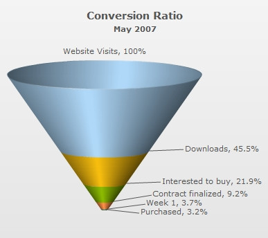
 Chart Image