In the previous example, we had shown how to create a streamlined funnel chart, i.e., chart whose data equals 100% when totaled. However, FusionWidgets XT also allows you to create non-streamlined charts, where height of each funnel segment depicts its value with respect to the entire funnel height. There is no filtering of data involved in this case.
| Employee Name | Sales ($) |
| Buchanan | 20,000 |
| Callahan | 49,000 |
| Davolio | 63,000 |
| Dodsworth | 41,000 |
| Fuller | 74,000 |
| King | 49,000 |
| Leverling | 77,000 |
| Peacock | 54,000 |
| Suyama | 14,000 |
<chart caption="Sales distribution by Employee" subCaption="Jan 07 - Jul 07" numberPrefix="$" isSliced="1" streamlinedData="0" isHollow="0">
  <set label="Buchanan" value="20000"/>
  <set label="Callahan" value="49000"/>
  <set label="Davolio" value="63000"/>
  <set label="Dodsworth" value="41000"/>
  <set label="Fuller" value="74000"/>
  <set label="King" value="49000"/>
  <set label="Leverling" value="77000"/>
  <set label="Peacock" value="54000"/>
  <set label="Suyama" value="14000"/>
</chart>
{
  "chart": {
    "caption": "Sales distribution by Employee",
    "subcaption": "Jan 07 - Jul 07",
    "numberprefix": "$",
    "issliced": "1",
    "streamlineddata": "0",
    "ishollow": "0"
  },
  "data": [
    {
      "label": "Buchanan",
      "value": "20000"
    },
    {
      "label": "Callahan",
      "value": "49000"
    },
    {
      "label": "Davolio",
      "value": "63000"
    },
    {
      "label": "Dodsworth",
      "value": "41000"
    },
    {
      "label": "Fuller",
      "value": "74000"
    },
    {
      "label": "King",
      "value": "49000"
    },
    {
      "label": "Leverling",
      "value": "77000"
    },
    {
      "label": "Peacock",
      "value": "54000"
    },
    {
      "label": "Suyama",
      "value": "14000"
    }
  ]
}
Here, we've:
- Defined the <chart> element with caption, sub-caption and number prefix.
- Set streamlinedData='0' attribute to <chart> element to convey the chart that we're not plotting streamlined data
- Configured the funnel slices to show up as filled by setting isHollow='0' and also set each slice to show separated from each other by setting isSliced='1'
- Provided data for each employee within each <set> element
- Applied Styles to increase caption font size
When you see this chart, you'll get a result as under:
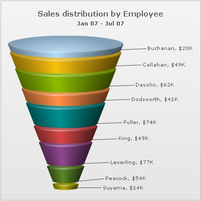
As you can see above, the chart has now rendered each funnel slice with a common slant angle. The height of each funnel slice represents its value.
Also, in this chart, since we've set isSliced='1' at chart level, all the funnel items remains sliced out when the chart renders. So, the funnel slices will not slice in or slice out on mouse click.