FusionWidgets XT bullet graphs allow you to configure a lot of functional and cosmetic properties. Here, we'll see how to:
- Use pre-defined & custom palettes
- Customize plot & target properties
- Customize color range properties
- Customize tick marks
- Plotting as point instead of filled bar
- Showing/hiding chart value
Let's see each of them one by one.
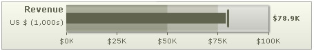
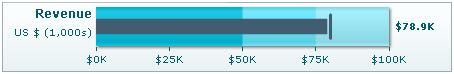
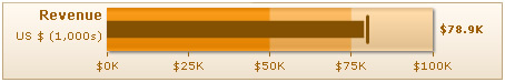
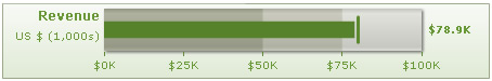
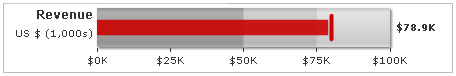
The bullet graphs offer 5 pre-defined color palettes for you to choose from. Each of these palettes is accessible by the numbers 1-5 respectively. To choose a palette, all you need to do is set:
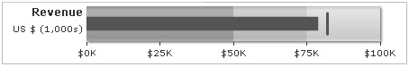
Shown below are a few examples of palettes applied on our previous graph:
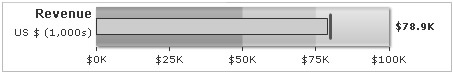
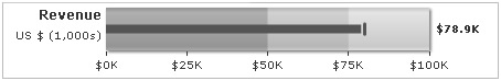
Additionally, you can also define an entire new palette by setting a single theme color using:
This will create a new palette derived from this color and then color the chart as under:
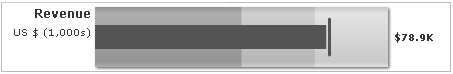
You can customize the plot & target color properties using:
This will result in:
You can also add a border to the plot bar using:
This will result in:
You can configure the thickness (height in horizontal bullet graph; width in vertical bullet graph) of the value bar and target line using:
Here, we've made both the plot bar and target line thinner, as shown below:
You can specify the color range's gradient mix and ratio in FusionWidgets XT gradient formula as under:
This will result in:
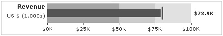
To get 2D look (without any gradient), you can set:
This will result in:
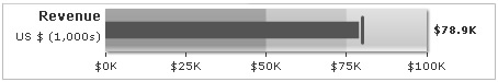
You can remove the chart's shadow using:
This will result in:
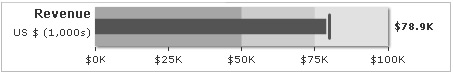
You can also opt to show color range border using:
<chart ... showColorRangeBorder="1" colorRangeBorderColor="666666" colorRangeBorderThickness="1" colorRangeBorderAlpha="100" colorRangeFillMix="" showShadow="0" .../>
{
  "chart": {
   ...
    "showcolorrangeborder": "1",
    "colorrangebordercolor": "666666",
    "colorrangeborderthickness": "1",
    "colorrangeborderalpha": "100",
    "colorRangeFillMix": "",
    "showshadow": "0"
    ...
},
This will result in:

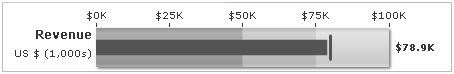
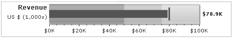
In a horizontal bullet graph, you can opt to show tick marks below the graph or above the graph. In a vertical, you can choose whether to show it at left or right. In horizontal, to move the tick marks up, you'll need to set:
This will result in:
You can hide tick marks and values using:
This will result in:
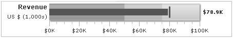
You can control the number of tick marks using:
This will result in:
You can customize tick mark properties using:
<chart ... majorTMColor='AAAAAA' majorTMAlpha='100' majorTMHeight='10' majorTMThickness='1' minorTMColor='BBBBBB' minorTMAlpha='100' minorTMHeight='6' minorTMThickness='1' ...>
{
  "chart": {
   ...
    "majorTMcolor": "AAAAAA",
    "majorTMalpha": "100",
    "majorTMheight": "10",
    "majorTMthickness": "1",
    "minorTMcolor": "BBBBBB",
    "minorTMalpha": "100"
    "minorTMheight": "6"
    "minorTMhickness": "1"
    ...
},
This will result in:
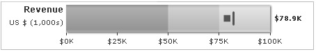
You can opt to show the plot as point, instead of bar, using:
This will result in:
You can hide chart value by setting:
Here, we've also increased the chart's right margin, so that the axis values do not go out of chart. You'll get a chart as under: