Here, we'll see how to configure various aspects of the dials. Specifically, we'll see how to:
- Configure background and border color of the dial
- Configure radius of the dial
- Configure base width, top width & rear extension to render realistic dials
- Adding custom tool text for dial
- Adding multiple dials on the chart
Let's see each of them one by one.
You can opt to have the dial fill in single color or as a gradient. To fill the dial using a single color, you can use:
Here we've specified the dial background color as 666666 and hidden the border using borderAlpha='0'. This will result in:
You can also fill the dial with a gradient by specifying the list of colors separated by comma. Each color will then form an equal part of gradient. Example:
This will result in:
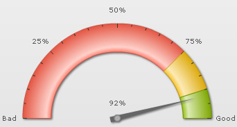
You can configure to show/hide the dial border using:
Here, we've set border alpha to 0 to hide it.
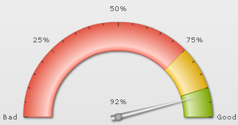
Additionally, you can configure border properties as under:
This will result in:
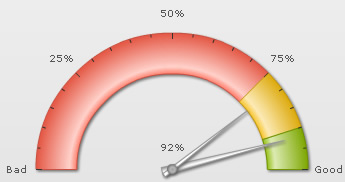
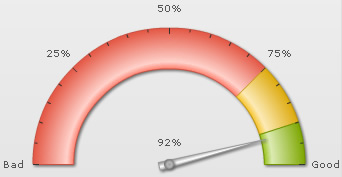
You can make the length of dial longer/shorter by specifying its exact radius in pixels as under:
This will result in:
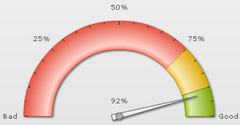
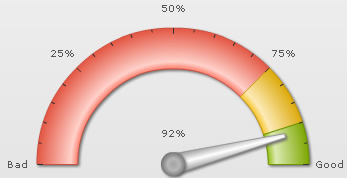
You can configure the base and top width of dials using:
This will result in the image below (we've also increased pivot radius here). As you can see, the thickness of both the base and top part of dial has increased.
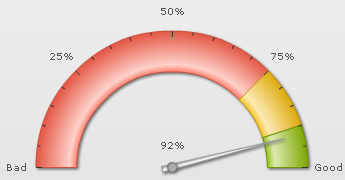
You can opt for the dial to have a rear extension (i.e., extension on the opposite side) using:
This will result in:
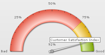
You can add custom tool text for each dial using:
This will result in:
You can add any number of dials to each chart, with each dial having its own value and individual properties as under:
<dials>
  <dial value="92" rearExtension="10" baseWidth="8" toolText="Current year"/>
  <dial value="79" bgcolor="FFFFFF" borderColor="999999" baseWidth="4" toolText="Previous year" rearExtension="10" showValue="0" radius="95"/>
</dials>
"dials": {
    "dial": [
      {
        "value": "92",
        "rearextension": "10",
        "basewidth": "8",
        "tooltext": "Current year"
      },
      {
        "value": "79",
        "bgcolor": "FFFFFF",
        "bordercolor": "999999",
        "basewidth": "4",
        "tooltext": "Previous year",
        "rearextension": "10",
        "showvalue": "0",
        "radius": "95"
      }
    ]
  }