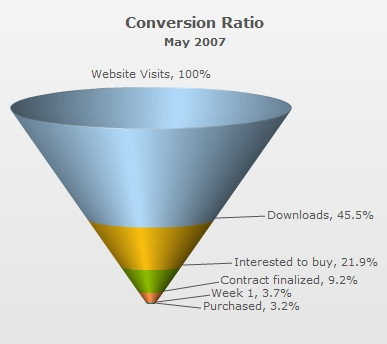
Since funnel charts are mostly used to show streamlined data, here, we'll create a simple funnel chart to show the "Sales Conversion Ratio" of a product website for a particular month. The chart will display the various processes involved in sales and how many targeted customers were filtered out in each process.
The chart will look as under:
| Process | Number of People |
| Website Visits | 3,85,634 |
| Downloads | 1,75,631 |
| Interested to buy | 84,564 |
| Contract finalized | 35,654 |
| Purchased | 12,342 |
<chart caption="Conversion Ratio" subcaption="May 2007" showPercentValues="1" decimals="1" baseFontSize="11">
  <set label="Website Visits" value="385634"/>
  <set label="Downloads" value="175631"/>
  <set label="Interested to buy" value="84564"/>
  <set label="Contract finalized" value="35654"/>
  <set label="Purchased" value="12342"/>
</chart>
{
  "chart": {
    "caption": "Conversion Ratio",
    "subcaption": "May 2007",
    "showpercentvalues": "1",
    "decimals": "1",
    "basefontsize": "11",
    "issliced": "1"
  },
  "data": [
    {
      "label": "Website Visits",
      "value": "385634"
    },
    {
      "label": "Downloads",
      "value": "175631"
    },
    {
      "label": "Interested to buy",
      "value": "84564"
    },
    {
      "label": "Contract finalized",
      "value": "35654"
    },
    {
      "label": "Purchased",
      "value": "12342"
    }
  ]
}
Here, we've:
- Defined the <chart> element and a few of its properties like caption, sub-caption using the caption and subCaption attributes.
- Displayed percent values using the showPercentValues attribute
- Set the decimals attribute is set to 1
- Set Base font size is set to 11 using the baseFontSize attribute
- Added the <set> elements for each data row that we had in the table
- Provided value and label for each data row using the value and label attributes in each <set> element
- Created Styles to increase caption font size
For detailed explanation on JSON data format click here.
When you now view the chart (after embedding it in HTML code) with above XML, you'll see it as under:
FusionWidgets XT has created the funnel segments based on the data you provided. Also, it has converted the numbers into percentage setting the following:
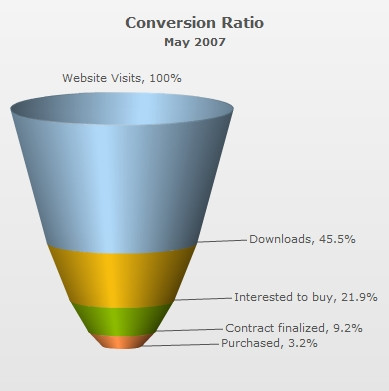
In the above example, each funnel slice has its width according to its data (top and bottom openings proportional to data in and out respectively, to get a visual cue of the funneling rate as compared to other funnels depicting funneling/screening rate of allied processes). However, if you do not want the width of each funnel to depend on its data, you can set:
This will result in: