The linear gauge chart from FusionWidgets suite offers a lot of configuration options. Here we'll learn:
- Using palettes
- Configuring pointer properties
- Adding tool text and link to pointer
- Adding multiple pointers
- Pointer value configurations
- Configuring Pointer position
- Configuring gauge gradient mix
- Configuring gauge borders
- Creating rounded gauge corners
- Hiding gauge labels
- Configuring gauge labels
Let's explain each one of them in detail.
The linear gauge offers 5 pre-defined color palettes for you to choose from. Each of these palettes are accessible by the number 1-5. To choose a palette, you need to set:
<chart palette='2' or '3' or ..>
Shown below are few examples of palettes applied on our previous chart:
Additionally, you can also define an entire new palette by setting a single theme color. To do this, set:
<chart paletteThemeColor='669933' ..>
This will create a new palette derived from this color and then color the chart as under:
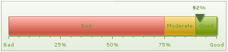
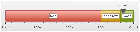
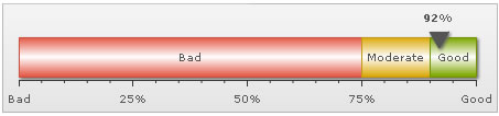
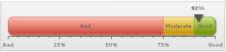
You can configure almost all properties of the gauge's pointer at both <chart> level and individual <pointer> level. While using multiple pointers on the chart, it's better to customize the chart at the <pointer> level.
To change the cosmetics of pointer, set:
<pointer value='92' borderColor='333333' borderThickness='3' borderAlpha='100' bgColor='FFFFFF'/>
This will result in:
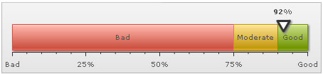
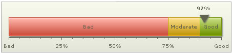
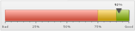
To configure the radius and shape of the chart, set:
<pointer value='92' radius='10' sides='4' />
This will result in:

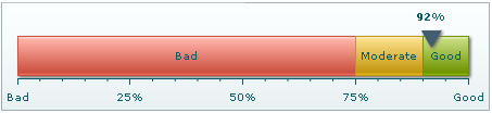
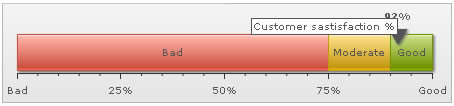
To add tool text and link to each pointer, set:
<pointer value='92' toolText='Customer sastisfaction %' link='http://www.fusioncharts.com' />
The link will need to be in FusionCharts link format. This will result in:
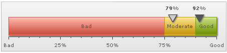
To add multiple pointers, you just need to add multiple <pointer> element within <pointers> element as shown below:
<pointers>
<pointer value='92' toolText='Current year' />
<pointer value='79' bgColor='CCCCCC' borderColor='333333' toolText='Last year' />
</pointers>
Here, we've added two pointers - one indicating current year's value and the another previous year's value. You can provide custom cosmetics for each pointer.
This will result in:
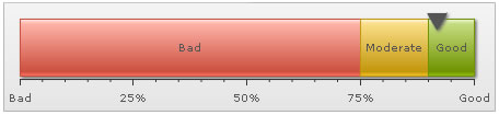
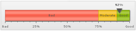
You can opt to show/hide the value for each pointer on gauge. For this, set:
<chart ... showValue='0' ...>
This will result in:
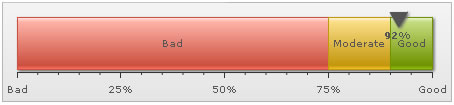
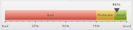
You can also opt to show the value above/below pointer. For this, set:
<chart ... valueAbovePointer='0' ...>
This will result in:
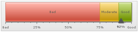
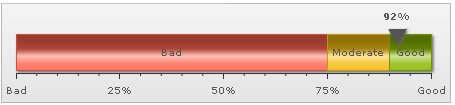
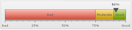
You can configure the position of the pointer. To show it on top of scale or bottom, set:
<chart ... pointerOnTop='0' ...>
This results in:
FusionWidgets linear gauge allows to configure the gradient fill mix of the gauge by specifying gradient fill formula as shown below:
<chart ... gaugeFillMix='{light-10},{light-20},{light-60},{dark-30},{dark-40}, {dark-40}' gaugeFillRatio='' ..>
Here, we've specified the fill mix as gradient formula (explained in section Advanced charting) and set gaugeFillRatio as empty (so as to instruct chart to automatically distribute the gradient color constituents). The color sequence starts applying from the bottom part to top part i.e., first color specified would apply to the bottom side and then move out towards top side.
The gauge looks similar to the one shown below:
Another example:
<chart ... gaugeFillMix='{dark-10},FFFFFF,{dark-10}' gaugeFillRatio='3' ..>
It results in:
More example:
<chart ... gaugeFillMix='{light-10},{light-30},{light-20},{dark-5},{color},{light-30},{light-20},{dark-10}' gaugeFillRatio='' ..>
Resulting in:
You can configure the show/hide option of the gauge border. Additionally, you can configure to show the entire border in single color or a color derived from the color range fill color.
To hide the gauge border, set:
<chart ... showGaugeBorder='0' ...>
This will result in (we've removed the shadow from this gauge to make the hidden border's effect more pronounced):
To set a single color as the border for entire gauge, set:
<chart ... showGaugeBorder='1' gaugeBorderColor='666666' gaugeBorderThickness='1' gaugeBorderAlpha='100' ...>
This will result in:
You can also notify the chart to color each color scale's border in a derivative of its fill color. For this, set:
<chart ... gaugeBorderColor='{dark-30}' ...>
Here, we've used one token of the gradient fill mix to color each color range using 30% darker color than its fill color. It will result in:

As you can see above, each color range now bears a border color, which is 30% darker than its fill color.
Or, if you want a 60% lighter fill shade, set:
<chart ... gaugeBorderColor='{light-60}' ...>
You can also set the border property for each color range invidually. For this, set:
<color minValue='0' maxValue='75' code='FF654F' borderColor='FF0000' borderAlpha='100'/>
This will result in:

To create gauges with rounded corners, set:
<chart ... gaugeRoundRadius='10' ..>
This will result in:
You can opt not to show gauge labels. You can do this in two ways:
- Do not provide the label attribute for each <color> element.
- Or, set <chart showGaugeLabels='0' ..>
This will result in:
<definition>
<style type='font' name='labelFont' bgColor='FFFFFF' borderColor='999999' />
</definition>
<application>
<apply toObject='GAUGELABELS' styles='labelFont,myShadow' />
</application>
</styles>
This will result in: