Here, we'll create a simple bullet graph to show the revenue figures for a fictional company.
The graph will look as under:
The various tasks involved in building this graph are:
- Set chart lower and upper limit.
- Divide the specified limits into qualitative ranges of performance, such as poor, satisfactory and good.
- Decide the value to represent.
- Decide the target figure to represent
- Choose chart cosmetics.
Let's see how to do each of these.
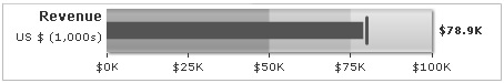
First, we decide the qualitative ranges of revenue performance for that company. Let's assume it to something as under:
| Range | What it means? | Color |
| $0-$50,000 | Poor | Dark gray |
| $50,000-$75,000 | Moderate | Normal gray |
| $75,000-$100,000 | Good | Light gray |
Also, we intend to plot the following values:
Intended revenue: $80,000
Revenue achieved: $78,900
The XML/JSON for the above data will look as under:
<chart lowerLimit="0" upperLimit="100" caption="Revenue" subcaption="US $ (1,000s)" numberPrefix="$" numberSuffix="K" showValue="1">
  <colorRange>
    <color minValue="0" maxValue="50" code="A6A6A6"/>
    <color minValue="50" maxValue="75" code="CCCCCC"/>
    <color minValue="75" maxValue="100" code="E1E1E1"/>
  </colorRange>
  <value>78.9</value>
  <target>80</target>
</chart>
{
  "chart": {
    "lowerlimit": "0",
    "upperlimit": "100",
    "caption": "Revenue",
    "subcaption": "US $ (1,000s)",
    "numberprefix": "$",
    "numbersuffix": "K",
    "showvalue": "1"
  },
  "colorrange": {
    "color": [
      {
        "minvalue": "0",
        "maxvalue": "50",
        "code": "A6A6A6"
      },
      {
        "minvalue": "50",
        "maxvalue": "75",
        "code": "CCCCCC"
      },
      {
        "minvalue": "75",
        "maxvalue": "100",
        "code": "E1E1E1"
      }
    ]
  },
  "value": "78.9",
  "target": "80"
}
- Created the <chart> element, which is the root element of each chart.
- Specified chart limits, caption, sub-caption, number prefix & number suffix. You can specify a lot more properties for the <chart> element, which have been discussed in next sections.
- Defined the color range (numerical value for qualitative ranges) for the chart under the <colorRange> element. Each range value has its own exclusive minValue and maxValue attributes and also a color code.
- Defined the value for chart inside the <value> element.
- Defined the intended target for chart inside the <target> element.
For detailed explanation on JSON data format click here.
When you now run this data against the horizontal bullet graph, you'll get something as under:
See it live!