Number scaling lets you define your own scales for numbers and then apply it to all numbers on the chart.
Let's start with the most basic example which is already defined in FusionWidgets XT - thousands and millions scale.
If your numbers on the chart are greater than 1000, FusionWidgets XT gives you the option to scale them to K (Thousands) or M (Millions). For example, if you plot an angular gauge with dial values as 3400 and 17400 and use number scaling by setting <chart ... formatNumberScale='1' ...>, you'll see the following chart:

FusionWidgets XT, by default, has 1000,1000 (K,M) scaling defined for all charts. It doesn't have the scaling for billions defined. Let's modify the number scaling to add billion so that the final scale looks like 1000,1000,1000 (K,M,B).
This scale, in human terms, will look something as under:
1000 = 1 K
1000 K = 1 M
1000 M = 1 B
Now, to convert this scale into FusionWidgets XT XML format, you'll have to do the following:
- Define your own scale for the chart as under:
<chart numberScaleValue='1000,1000,1000' numberScaleUnit='K,M,B' >
If you carefully see this and match it with previous table, you'll find that whatever numeric figure was present on the left hand side of the table is put in numberScaleValue and whatever unit was present on the right side of the scale table has been put under numberScaleUnit - all separated by commas. - Set the chart formatting flag to on as under:
<chart formatNumberScale='1' ..>
When you now view a chart containing data in billions, you'll see as under. Note that the chart now contains figure both in millions and billions.
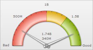
<chart lowerLimit='0' upperLimit='2000000000' lowerLimitDisplay='Bad' upperLimitDisplay='Good' numberScaleValue='1000,1000,1000' numberScaleUnit='K,M,B' formatNumberScale='1'>
    <colorRange>
        <color minValue='0' maxValue='1000000000' code='FF654F'/>
        <color minValue='1000000000' maxValue='1400000000' code='F6BD0F'/>
        <color minValue='1400000000' maxValue='2000000000' code='8BBA00'/>
    </colorRange>
    <dials>
        <dial value='340000000' rearExtension='10'/>
        <dial value='1740000000' rearExtension='10'/>
    </dials>
</chart>
{
  "chart": {
    "lowerlimit": "0",
    "upperlimit": "2000000000",
    "lowerlimitdisplay": "Bad",
    "upperlimitdisplay": "Good",
    "numberscalevalue": "1000,1000,1000",
    "numberscaleunit": "K,M,B",
    "formatnumberscale": "1"
  },
  "colorrange": {
    "color": [
      {
        "minvalue": "0",
        "maxvalue": "1000000000",
        "code": "FF654F"
      },
      {
        "minvalue": "1000000000",
        "maxvalue": "1400000000",
        "code": "F6BD0F"
      },
      {
        "minvalue": "1400000000",
        "maxvalue": "2000000000",
        "code": "8BBA00"
      }
    ]
  },
  "dials": {
    "dial": [
      {
        "value": "340000000",
        "rearextension": "10"
      },
      {
        "value": "1740000000",
        "rearextension": "10"
      }
    ]
  }
}Let's consider another example where we intend to plot time related figures on the chart. Say we're plotting a chart which indicates the time taken by a machine to do a particular task. The task can take any time ranging from a few seconds to few days. And we've the data for the task in seconds itself. Now, if we were to show all the data on the chart in seconds only, it won't appear too legible. What we can do is build a scale indicating time and then specify it to the chart. This scale, in human terms, will look something as under:
60 seconds = 1 minute
60 minute = 1 hr
24 hrs = 1 day
7 days = 1 week
Now, to convert this scale into FusionWidgets XT XML format, you'll have to do it as under:
- First you need to define the unit of the data which you're providing. Like, in this example, you're providing all data in seconds. So, the default number scale will be represented in seconds. We can represent it as under:
<chart defaultNumberScale='s' ...> - Next, we define our own scale for the chart as under:
<chart numberScaleValue='60,60,24,7' numberScaleUnit='min,hr,day,wk' >
Again, if you carefully see this and match it with our range, you'll find that whatever numeric figures are present on the left side of the range have been put in numberScaleValue and whatever units are present on the right side of the scale have been put under numberScaleUnit - all separated by commas. - Set the chart formatting flags to on as under:
<chart formatNumberScale='1' ..>
The entire XML/JSON looks as under:
<chart lowerLimit='0' upperLimit='100000' numberScaleValue='60,60,24,7' numberScaleUnit='min,hr,day,wk' formatNumberScale='1'>
   <colorRange>
      <color minValue='0' maxValue='100000' code='F6BD0F'/>
   </colorRange>
   <dials>
      <dial value='340' rearExtension='10'/>
      <dial value='17400' rearExtension='10'/>
   </dials>
</chart>
{
"chart": {
"lowerlimit": "0",
"upperlimit": "100000",
"numberscalevalue": "60,60,24,7",
"numberscaleunit": "min,hr,day,wk",
"formatnumberscale": "1"
},
"colorrange": {
"color": [
{
"minvalue": "0",
"maxvalue": "100000",
"code": "F6BD0F"
}
]
},
"dials": {
"dial": [
{
"value": "340",
"rearextension": "10"
},
{
"value": "17400",
"rearextension": "10"
}
]
}
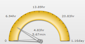
}When you now view the chart, you'll see that all the data has been automatically scaled to the best value. Like:
100000s - the upper limit was converted to 1.16 days
340s - the 1st dial's value was converted to 5.67 min
17400s - the 2nd dial's value was converted to 4.83 hours
and so on...
Take another example, where you're plotting a chart indicating memory usage of a network server. The usage can be from few bits to a few gigabytes. Again, you've all your data in bits - so we can render the range as under:
8 bits = 1 Byte
1024 bytes = 1 KB
1024 KB = 1 MB
1024 MB = 1 GB
1024 GB = 1 TB
And the XML can be written as under:
<chart defaultNumberScale='bits' numberScaleValue='8,1024,1024,1024,1024' numberScaleUnit='bytes,KB,MB,GB,TB' formatNumberScale='1'>
Let's consider another length/distance example. The standard length/distance range can be rendered as under (with inches being the default unit):
12 inches = 1 feet
3 feet = 1 yard
1760 yards = 1 mile
So, we can write the XML as under:
<chart defaultNumberScale='inches' numberScaleValue='12,3,1760' numberScaleUnit='feet,yards,miles' >