<chart caption='Radar Chart' anchorAlpha='0'>
   <categories>
      <category label='Index 1' />
      <category label='Index 2' />
      <category label='Index 3' />
      <category label='Index 4' />
      <category label='Index 5' />
      <category label='Index 6' />
      <category label='Index 7' />
      <category label='Index 8' />
      <category label='Index 9' />
      <category label='Index 10' />
      <category label='Index 11' />
   </categories>
   <dataset seriesName='Series 1'>
      <set value='9' />
      <set value='9' />
      <set value='9' />
      <set value='7' />
      <set value='8' />
      <set value='8' />
      <set value='9' />
      <set value='9' />
      <set value='9' />
      <set value='7' />
      <set value='8' />
   </dataset>
   <dataset seriesName='Series 2'>
      <set value='5' />
      <set value='3' />
      <set value='2' />
      <set value='4' />
      <set value='5' />
      <set value='9' />
      <set value='5' />
      <set value='3' />
      <set value='2' />
      <set value='4' />
      <set value='5' />
   </dataset>
</chart>
{
  "chart":{
    "caption":"Radar Chart",
    "anchoralpha":"0"
  },
  "categories":[{
      "category":[{
          "label":"Index 1"
        },
        {
          "label":"Index 2"
        },
        {
          "label":"Index 3"
        },
        {
          "label":"Index 4"
        },
        {
          "label":"Index 5"
        },
        {
          "label":"Index 6"
        },
        {
          "label":"Index 7"
        },
        {
          "label":"Index 8"
        },
        {
          "label":"Index 9"
        },
        {
          "label":"Index 10"
        },
        {
          "label":"Index 11"
        }
      ]
    }
  ],
  "dataset":[{
      "seriesname":"Series 1",
      "data":[{
          "value":"9"
        },
        {
          "value":"9"
        },
        {
          "value":"9"
        },
        {
          "value":"7"
        },
        {
          "value":"8"
        },
        {
          "value":"8"
        },
        {
          "value":"9"
        },
        {
          "value":"9"
        },
        {
          "value":"9"
        },
        {
          "value":"7"
        },
        {
          "value":"8"
        }
      ]
    },
    {
      "seriesname":"Series 2",
      "data":[{
          "value":"5"
        },
        {
          "value":"3"
        },
        {
          "value":"2"
        },
        {
          "value":"4"
        },
        {
          "value":"5"
        },
        {
          "value":"9"
        },
        {
          "value":"5"
        },
        {
          "value":"3"
        },
        {
          "value":"2"
        },
        {
          "value":"4"
        },
        {
          "value":"5"
        }
      ]
    }
  ]
}
 Chart Image
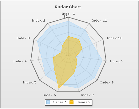