{
  "chart":{
    "palette":"2",
    "xaxisminvalue":"0",
    "xaxismaxvalue":"100",
    "yaxisminvalue":"0",
    "yaxismaxvalue":"100",
    "showformbtn":"1",
    "viewmode":"0",
	"is3D" : "1"
  },
  "dataset":[{
      "data":[{
          "x":"12",
          "y":"79",
          "width":"70",
          "height":"56",
          "name":"Node 1 with a long label",
          "color":"FE3233",
          "id":"1"
        },
        {
          "x":"59",
          "y":"15",
          "width":"40",
          "height":"56",
          "name":"Node 2",
          "color":"FE9191",
          "id":"2",
          "link":"n-http://www.fusioncharts.com"
        },
        {
          "x":"88",
          "y":"75",
          "radius":"37",
          "shape":"circle",
          "name":"Node 3",
          "color":"62D0FE",
          "id":"3",
          "link":"n-http://www.fusioncharts.com"
        },
        {
          "x":"33",
          "y":"35",
          "radius":"37",
          "shape":"circle",
          "name":"Node 4",
          "color":"FE8181",
          "id":"4",
          "link":"n-http://www.fusioncharts.com"
        },
        {
          "x":"40",
          "y":"85",
          "width":"45",
          "height":"67",
          "name":"Node 5",
          "color":"FE7272",
          "bordercolor":"ff5904",
          "id":"5"
        },
        {
          "x":"69",
          "y":"85",
          "width":"45",
          "height":"67",
          "name":"Node 6",
          "color":"72D4FE",
          "id":"6",
          "link":"n-http://www.fusioncharts.com"
        },
        {
          "x":"87",
          "y":"45",
          "radius":"47",
          "shape":"polygon",
          "numsides":"3",
          "name":"Node 7",
          "color":"FE5151",
          "id":"7",
          "link":"n-http://www.fusioncharts.com"
        },
        {
          "x":"65",
          "y":"60",
          "radius":"47",
          "shape":"polygon",
          "numsides":"5",
          "name":"Node 8",
          "color":"FE9191",
          "id":"8",
          "link":"n-http://www.fusioncharts.com"
        },
        {
          "x":"12",
          "y":"20",
          "radius":"37",
          "shape":"circle",
          "name":"Node 9",
          "color":"33C1FE",
          "id":"9",
          "link":"n-http://www.fusioncharts.com"
        },
        {
          "x":"80",
          "y":"12",
          "radius":"47",
          "shape":"polygon",
          "numsides":"4",
          "name":"Node 10",
          "color":"33C1FE",
          "id":"10",
          "link":"n-http://www.fusioncharts.com"
        }
      ]
    }
  ],
  "connectors":[{
      "color":"FF0000",
      "stdthickness":"5",
      "connector":[{
          "strength":"0.96",
          "label":"link label",
          "from":"1",
          "to":"9",
          "color":"BBBB00",
          "arrowatstart":"1",
          "arrowatend":"1"
        },
        {
          "strength":"0.8",
          "label":"link12",
          "from":"1",
          "to":"5",
          "color":"BBBB00",
          "arrowatstart":"1",
          "arrowatend":"1"
        },
        {
          "strength":"0.8",
          "label":"link2",
          "from":"1",
          "to":"8",
          "color":"BBBB00"
        },
        {
          "strength":"0.3",
          "label":"link3",
          "from":"1",
          "to":"4",
          "color":"BBBB00",
          "arrowatstart":"1",
          "arrowatend":"1"
        },
        {
          "strength":"0.4",
          "label":"link4",
          "from":"2",
          "to":"4",
          "color":"BBBB00",
          "arrowatstart":"1",
          "arrowatend":"1"
        },
        {
          "strength":"0.6",
          "label":"link5",
          "from":"4",
          "to":"2",
          "color":"BBBB00",
          "arrowatstart":"1",
          "arrowatend":"1"
        },
        {
          "strength":"0.33",
          "label":"link1",
          "from":"2",
          "to":"8",
          "color":"BBBB00"
        },
        {
          "strength":"0.66",
          "label":"link7",
          "from":"8",
          "to":"3",
          "color":"BBBB00",
          "arrowatstart":"1",
          "arrowatend":"1"
        },
        {
          "strength":"0.7",
          "label":"link6",
          "from":"4",
          "to":"5",
          "color":"BBBB00",
          "arrowatstart":"1",
          "arrowatend":"1"
        },
        {
          "strength":"0.6",
          "from":"4",
          "to":"8",
          "color":"FF5904",
          "arrowatstart":"1",
          "arrowatend":"1"
        },
        {
          "strength":"0.6",
          "label":"link9",
          "from":"5",
          "to":"8",
          "color":"BBBB00"
        },
        {
          "strength":"0.5",
          "label":"link10",
          "from":"7",
          "to":"8",
          "color":"BBBB00",
          "arrowatstart":"1",
          "arrowatend":"1"
        },
        {
          "strength":"0.3",
          "label":"link11",
          "from":"7",
          "to":"10",
          "color":"BBBB00"
        }
      ]
    }
  ],
  "labels":{
    "label":[{
        "text":"A Note added as Text Label",
        "x":"18",
        "y":"5"
      }
    ]
  }
}
 Chart Image
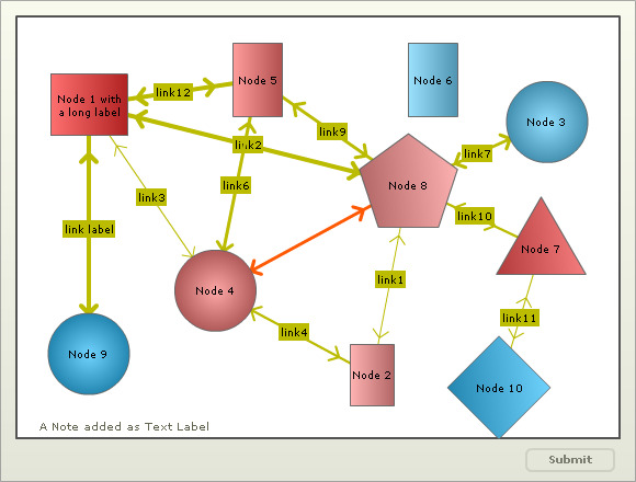