In our previous population example, when we were providing data for each entity of the world map, we were not distinguishing each entity based on colors. Effectively, this didn't enhance the visual interpretation of data. But, FusionMaps XT allows you to use color ranges to distinguish various entities based on their data.
Using color range, you can classify your data into sections, with each section having a different name and color to differentiate from each other. These sections are called color ranges. For each color range, you'll have to specify the minimum and maximum values, and the hex color code for the range.
Let's say we wanted to divide the World Continent Population into three groups as under:
| Population | Name |
| 0-500 Million | Sparsely Populated |
| 500-1000 Million | Well Populated |
| Over 1000 Million | Densely Populated |
From our above table, we can clearly define three color ranges as under:
| Numeric Range | Label | Color Hex code |
| value is greater than equal to 0 and less then 500. | Sparsely Populated | A7E9BC (Green) |
| value is greater than equal to 500 and less than 1000. | Well Populated | FFFFCC (Yellow) |
| value is greater than equal to 1000 and less than equal to 5000. | Densely Populated | FF9377 (Red) |
Now, for each color range, we can select the following properties:
- MinValue – Lower limit (data value) from where this color range starts. For example, 0 is minValue for first color range and 500 is minValue for second.
- MaxValue – Upper limit (data value) from where this color range ends. For example, 500 is maxValue for first color range and 1000 for second one.
- displayValue – Color range name which will be added to the map legend to aid interpretation of data. In our above example, "Sparsely Populated", "Well Populated" and "Densely Populated" are the names of the three color ranges. This attribute is optional – if you do not specify the displayValue for a specific color range, it'll show the range value instead (e.g., 500-1000).
- Code – Each color range is denoted by a unique color. All the entities on the map whose data value fall within the given color range assume the same color as that of the applicable color range. You need to provide hex color codes without #.
- Alpha – You can also set the alpha (transparency) for color range to highlight data.
Each color range should have its own unique range value, displayValue and code.
Starting FusionMaps XT, use of color as the unique hex color code in <color> element is deprecated . Use code instead. However, if you use color it will work fine as earlier. It is recommended that you use code.
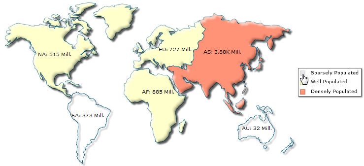
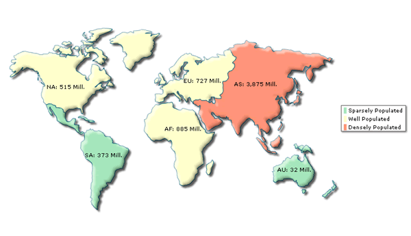
Let's now implement the color range concept in our World Population Map. We'll follow the above defined range and color "Sparsely Populated" continents in green, "Well Populated" continents in yellow and "Densely Populated" continents in red.
To do so, create a new XML file named as ColorRange.xml, with the following XML data:
<map borderColor='005879' fillColor='D7F4FF' numberSuffix='Mill.' includeValueInLabels='1' labelSepChar=': ' baseFontSize='9'>
           <colorRange>
                <color minValue='0' maxValue='500' displayValue='Sparsely Populated' code='A7E9BC' />
                <color minValue='500' maxValue='1000' displayValue='Well Populated' code='FFFFCC' />
                <color minValue='1000' maxValue='5000' displayValue='Densely Populated' code='FF9377' />
           </colorRange>
           <data>
              <entity id='NA' value='515' />
              <entity id='SA' value='373' />
              <entity id='AS' value='3875' />
              <entity id='EU' value='727' />
              <entity id='AF' value='885' />
              <entity id='AU' value='32' />
           </data>
</map>
The only difference in this data (from the previous one) is the introduction of new <colorRange> and <color> elements. The <colorRange> element encapsulates the definition of all color range. And, individual color ranges are defined using the <color> element which can assume the following attributes:
- minValue – Lower limit of range
- maxValue – Upper limit of range
- displayValue – Text representation of range (to be shown in legend)
- code– Hex color code (without #) for the range
- alpha – Transparency (0-100) for the entities belonging to that range
Here, we've defined our 3 color ranges in the XML. When you now view the map, you'll see the following results:
Note: If any entity's data doesn't fall into any of the defined color range, it takes the color defined in fillColor attribute of <map> element (or it's default value if this attribute is also not defined).
Starting FusionMaps XT, Legend is also interactive. You can click on a legend item to hide or show all the cells mapped with the color range represented by the legend item. For example, you may want to hide the numeric range 0-500. Click on the icon labeled as "Sparsely Populated ". The map will show blank dataplots only with the border for the numbers residing in that range. Any data value not present in that range will be visible. A sample map is shown below: