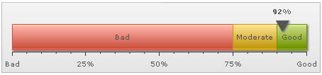
In this first chart, we would be plotting the value of Customer Satisfaction Survey, on a scale of 0 to 100%. The final result would look similar to the one shown below.
The following tasks are involved in building this chart:
- Defining the minimum and maximum value which would be plotted on the gauge scale. They are termed as the lower and upper limits of the gauge scale. In this case setting them to 0 and 100 respectively would suit our purpose just fine - as we're plotting the chart indicating a %, which cannot go below 0 or beyond 100. The limits are displayed at the starting and ending points of the circular scale as in the image above.
- Dividing the gauge scale into 3 regions: the ones shown in red, yellow and green that convey the Customer Satisfaction Index to be in the bad, satisfactory and good regions respectively.
- Pointing the pointer of the linear chart to a certain value, 92 in the above image.
- Embedding the chart in your MXML application.
With the tasks defined, now lets get to the XML side of things.
Creating the XML
Since we're plotting customer satisfaction index for a fictional company, let us first define the scales for measuring this index. The scales in a tabular form would look similar to the one shown below.
| Range | What it means? |
Color to be represented in |
| 0-75% | Bad customer satisfaction |
Red |
| 75-90% | Moderate customer satisfaction |
Yellow |
| 90-100% | Good customer satisfaction |
Green |
<chart lowerLimit='0' upperLimit='100' lowerLimitDisplay='Bad' upperLimitDisplay='Good' palette='1' numberSuffix='%' chartRightMargin='20'>
<colorRange>
<color minValue='0' maxValue='75' code='FF654F' label='Bad'/>
<color minValue='75' maxValue='90' code='F6BD0F' label='Moderate'/>
<color minValue='90' maxValue='100' code='8BBA00' label='Good'/>
</colorRange>
<pointers>
<pointer value='92' />
</pointers>
</chart>
First of all comes the <chart> element, which is the starting element for any chart that you create using FusionWidgets. Now we define the lower and upper limits of the gauge scale. To define the limits, we use the lowerLimit and upperLimit attributes of the <chart> element. We've notified the chart to show the lower limit text as Bad and the upper limit text as Good.
We also set the palette number and number suffix (the character which would show up at the end of end number).
There are other attributes of the <chart> element but we won't be exploring the attributes right now.
Next, we need to define the color range. As shown above, this chart has 3 color ranges. To define the color range, we use the <colorRange> element, which is an immediate child of the <chart> element. Under each <colorRange> element, we place a <color> element specifying a single color range as shown in the code below.
<color minValue='0' maxValue='75' code='FF654F' label='Bad'/>
<color minValue='75' maxValue='90' code='F6BD0F' label='Moderate'/>
<color minValue='90' maxValue='100' code='8BBA00' label='Good'/>
</colorRange>
Now that we've the color ranges in place, we need the pointer to point to the desired value (92% in our case). We create the pointer using the <pointers><pointer .../></pointers> elements, as shown below.
<pointer value='92' />
</pointers>
You can customize the pointer's visual properties using the attributes of <pointer> element, as explained in next sections.
FusionWidgets linear gauge chart allows to have multiple pointers on a single chart. To have multiple pointers, keep on adding <pointer...> element within the <pointers> tag with the required attributes.
Bingo!! you just made your first linear gauge. Next, we'll see how to customize the various facets of this chart.
Building the Chart
We will assume that you already have a project open and an MXML application, where you are ready to insert your chart. Begin by switching to the Design View in your MXML application. Here you'll find a custom component named FusionWidgets in the Components window. Next, follow the steps listed below.
- Drag the
FusionWidgetscustom component and drop it onto the stage. You will find that a control with FusionWidgets logo has been created on the stage.
- Next, switch to the
Flex Propertieswindow, select theCategory Viewoption and then choose the FusionCharts group.
- Select HLinearGauge as the value of FCChartType from the drop-down list.
- Select Data.xml as the value of FCDataURL from the drop-down list. FCDataURL property sets the path of the XML file.
The equivalent code in Source view should be:
<?xml version="1.0" encoding="utf-8"?>
<s:Application xmlns:fx="http://ns.adobe.com/mxml/2009"
			   xmlns:s="library://ns.adobe.com/flex/spark"
			   xmlns:mx="library://ns.adobe.com/flex/mx"
			   xmlns:components="com.fusionwidgets.components.*">
	...

	<components:FusionWidgets x="10" y="10" FCDataURL="Data.xml" FCChartType="HLinearGauge" width="400" height="100"/>

	...

</s:Application>
The file Data.xml is our previously created XML file. The file should be present in the same location as your MXML file. If not, you should specify the path of the file in the FCDataURL property. If you do not wish to create a separate XML data file, you can also bind the data as a string to the FCDataXML property.