|
Object Name
|
Description
|
Features Supported
|
Animation Parameters Supported
|
|
BACKGROUND
|
BACKGROUND refers to the entire background of the chart.
|
AnimationShadowGlowBevelBlur
|
_alpha_x_y_xScale_yScale
|
|
CAPTION
|
CAPTION refers to the heading of the chart.
|
AnimationFontShadowGlowBevelBlur
|
_alpha_x_y
|
|
DATALABELS
|
DATALABELS refer to the x-axis labels of the data.
|
FontShadowGlowBevelBlur
|
|
|
DATAPLOT
|
DATAPLOT refers to the actual plot of the chart. For example, in Column 2D chart, columns are referred to as DATAPLOT. In Pie chart, it's the pies. In Bubble chart, it's the bubbles and so on.
|
AnimationShadowGlowBevelBlur
|
_alpha_rotation
|
|
SUBCAPTION
|
SUBCAPTION refers to the sub-heading of the chart.
|
AnimationFontShadowGlowBevelBlur
|
_alpha_x_y
|
|
TOOLTIP
|
TOOLTIP refers to the tool tip shown when mouse is hovered over the data plots.
|
Font
|
|

|
|
animation
|
Boolean
|
0/1
|
This attribute lets you set the configuration whether the chart should appear in an animated fashion. If you do not want to animate any part of the chart, set this as 0.
|
|
palette
|
Number
|
1-5
|
FusionCharts introduces the concept of Color Palettes. Each chart has 5 pre-defined color palettes which you can choose from. Each palette renders the chart in a different color theme. Valid values are 1-5.
|
| paletteColors |
String |
List of hex color codes separated by comma |
While the palette attribute allows to select a palette theme that applies to chart background, canvas, font and tool-tips, it does not change the colors of data items (i.e., column, line, pie etc.). Using paletteColors attribute, you can specify your custom list of hex colors for the data items. The list of colors have to be separated by comma e.g., <chart paletteColors='FF0000,0372AB,FF5904...'>. The chart will cycle through the list of specified colors and then render the data plot accordingly.
To use the same set of colors throughout all your charts in a web application, you can store the list of palette colors in your application globally and then provide the same in each chart XML. |
| showAboutMenuItem |
Boolean |
0/1 |
Setting this to 1 shows up a custom context menu in the chart, which can be customized to show your text and can be linked to your URL. For e.g., you can set the context menu of the chart to include "About your company name" and then link to your company home page. By default, the chart shows "About FusionCharts" when right clicked. |
| aboutMenuItemLabel |
String |
|
The menu item label for the custom context menu item. |
| aboutMenuItemLink |
String |
URL |
Link for the custom context menu item. You can specify the link in FusionCharts link format to be able to open the same in new window, pop-ups, frames or as JavaScript links. |
|
showZeroPies
|
Boolean
|
0/1
|
Configuration whether to show pies with 0 values (and their values). Otherwise, they won't show up in the chart.
|
|
showPercentValues
|
Boolean
|
0/1
|
Whether to show percentage values in labels of the chart?
|
|
showPercentInToolTip
|
Boolean
|
0/1
|
Whether to show percentage values in tool tip?
|
|
showLabels
|
Boolean
|
0/1
|
Whether to show labels on the chart?
|
|
showValues
|
Boolean
|
0/1
|
Whether to show values on the chart?
|
|
labelSepChar
|
String
|
Character
|
The character to separate the data label and data values on the chart.
|
|
defaultAnimation
|
Boolean
|
0/1
|
By default, each chart animates some of its elements. If you wish to switch off the default animation patterns, you can set this attribute to 0. It can be particularly useful when you want to define your own animation patterns using STYLE feature.
|
|
clickURL
|
String
|
|
The entire chart can now act as a hotspot. Use this URL to define the hotspot link for the chart. The link can be specified in FusionCharts Link Format.
|
|
showBorder |
Boolean |
0/1 |
Whether to show a border around the chart or not? |
|
borderColor |
Color |
|
Border color of the chart. |
|
borderThickness |
Number |
In Pixels |
Border thickness of the chart. |
|
borderAlpha |
Number |
0-100 |
Border alpha of the chart. |
| logoURL |
String |
URL |
You can load an external logo (JPEG/PNG/SWF) on the chart once it has rendered. This attribute lets you specify the URL of the same. Owing to Flash Player security settings, you can only specify logo that are on the sub-domain as the SWF file of the chart. |
| logoPosition |
String |
TL, TR, BL, BR, CC |
Where to position the logo on the chart:
- TL - Top-left
- TR - Top-right
- BR - Bottom right
- BL - Bottom left
- CC - Center of screen
|
| logoAlpha |
Number |
0-100 |
Once the logo has loaded on the chart, you can configure its opacity using this attribute. |
| logoScale |
Number |
0-300 |
You can also change the scale of externally loaded logo at run-time by specifying a value for this parameter. |
| logoLink |
String |
URL |
If you want to link the logo to an external URL, specify the link in this attribute. The link can be in FusionCharts link format, allowing you to link to new windows, pop-ups, frames etc. |
|
bgColor |
Color |
|
This attribute sets the background color for the chart. You can set any hex color code as the value of this attribute. To specify a gradient as background color, separate the hex color codes of each color in the gradient using comma. Example: FF5904,FFFFFF. Remember to remove # and any spaces in between. See the gradient specification page for more details. |
|
bgAlpha |
Number |
0-100 |
Sets the alpha (transparency) for the background. If you've opted for gradient background, you need to set a list of alpha(s) separated by comma. See the gradient specification page for more details. |
|
bgRatio |
Number |
0-100 |
If you've opted for a gradient background, this attribute lets you set the ratio of each color constituent. See the gradient specification page for more details. |
|
bgAngle |
Number |
0-360 |
Angle of the background color, in case of a gradient. See the gradient specification page for more details. |
bgImage
or
bgSWF - deprecated |
String |
|
To place any Flash movie as background of the chart, enter the (path and) name of the background SWF. It should be in the same domain as the chart. |
bgImageAlpha
or
bgSWFAlpha - deprecated |
Number |
0-100 |
Helps you specify alpha for the loaded background SWF. |
| bgImageDisplayMode
Since v1.3 |
String |
stretch, tile, fit, fill, center, none |
Helps you specify the mode in which the background image is to be displayed.
- Stretch - expands the image to fit the entire chart area, without maintaining original image constraints
- Tile - the image is repeated as a pattern on the entire chart area
- Fit - fits the image proportionately on the chart area
- Fill -proportionately fills the entire chart area with the image
- Center - the image is positioned at the center of the chart area
- None - Default mode. None of the above modes are applied
|
| bgImageVAlign
Since v1.3 |
String |
top, middle, bottom |
Helps you to vertically align the background image. |
| bgImageHAlign
Since v1.3 |
String |
left, middle, right |
Helps you to horizontally align the background image. |
| bgImageScale
Since v1.3 |
Number |
0-300 |
Helps you magnify the background image.This attribute will only work when the attribute bgImageDisplayMode is set to none, center or tile. |
| logoURL |
String |
URL |
You can load an external logo (JPEG/PNG/SWF) on the chart once it has rendered. This attribute lets you specify the URL of the same. Owing to Flash Player security settings, you can only specify logo that are on the same sub-domain as that of the SWF file of the chart. |
| logoPosition |
String |
TL, TR, BL, BR, CC |
Where to position the logo on the chart:
- TL - Top-left
- TR - Top-right
- BR - Bottom right
- BL - Bottom left
- CC - Center of screen
|
| logoAlpha |
Number |
0-100 |
Once the logo has loaded on the chart, you can configure its opacity using this attribute. |
| logoScale |
Number |
0-300 |
You can also change the scale of externally loaded logo at run-time by specifying a value for this parameter. |
| logoLink |
String |
URL |
If you want to link the logo to an external URL, specify the link in this attribute. The link can be in FusionCharts Link format, allowing you to link to new windows, pop-ups, frames etc. |
|
showPlotBorder
|
Boolean
|
0/1
|
Whether the column, area, pie etc. border would show up.
|
|
plotBorderColor
|
Color
|
|
Color for column, area, pie border
|
|
plotBorderThickness
|
Number
|
0-5 (Pixels)
|
Thickness for column, area, pie border
|
|
plotBorderAlpha
|
Number
|
0-100
|
Alpha for column, area, pie border
|
|
plotFillAlpha
|
Number
|
0-100
|
This attribute lets you set the fill alpha for plot.
|
|
showShadow
|
Boolean
|
0/1
|
Whether to show shadow for pie/doughnuts?
|
|
use3DLighting
|
Boolean
|
0/1
|
Whether to use advanced gradients and shadow effects to create better looking 3D charts?
|
|
radius3D |
Number
|
In Percent
|
You can define the 3D Radius of chart in percentage using this attribute. It basically helps you set the bevel distance for the pie/doughnut (if in 3D Lighting Mode).
|
|
slicingDistance
|
Number
|
In Pixels
|
If you've opted to slice a particular pie/doughnut slice, using this attribute you can control the distance between the slice and the center of chart.
|
|
pieRadius
|
Number
|
In Pixels
|
This attribute lets you explicitly set the outer radius of the chart. FusionCharts automatically calculates the best fit pie radius for the chart. This attribute is useful if you want to enforce one of your own values.
|
|
startingAngle
|
Number
|
0-360
|
By default, the pie chart starts from angle 0 i.e., the first pie starts plotting from 0 angle. If you want to change the starting angle of the chart, use this attribute.
|
|
enableRotation
|
Boolean
|
0/1
|
The doughnut/pie charts have three modes: Slicing, Rotation and Link. If any links are defined, the chart works in Link mode. Otherwise, it starts in Slicing mode. If you need to enable rotation by default, set this attribute to 1.
|
|
enableSmartLabels
|
Boolean
|
0/1
|
Whether to use smart labels or not?
|
|
skipOverlapLabels
|
Boolean
|
0/1
|
Whether to skip labels that are overlapping even when using smart labels? If not, they might overlap if there are too many labels.
|
|
isSmartLineSlanted
|
Boolean
|
0/1
|
The smart lines (smart label connector lines) can appear in two ways: Slanted or Straight. This attribute lets you choose between them.
|
|
smartLineColor
|
Color
|
Hex Code
|
Color of smart label connector lines.
|
|
smartLineThickness
|
Number
|
In Pixels
|
Thickness of smart label connector lines.
|
|
smartLineAlpha
|
Number
|
0-100
|
Alpha of smart label connector lines.
|
|
labelDistance
|
Number
|
In Pixels
|
This attribute helps you set the distance of the label/value text boxes from the pie/doughnut edge.
This attribute will work only when the attribute enableSmartLabels is set to '0'. |
| smartLabelClearance |
Number |
In Pixels |
Clearance distance of a label (for sliced-in pies) from an adjacent sliced out pies. |
| manageLabelOverflow |
Boolean |
0/1 |
This attribute tries to manage overflow of data labels. If enabled, data labels are either wrapped or truncated with ellipses to prevent them from overflowing out of the chart canvas.
In case smartLabels is disabled, the labels are wrapped to avoid the overflow. Since smartLabels is disabled, the wrapped labels might get overlapped.
When smartLabels is enabled, management of the overflowing labels fit in the "quadrant specific smart labeling algorithm". Data labels try to wrap first. In case, there is constrain of space in the quadrant, the labels get truncated with ellipses. |
| useEllipsesWhenOverflow
Since v1.3 |
Boolean |
0/1 |
When enabled, long data labels are truncated by adding ellipses to prevent them from overflowing the chart background. The default value is 1. This setting works only when manageLabelOverflow is set to 1. |
|
formatNumber
|
Boolean
|
0/1
|
This configuration determines whether the numbers displayed on the chart will be formatted using commas, e.g., 40,000 if formatNumber='1' and 40000 if formatNumber='0'. |
|
formatNumberScale
|
Boolean
|
0/1
|
Configuration whether to add K (thousands) and M (millions) to a number after truncating and rounding it - e.g., if formatNumberScale is set to 1, 1043 would become 1.04K (with decimals set to 2 places). Same with numbers in millions - a M will added at the end. For more details, please see Advanced Number Formatting section. |
|
defaultNumberScale
|
String
|
|
The default unit of the numbers that you're providing to the chart. For more details, please see Advanced Number Formatting section.
|
|
numberScaleUnit
|
String
|
|
Unit of each block of the scale. For more details, please see Advanced Number Formatting section.
|
|
numberScaleValue
|
String
|
|
Range of the various blocks that constitute the scale. For more details, please see Advanced Number Formatting section.
|
|
numberPrefix
|
String
|
Character
|
Using this attribute, you could add prefix to all the numbers visible on the graph. For example, to represent all dollars figure on the chart, you could specify this attribute to ' $' to show like $40000, $50000. For more details, please see Advanced Number Formatting section.
|
|
numberSuffix
|
String
|
Character
|
Using this attribute, you could add suffix to all the numbers visible on the graph. For example, to represent all figure quantified as per annum on the chart, you could specify this attribute to ' /a' to show like 40000/a, 50000/a. For more details, please see Advanced Number Formatting section.
|
|
decimalSeparator
|
String
|
Character
|
This option helps you specify the character to be used as the decimal separator in a number. For more details, please see Advanced Number Formatting section.
|
|
thousandSeparator
|
String
|
Character
|
This option helps you specify the character to be used as the thousands separator in a number. For more details, please see Advanced Number Formatting section.
|
|
inDecimalSeparator
|
String
|
Character
|
In some countries, commas are used as decimal separators and dots as thousand separators. In XML, if you specify such values, it will give a error while converting to number. So, FusionCharts accepts the input decimal and thousand separator from user, so that it can covert it accordingly into the required format. This attribute lets you input the decimal separator. For more details, please see Advanced Number Formatting section.
|
|
inThousandSeparator
|
String
|
Character
|
In some countries, commas are used as decimal separators and dots as thousand separators. In XML, if you specify such values, it will give a error while converting to number. So, FusionCharts accepts the input decimal and thousand separator from user, so that it can covert it accordingly into the required format. This attribute lets you input the thousand separator. For more details, please see Advanced Number Formatting section.
|
|
decimals
|
Number
|
0-10
|
Number of decimal places to which all numbers on the chart would be rounded to.
|
|
forceDecimals
|
Boolean
|
0-1
|
Whether to add 0 padding at the end of decimal numbers. For example, If you limit the maximum number of decimal digits to 2, a number like 55.345 will be rounded to 55.34. This does not mean that all numbers will be displayed with a fixed number of decimal places. For instance 55 will not be displayed as 55.00 and 55.1 will not become 55.10. In order to have fixed number of decimal places attached to all the numbers, set this attribute to 1. For more details, please see Advanced Charting > Number Formatting > Basics page. |
| showLegend
Since v1.3 |
Boolean |
0/1 |
Whether to show legend on the chart. |
| legendPosition
Since v1.3 |
String |
BOTTOM or
RIGHT |
The legend can be plotted at two positions on the chart - below the chart (BOTTOM) and on the RIGHT side of the chart. |
| legendCaption
Since v1.3 |
String |
|
You can add a caption for the entire legend by setting the same here. |
| legendIconScale
Since v1.3 |
Number |
Greater than 0 and less than equal to 5 |
Scaling of legend icon is possible starting FusionCharts for Flex v1.3. This attribute lets you control the size of the legend icon.
The default scale value is 1. Anything less than 1 reduces the size of the legend-icons on the chart. Any value bigger than 1 enlarges the icons. e.g., 0.5 means half the size, where as, 2 means twice the size. |
| legendBgColor
Since v1.3 |
Color |
Hex Code |
Background color for the legend. |
| legendBgAlpha
Since v1.3 |
Number |
0-100 |
Background alpha for the legend. |
| legendBorderColor
Since v1.3 |
Color |
Hex Code |
Border Color for the legend. |
| legendBorderThickness
Since v1.3 |
Number |
In Pixels |
Border thickness for the legend. |
| legendBorderAlpha
Since v1.3 |
Number |
0-100 |
Border alpha for the legend. |
| legendShadow
Since v1.3 |
Boolean |
0/1 |
Whether to show a shadow for legend. |
| legendAllowDrag
Since v1.3 |
Boolean |
0/1 |
The legend can be made drag-able by setting this attribute to 1. End viewers of the chart can drag the legend around on the chart. |
| legendScrollBgColor
Since v1.3 |
Color |
Hex Code |
If you've too many items on the legend, a scroll bar shows up on the same. This attribute lets you configure the background color of the scroll bar. |
| legendScrollBarColor
Since v1.3 |
Color |
Hex Code |
If you've too many items on the legend, a scroll bar shows up on the same. This attribute lets you configure the bar color of the scroll bar. |
| legendScrollBtnColor
Since v1.3 |
Color |
Hex Code |
If you've too many items on the legend, a scroll bar shows up on the same. This attribute lets you configure the color of buttons of the scroll bar. |
| reverseLegend
Since v1.3 |
Boolean |
0/1 |
You can reverse the ordering of datasets in the legend by setting this attribute to 1. |
| interactiveLegend
Since v1.3 |
Boolean |
0/1 |
This attribute lets you interact with the legend in your chart. When you click the legend key of a sliced-in pie, it gets sliced out and vice-versa. |
| legendNumColumns
Since v1.3 |
Number |
Zero and Positive Integers |
The legend items are arranged in columns. Using this attribute, you can propose the number of columns. This value undergoes internal checking on judicious use of white-space. In case, the value is found improper, the chart auto-calculates the number of columns. When set to 0, the chart automatically decides the number of columns.
The above is applicable when legendPosition is set to BOTTOM If you have set RIGHT legendPosition, the number of columns is always set to 1. |
| minimiseWrappingInLegend
Since v1.3 |
Boolean |
0/1 |
Whether to minimize legend item text wrapping. |
|
borderColor
|
Color
|
Hex Code
|
If you want to set border color of individual pie/doughnut data items, you can specify using this attribute.
|
|
borderAlpha
|
Color
|
Hex Code
|
If you want to set border alpha of individual pie/doughnut data items, you can specify using this attribute.
|
|
isSliced
|
Boolean
|
0/1
|
This attribute determines whether the pie appears as a part of the total chart or is sliced out as an individual item.
|
|
label
|
String
|
|
This attribute determines the label for the data item. The label appears on the x-axis of chart.
|
|
value
|
Number
|
|
Numerical value for the data item. This value would be plotted on the chart.
|
| displayValue |
String |
|
If instead of the numerical value of this data, you wish to display a custom string value, you can specify the same here. Examples are annotation for a data item etc. |
|
color
|
Color
|
Hex Code
|
If you want to define your own colors for the data items on chart, use this attribute to specify color for the data item. This attribute accepts hex color codes without #.
|
|
link
|
String
|
|
You can define links for individual data items. That enables the end user to click on data items (columns, lines, bars, etc.) and drill down to other pages. To define the link for data items, use the link attribute.
You can define links that open in same window, new window, pop-up window or frames. Please see "Advanced Charting > Drill Down Charts" for more information.
Also, you'll need to URL Encode all the special characters (like ? and &) present in the link.
|
|
toolText
|
String
|
|
By default, FusionCharts shows the data item name and value as tool tip text for that data item. But, if you want to display more information for the data item as tool tip, you can use this attribute to specify the same.
|
|
dashed
|
Boolean
|
0/1
|
Whether the border of this data item should appear as dashed? This is particularly useful when you want to highlight a data (such as forecast or trend etc.).
|
|
alpha
|
Number
|
0-100
|
This attribute determines the transparency of a data item. The range for this attribute is 0 to 100. 0 means complete transparency (the data item won?t be shown on the graph) and 100 means opaque.
|
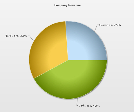
 Chart Image