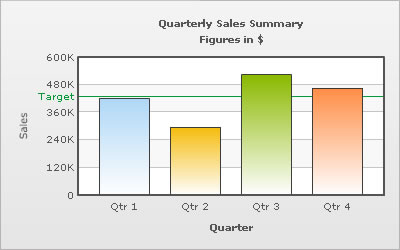
Trend lines are horizontal/vertical lines spanning the chart canvas which aid in interpretation of data with respect to some pre-determined value. For example, when you are plotting the quarterly revenue of a company, you might want to show what the target revenue was.
The data going into the above is:
<chart caption='Quarterly Sales Summary' subcaption='Figures in $' xAxisName='Quarter' yAxisName='Sales' showValues='0'>
   <set label='Qtr 1' value='420500' />
   <set label='Qtr 2' value='295400' />
   <set label='Qtr 3' value='523400' />
   <set label='Qtr 4' value='465400' />
   <trendLines>
        <line startValue='430000' color='009933' displayvalue='Target' />
   </trendLines>
</chart>
{
  "chart":{
    "caption":"Quarterly Sales Summary",
    "subcaption":"Figures in $",
    "xaxisname":"Quarter",
    "yaxisname":"Sales",
    "showvalues":"0"
  },
  "data":[{
      "label":"Qtr 1",
      "value":"420500"
    },
    {
      "label":"Qtr 2",
      "value":"295400"
    },
    {
      "label":"Qtr 3",
      "value":"523400"
    },
    {
      "label":"Qtr 4",
      "value":"465400"
    }
  ],
  "trendlines":[{
      "line":[{
          "startvalue":"430000",
          "color":"009933",
          "displayvalue":"Target"
        }
      ]
    }
  ]
}
The trend line is plotted at the value which you have specified. If the value specified is not within the chart limits, then the trend line is not plotted at all.
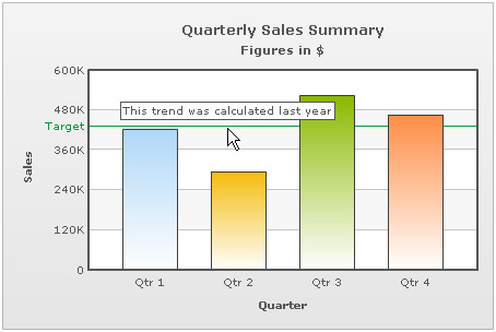
The trendlines can also show tool-text when hovered over. To specify a custom tool-text for trend-line, the following data can be used:
<chart caption='Quarterly Sales Summary' subcaption='Figures in $' xAxisName='Quarter' yAxisName='Sales' showValues='0'>
  <set label='Qtr 1' value='420500' />
  <set label='Qtr 2' value='295400' />
  <set label='Qtr 3' value='523400' />
  <set label='Qtr 4' value='465400' />
  <trendLines>
      <line startValue='430000' color='009933' displayvalue='Target' toolText='This trend was calculated last year'/>
  </trendLines>
</chart>
{
  "chart":{
    "caption":"Quarterly Sales Summary",
    "subcaption":"Figures in $",
    "xaxisname":"Quarter",
    "yaxisname":"Sales",
    "showvalues":"0"
  },
  "data":[{
      "label":"Qtr 1",
      "value":"420500"
    },
    {
      "label":"Qtr 2",
      "value":"295400"
    },
    {
      "label":"Qtr 3",
      "value":"523400"
    },
    {
      "label":"Qtr 4",
      "value":"465400"
    }
  ],
  "trendlines":[{
      "line":[{
          "startvalue":"430000",
          "color":"009933",
          "displayvalue":"Target",
          "tooltext":"This trend was calculated last year"
        }
      ]
    }
  ]
}
This results in:
Trend zones are similar to trend lines except that they mark out an entire zone rather than just a line.
For a trend zone, the data will be as under:
Note that for converting a trend line into a trend zone, all we have to do is add an end value and set isTrendZone to 1.
The looks of the trend lines can be customized using the following attributes:
| Attribute Name | Range | Description |
| color | Hex Code | Color of the trend line and its associated text |
| thickness | In Pixels | If you've opted to show the trend as a line, this attribute lets you define the thickness of trend line. |
| alpha | 0-100 | Alpha of the trend line |
You can have slanted trend lines as well, i.e., trend lines having a different starting & ending value.
<line startValue='430000' endValue='450000' color='009933' displayvalue='Target' />
You can show the trendline label to the right of the chart canvas by setting valueOnRight ='1'.
<line startValue='430000' color='009933' displayvalue='Target' valueOnRight='1'/>
The trend lines can be made dashed by setting dashed='1'. The dash length and gap can be customized using dashLen & dashGap attributes respectively.
<line startValue='430000' color='009933' displayvalue='Target' dashed='1' dashLen='2' dashGap='2' />
Using Styles, we can animate the trend lines. Here, we will animate the x-scale & the alpha of the trend line.
<chart caption='Quarterly Sales Summary' subcaption='Figures in $' xAxisName='Quarter' yAxisName='Sales' showValues='0'>
  <set label='Qtr 1' value='420500' />
  <set label='Qtr 2' value='295400' />
  <set label='Qtr 3' value='523400' />
  <set label='Qtr 4' value='465400' />
  <trendLines>
      <line startValue='430000' color='009933' displayvalue='Target' />
  </trendLines>
  <styles>
     <definition>
         <style name='Anim1' type='animation' param='_xScale' start='0' duration='1' />
         <style name='Anim2' type='animation' param='_alpha' start='0' duration='1' />
     </definition>
     <application>
         <apply toObject='TRENDLINES' styles='Anim1, Anim2' />
     </application>
  </styles>
</chart>
{
"chart":{
"caption":"Quarterly Sales Summary",
"subcaption":"Figures in $",
"xaxisname":"Quarter",
"yaxisname":"Sales",
"showvalues":"0"
},
"data":[{
"label":"Qtr 1",
"value":"420500"
},
{
"label":"Qtr 2",
"value":"295400"
},
{
"label":"Qtr 3",
"value":"523400"
},
{
"label":"Qtr 4",
"value":"465400"
}
],
"trendlines":[{
"line":[{
"startvalue":"430000",
"color":"009933",
"displayvalue":"Target"
}
]
}
],
"styles": {
"definition": [
{
"name": "Anim1",
"type": "animation",
"param": "_xScale",
"start": "0",
"duration": "1"
},
{
"name": "Anim2",
"type": "animation",
"param": "_alpha",
"start": "0",
"duration": "1"
}
],
"application": [
{
"toobject": "TRENDLINES",
"styles": "Anim1, Anim2"
}
]
}
}A dual y-axis chart has 2 y-axes. So when you are defining a trend line, you also need to define which axis the line has to be defined on. This can be done using the parentYAxis attribute. By default, the trend line shows up on the primary y-axis but if you want to show it on the secondary y-axis you have to configure the same by setting parentYAxis='S'.
<line startValue='430000' color='009933' displayvalue='Target' parentYAxis='S' />
Scatter, Bubble or Zoom Line charts support vertical trend lines as well, which run through the height of the chart. The vertical trend lines are otherwise similar to horizontal trend lines. An example of vertical trend line is:
<vTrendlines>
   <line startValue='20' endValue='65' alpha='5' color='00FF00' />
   <line startValue='65' endValue='75' alpha='15' color='FFFF00' />
   <line startValue='75' endValue='100' alpha='15' color='FF0000' />
</vTrendlines>
"vtrendlines":[{
      "line":[{
          "startvalue":"20",
          "endvalue":"65",
          "alpha":"5",
          "color":"00FF00"
        },
        {
          "startvalue":"65",
          "endvalue":"75",
          "alpha":"15",
          "color":"FFFF00"
        },
        {
          "startvalue":"75",
          "endvalue":"100",
          "alpha":"15",
          "color":"FF0000"
        }
      ]
    }
  ]
In Zoom Line Chart, you can define conditional vertical trend lines that show up when certain conditions are met with respect to how many data points are contained in currently viewed (zoomed-in) dataset.