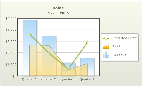
In multi-series / combination charts, the series name of each dataset shows up in the legend of the chart. This helps you relate a data plot to its series name using its color. The legend does not appear for single-series charts because there is only one series in the chart.
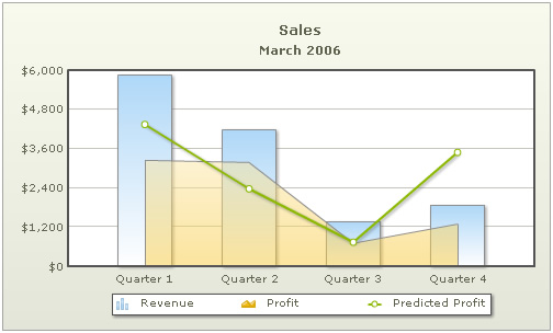
Notice the legend below the chart which helps identify the series name. Starting FusionCharts XT, each series is represented by its own icon.
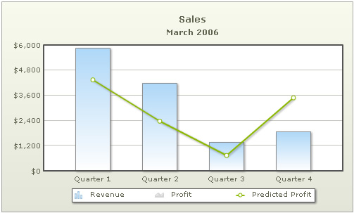
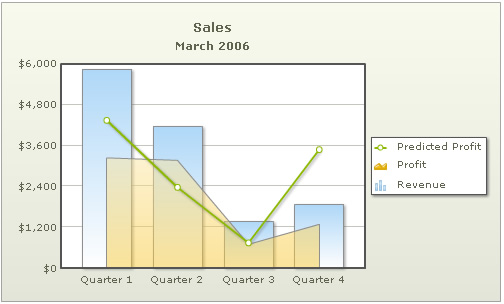
Starting FusionCharts XT, the legend is interactive. That is, when you click on each legend icon, it hides the dataset corresponding to that item. In the example below, profit legend icon was clicked that resulted in the chart as under. Note how the Profit icon has also been converted to gray-scale. To show the area back, you click on this icon again.
The XML/JSON going into the chart above is:
<chart palette='2' caption='Sales' subCaption='March 2006' showValues='0' divLineDecimalPrecision='1' limitsDecimalPrecision='1' numberPrefix='$' formatNumberScale='0' >
    <categories>
        <category label='Quarter 1' />
        <category label='Quarter 2' />
        <category label='Quarter 3' />
        <category label='Quarter 4' />
    </categories>
    <dataset seriesName='Revenue' >
        <set value='5854' />
        <set value='4171' />
        <set value='1375' />
        <set value='1875' />
    </dataset>
    <dataset seriesName='Profit' renderAs='Area'>
        <set value='3242' />
        <set value='3171' />
        <set value='700' />
        <set value='1287' />
    </dataset>
    <dataset seriesName='Predicted Profit' renderAs='Line'>
        <set value='4342' />
        <set value='2371' />
        <set value='740' />
        <set value='3487' />
    </dataset>
</chart>
{
"chart":{
"palette":"2",
"caption":"Sales",
"subcaption":"March 2006",
"showvalues":"0",
"divlinedecimalprecision":"1",
"limitsdecimalprecision":"1",
"numberprefix":"$",
"formatnumberscale":"0"
},
"categories":[{
"category":[{
"label":"Quarter 1"
},
{
"label":"Quarter 2"
},
{
"label":"Quarter 3"
},
{
"label":"Quarter 4"
}
]
}
],
"dataset":[{
"seriesname":"Revenue",
"data":[{
"value":"5854"
},
{
"value":"4171"
},
{
"value":"1375"
},
{
"value":"1875"
}
]
},
{
"seriesname":"Profit",
"renderas":"Area",
"data":[{
"value":"3242"
},
{
"value":"3171"
},
{
"value":"700"
},
{
"value":"1287"
}
]
},
{
"seriesname":"Predicted Profit",
"renderas":"Line",
"data":[{
"value":"4342"
},
{
"value":"2371"
},
{
"value":"740"
},
{
"value":"3487"
}
]
}
]
}To enable legend for a pie/doughnut chart, you use the following data:
<chart showLegend="1" caption="Sales Per Employee for year 1996" palette="2" animation="1" formatNumberScale="0" numberPrefix="$" pieSliceDepth="30" startingAngle="125">
   <set label="Leverling" value="100524"/>
   <set label="Fuller" value="87790" isSliced="1" />
   <set label="Davolio" value="81898" isSliced="0" />
   <set label="Peacock" value="76438" isSliced="0" />
   <set label="King" value="57430" isSliced="0" />
   <set label="Callahan" value="55091" isSliced="0"  />
   <set label="Dodsworth" value="43962" isSliced="0" />
   <set label="Suyama" value="22474" isSliced="0" />
   <set label="Buchanan" value="21637" isSliced="0" />
</chart>
{
  "chart":{
    "showlegend":"1",
    "caption":"Sales Per Employee for year 1996",
    "palette":"2",
    "animation":"1",
    "formatnumberscale":"0",
    "numberprefix":"$",
    "pieslicedepth":"30",
    "startingangle":"125"
  },
  "data":[{
      "label":"Leverling",
      "value":"100524"
    },
    {
      "label":"Fuller",
      "value":"87790",
      "issliced":"1"
    },
    {
      "label":"Davolio",
      "value":"81898",
      "issliced":"0"
    },
    {
      "label":"Peacock",
      "value":"76438",
      "issliced":"0"
    },
    {
      "label":"King",
      "value":"57430",
      "issliced":"0"
    },
    {
      "label":"Callahan",
      "value":"55091",
      "issliced":"0"
    },
    {
      "label":"Dodsworth",
      "value":"43962",
      "issliced":"0"
    },
    {
      "label":"Suyama",
      "value":"22474",
      "issliced":"0"
    },
    {
      "label":"Buchanan",
      "value":"21637",
      "issliced":"0"
    }
  ]
}
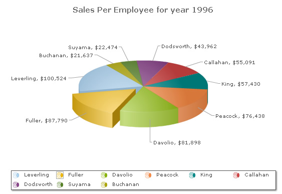
This results in the chart below. Note how the pie that is sliced out (of Fuller) also shows in the legend with a border around it. Again, the legend here is interactive. When you click on a legend item, the respective pie slice moves in/out.
FusionCharts XT offers a lot of customization options for legend - both functional and cosmetic. Let's quickly run through each of them.
The legend can be placed in 2 positions: RIGHT and BOTTOM. It gets placed below the canvas by default. To place it to the right of the chart canvas, set legendPosition='RIGHT'.
<chart legendPosition='RIGHT'...>
This results in a chart as under:
You can increase the size of legend icons by specifying a value between 0 and 5 for the attribute legendIconScale i.e., a value greater than 0 (not equal to) and less than 5. Shown below is an example of legendIconScale='2'. The chart will automatically shrink to adjust the legend.
If you've a lot of items in legend (i.e., a lot of data-series) and not enough space on the chart, the legend automatically shows up the scroll bar. Shown below is an example:
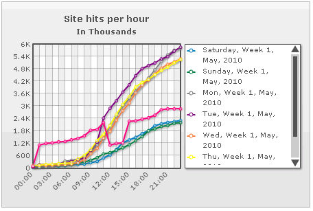
You can customize the visual properties of this scroll bar using following attributes:
| Attribute Name | Range | Description |
| legendScrollBgColor | Hex Code | This attribute lets you configure the background color of the scroll bar |
| legendScrollBarColor | Hex Code | This attribute lets you configure the bar color of the scroll bar |
| legendScrollBtnColor | Hex Code | This attribute lets you configure the color of buttons of the scroll bar |
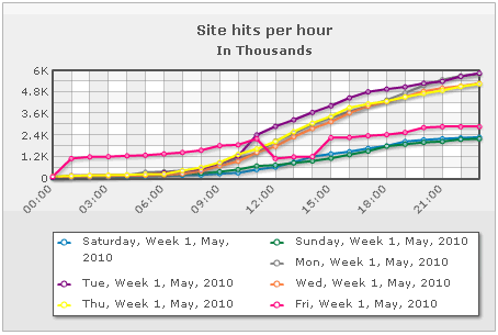
When rendering the legend at the bottom of chart, you can also customize the number of columns across which the legend items will be split. If FusionCharts XT can accommodate the items within those number of columns, it will render accordingly. This can be done by setting:
<chart legendNumColumns='2' ...>
This results in a chart as under. Note, that by default the chart at this size will render the legend in a single column. Setting 2 columns forces it to wrap first label. However, if you specify number of columns as 3, FusionCharts XT will ignore it, as there isn't enough space to render 3 columns horizontally.
Note that this attribute does not work when rendering legend at right side of chart.
The order of items in legend can be reversed by setting the XML/JSON as under. This is specifically useful in stacked charts to change order of items.
<chart reverseLegend='1' ...>
This results in:
The legend can be hidden as well using showLegend='0'.
<chart showLegend='0'...>
The looks of the legend can be customized using the following attributes:
| Attribute Name | Range | Description |
| legendBgColor | Hex Code | Background color for the legend |
| legendBgAlpha | 0-100 | Background alpha for the legend |
| legendBorderColor | Hex Code | Border Color for the legend |
| legendBorderThickness | In Pixels | Border thickness for the legend |
| legendBorderAlpha | 0-100 | Border alpha for the legend |
| legendShadow | 0/1 | Whether to show a shadow for legend |
| legendScrollBgColor | Hex Code | If you've too many items on the legend, a scroll bar shows up on the same. This attribute lets you configure the background color of the scroll bar. |
| legendScrollBarColor | Hex Code | If you've too many items on the legend, a scroll bar shows up on the same. This attribute lets you configure the bar color of the scroll bar. |
| legendScrollBtnColor | Hex Code | If you've too many items on the legend, a scroll bar shows up on the same. This attribute lets you configure the color of buttons of the scroll bar. |
Using Styles, the font properties of the legend can be customized.
<chart caption='Business Results 2005 v 2006' xAxisName='Month' yAxisName='Revenue' showValues='0' numberPrefix='$'>
    <categories>
        <category label='Jan' />
        <category label='Feb' />
        <category label='Mar' />
        <category label='Apr' />
        <category label='May' />
        <category label='Jun' />
    </categories>
    <dataset seriesName='2006'>
        <set value='27400' />
        <set value='29800' />
        <set value='25800' />
        <set value='26800' />
        <set value='29600' />
        <set value='32600' />
    </dataset>
    <dataset seriesName='2005'>
        <set value='10000'/>
        <set value='11500'/>
        <set value='12500'/>
        <set value='15000'/>
        <set value='11000' />
        <set value='9800' />
    </dataset>
    <styles>
       <definition>
           <style name='myLegendFont' type='font' size='12' color='078BC5' bold='1' />
       </definition>
       <application>
           <apply toObject='Legend' styles='myLegendFont' />
       </application>
    </styles>
</chart>
{
"chart":{
"caption":"Business Results 2005 v 2006",
"xaxisname":"Month",
"yaxisname":"Revenue",
"showvalues":"0",
"numberprefix":"$"
},
"categories":[{
"category":[{
"label":"Jan"
},
{
"label":"Feb"
},
{
"label":"Mar"
},
{
"label":"Apr"
},
{
"label":"May"
},
{
"label":"Jun"
}
]
}
],
"dataset":[{
"seriesname":"2006",
"data":[{
"value":"27400"
},
{
"value":"29800"
},
{
"value":"25800"
},
{
"value":"26800"
},
{
"value":"29600"
},
{
"value":"32600"
}
]
},
{
"seriesname":"2005",
"data":[{
"value":"10000"
},
{
"value":"11500"
},
{
"value":"12500"
},
{
"value":"15000"
},
{
"value":"11000"
},
{
"value":"9800"
}
]
}
],
"styles": {
"definition": [
{
"name": "myLegendFont",
"type": "font",
"size": "12",
"color": "078BC5",
"bold": "1"
}
],
"application": [
{
"toobject": "Legend",
"styles": "myLegendFont"
}
]
}
}
The above XML/JSON will yield a legend which looks as under:
To read more on Styles, please refer to FusionCharts XT Styles.
The legend can be animated using Styles. Here, we will give a fade-in effect to the legend.
<chart ... >
        ...
          <styles>
             <definition>
                  <style name='myAnim' type='animation' param='_alpha' start='0' duration='1'/>
             </definition>
             <application>
                  <apply toObject='Legend' styles='myAnim' />
             </application>
          </styles>
</chart>
{
"chart":{...},
...
"styles": {
"definition": [
{
"name": "myAnim",
"type": "animation",
"param": "_alpha",
"start": "0",
"duration": "1"
}
],
"application": [
{
"toobject": "Legend",
"styles": "myAnim"
}
]
}
}