Divisional lines are horizontal lines running through the canvas. They break up the y-axis into smaller units helping in better visual data interpretation.
In scatter and bubble charts, there are additional vertical divisional lines to care for better visualization.
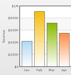
The XML/JSON code going into the above is:
<chart caption='Monthly Revenue' xAxisName='Month' yAxisName='Revenue' numberPrefix='$' showValues='0'>
  <set label='Jan' value='420000' />
  <set label='Feb' value='910000' />
  <set label='Mar' value='720000' />
  <set label='Apr' value='550000' />
  ....
</chart>
{
  "chart":{
    "caption":"Monthly Revenue",
    "xaxisname":"Month",
    "yaxisname":"Revenue",
    "numberprefix":"$",
    "showvalues":"0"
  },
  "data":[{
      "label":"Jan",
      "value":"420000"
    },
    {
      "label":"Feb",
      "value":"910000"
    },
    {
      "label":"Mar",
      "value":"720000"
    },
    {
      "label":"Apr",
      "value":"550000"
    }
...
  ]
}
Note that we haven't specified the number of div lines we want, nor the y-axis min or max value.
In certain cases, you will want to explicitly specify the y-axis upper & lower limit values and also the number of divisional lines. In those cases, you need to disable automatic adjustment of divisional lines using adjustDiv='0'. Then you can specify the y-axis upper and lower limits using the yAxisMaxValue and yAxisMinValue attributes respectively. Also, the number of divisional lines can be specified using the numDivLines attribute.
Note: This attribute is not applicable for Zoom Line chart, in which axis can be configured to show pre-defined intervals, as explained later.
<chart ... adjustDiv='0' yAxisMaxvalue='100' yAxisMinValue='0' numDivLines='5'>
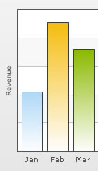
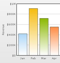
You can hide all the y-axis values using showYAxisValues='0'.
<chart caption='Monthly Revenue' xAxisName='Month' yAxisName='Revenue' numberPrefix='$' showValues='0' showYAxisValues='0'>
  <set label='Jan' value='420000' />
  <set label='Feb' value='910000' />
  <set label='Mar' value='720000' />
  ....
</chart>
{
  "chart":{
    "caption":"Monthly Revenue",
    "xaxisname":"Month",
    "yaxisname":"Revenue",
    "numberprefix":"$",
    "showvalues":"0",
    "showyaxisvalues":"0"
  },
  "data":[{
      "label":"Jan",
      "value":"420000"
    },
    {
      "label":"Feb",
      "value":"910000"
    },
    {
      "label":"Mar",
      "value":"720000"
    }
...
  ]
}
The above will yield the following result:
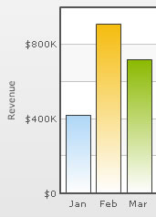
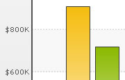
You can display every nth y-axis value using the yAxisValuesStep attribute. This attribute assumes default values based on space available in the chart to render y-axis values, and can over-ride the values provided in XML/JSON to avoid overlapping y-axis values.
<chart caption='Monthly Revenue' xAxisName='Month' yAxisName='Revenue' numberPrefix='$' showValues='0' yAxisValuesStep='2'>
   <set label='Jan' value='420000' />
   <set label='Feb' value='910000' />
   <set label='Mar' value='720000' />
    ....
</chart>
{
"chart":{
"caption":"Monthly Revenue",
"xaxisname":"Month",
"yaxisname":"Revenue",
"numberprefix":"$",
"showvalues":"0",
"yaxisvaluesstep":"2"
},
"data":[{
"label":"Jan",
"value":"420000"
},
{
"label":"Feb",
"value":"910000"
},
{
"label":"Mar",
"value":"720000"
}
...
]
}
Now the chart will look as under:
Setting div interval hints in Zoom Line Chart
When using the linear axis in Zoom Line Chart, you can set div interval hints using:
<chart divIntervalHints='10,20,50,100' ...>
Using the above code you basically instruct the chart to put div interval in multiples of either 10, 20, 50 or 100, whichever is applicable. Based on which intervals are valid (intervals have to be less than range of chart limits and divisible) and how much space is available on the chart to render the same, the chart automatically uses the best interval hint among all values provided.
So, if you've a chart with axis limits 0-100 and you wish to plot divisional lines at 0,50 and 100, you must specify:
<chart divIntervalHints='50' ...>
However, if you want to plot intervals at 0,20,40,60,100, you can set:
<chart divIntervalHints='20' ...>
The looks of the divisional lines can be customized using the following attributes:
| Attribute Name | Range | Description |
| divLineColor | Hex Code | Color for divisional lines (without the '#') |
| divLineThickness | 1-5 | Thickness of divisional lines |
| divLineAlpha | 0-100 | Alpha of divisional lines |
<chart ... divLineColor='8CB1FF' divLineThickness='2' divLineAlpha='40'>
This will yield the following result:
The divisional line can be made dashed using divLineIsDashed='1'.
The dash properties - dash length and dash gap can be customized using the divLineDashLen & divLineDashGap attributes respectively.
<chart divLineIsDashed='1' divLineDashLen='1' divLineDashGap='2' ...>
The dashed div lines with the customized dash properties will look as shown below:
The horizontal grid bands appear alternately between the divisional lines for all 2D charts. They can be hidden by setting showAlternateHGridColor='0'.
<chart showAlternateHGridColor='0' ...>
The chart without the alternate horizontal grid bands will look as under:
The color and alpha of the alternate horizontal grid bands can be customized using the alternateHGridColor and alternateVGridAlpha attributes.
Using Styles, you can individually set the font properties for the y-axis values.
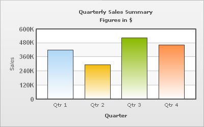
The data for this chart is as under. To read more on Styles, please see "FusionCharts XT Styles" section.
<chart caption='Quarterly Sales Summary' subcaption='Figures in $' xAxisName='Quarter' yAxisName='Sales' showValues='0' >
   <set label='Qtr 1' value='420500' />
   <set label='Qtr 2' value='295400' />
   <set label='Qtr 3' value='523400' />
   <set label='Qtr 4' value='465400' />
   <styles>
      <definition>
         <style name='myValuesFont' type='font' font='Arial' size='12' color='666666' bold='1'/>
      </definition>
      <application>
        <apply toObject='YAXISVALUES' styles='myValuesFont' />
      </application>
   </styles>
</chart>
{
"chart":{
"caption":"Quarterly Sales Summary",
"subcaption":"Figures in $",
"xaxisname":"Quarter",
"yaxisname":"Sales",
"showvalues":"0"
},
"data":[{
"label":"Qtr 1",
"value":"420500"
},
{
"label":"Qtr 2",
"value":"295400"
},
{
"label":"Qtr 3",
"value":"523400"
},
{
"label":"Qtr 4",
"value":"465400"
}
],
"styles": {
"definition": [
{
"name": "myValuesFont",
"type": "font",
"font": "Arial",
"size": "12",
"color": "666666",
"bold": "1"
}
],
"application": [
{
"toobject": "YAXISVALUES",
"styles": "myValuesFont"
}
]
}
}
We can apply effects (shadow, glow, blur, bevel) to the y-axis values and div lines using Styles. Here, we will see a chart having shadow for the div lines.
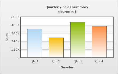
<chart caption='Quarterly Sales Summary' subcaption='Figures in $' xAxisName='Quarter' yAxisName='Sales' showValues='0' >
   <set label='Qtr 1' value='420500' />
   <set label='Qtr 2' value='295400' />
   <set label='Qtr 3' value='523400' />
   <set label='Qtr 4' value='465400' />
   <styles>
      <definition>
         <style name='myShadow' type='shadow' angle='45' distance='3' color='000000'/>
      </definition>
      <application>
         <apply toObject='DIVLINES' styles='myShadow' />
      </application>
   </styles>
</chart>
{
"chart":{
"caption":"Quarterly Sales Summary",
"subcaption":"Figures in $",
"xaxisname":"Quarter",
"yaxisname":"Sales",
"showvalues":"0"
},
"data":[{
"label":"Qtr 1",
"value":"420500"
},
{
"label":"Qtr 2",
"value":"295400"
},
{
"label":"Qtr 3",
"value":"523400"
},
{
"label":"Qtr 4",
"value":"465400"
}
],
"styles": {
"definition": [
{
"name": "myShadow",
"type": "shadow",
"angle": "45",
"distance": "3",
"color": "000000"
}
],
"application": [
{
"toobject": "DIVLINES",
"styles": "myShadow"
}
]
}
}
Similarly, the other effects can be applied to the div lines and to the y-axis values as well.
You can also apply animation effects to the div lines & y-axis values. In the example given below, the x-Scale of the div lines will be animated and y-position of the y-axis values will be animated.
<chart caption='Quarterly Sales Summary' subcaption='Figures in $' xAxisName='Quarter' yAxisName='Sales' showValues='0' >
  <set label='Qtr 1' value='420500' />
  <set label='Qtr 2' value='295400' />
  <set label='Qtr 3' value='523400' />
  <set label='Qtr 4' value='465400' />
  <styles>
    <definition>
       <style name='myAnim1' type='animation' param='_xScale' start='0' duration='1'/>
       <style name='myAnim2' type='animation' param='_y' start='$canvasStartY' duration='1'/>
    </definition>
    <application>
       <apply toObject='DIVLINES' styles='myAnim1' />
       <apply toObject='YAXISVALUES' styles='myAnim2' />
    </application>
  </styles>
</chart>
{
"chart":{
"caption":"Quarterly Sales Summary",
"subcaption":"Figures in $",
"xaxisname":"Quarter",
"yaxisname":"Sales",
"showvalues":"0"
},
"data":[{
"label":"Qtr 1",
"value":"420500"
},
{
"label":"Qtr 2",
"value":"295400"
},
{
"label":"Qtr 3",
"value":"523400"
},
{
"label":"Qtr 4",
"value":"465400"
}
],
"styles": {
"definition": [
{
"name": "myAnim1",
"type": "animation",
"param": "_xScale",
"start": "0",
"duration": "1"
},
{
"name": "myAnim2",
"type": "animation",
"param": "_y",
"start": "$canvasStartY",
"duration": "1"
}
],
"application": [
{
"toobject": "DIVLINES",
"styles": "myAnim1"
},
{
"toobject": "YAXISVALUES",
"styles": "myAnim2"
}
]
}
}
Animation effects can be applied to the alternate horizontal grid using Styles. The following XML/JSON will animate the x-Scale and the alpha of the horizontal grid bands.
<chart caption='Quarterly Sales Summary' subcaption='Figures in $' xAxisName='Quarter' yAxisName='Sales' showValues='0' >
   <set label='Qtr 1' value='420500' />
   <set label='Qtr 2' value='295400' />
   <set label='Qtr 3' value='523400' />
   <set label='Qtr 4' value='465400' />
   <styles>
      <definition>
          <style name='myAnim1' type='animation' param='_xScale' start='0' duration='1'/>
          <style name='myAnim2' type='animation' param='_alpha' start='0' duration='1'/>
      </definition>
      <application>
          <apply toObject='HGRID' styles='myAnim1, myAnim2' />
      </application>
   </styles>
</chart>
{
"chart":{
"caption":"Quarterly Sales Summary",
"subcaption":"Figures in $",
"xaxisname":"Quarter",
"yaxisname":"Sales",
"showvalues":"0"
},
"data":[{
"label":"Qtr 1",
"value":"420500"
},
{
"label":"Qtr 2",
"value":"295400"
},
{
"label":"Qtr 3",
"value":"523400"
},
{
"label":"Qtr 4",
"value":"465400"
}
],
"styles": {
"definition": [
{
"name": "myAnim1",
"type": "animation",
"param": "_xScale",
"start": "0",
"duration": "1"
},
{
"name": "myAnim2",
"type": "animation",
"param": "_alpha",
"start": "0",
"duration": "1"
}
],
"application": [
{
"toobject": "HGRID",
"styles": "myAnim1, myAnim2"
}
]
}
}
In scatter and bubble charts, you can also customize vertical divisional lines and vertical grids along with horizontal divisional lines and grids. The attributes to customize the vertical divisional lines and grids are as follows:
| Attribute Name | Range | Description |
| adjustVDiv Since v3.2.2 |
Boolean | FusionCharts XT automatically tries to adjust divisional lines and limit values of the x-axis based on the data provided. However, if you want to set your explicit lower and upper limit values and number of divisional lines for the x-axis, first set this attribute to 0. That will disable automatic adjustment of divisional lines. |
| showXAxisValues
Since v3.2.2 |
Boolean | The X-Axis is divided into horizontal sections using div (divisional) lines. Each div line assumes a value based on its position. Using this attribute you can set whether to show those div line (x-axis) values or not. This attribute shows or hides the x-axis divisional lines and limits. |
|
numVDivlines Since v3.2.2 |
Numeric Value > 0 | Number of vertical axis division lines that you want to display on the chart. |
| xAxisValuesStep Since v3.2.2 |
Number 1 or above | By default, all div lines show their values. However, you can opt to skip every x(th) div line value using this attribute. |
|
vDivlineColor Since v3.2.2 |
Hex Code | Color for vertical divisional lines. |
|
vDivlineThickness Since v3.2.2 |
1-5 | Thickness of vertical divisional lines. |
|
vDivlineAlpha Since v3.2.2 |
0-100 | Transparency of the vertical divisional lines. |
|
vDivlineIsDashed Since v3.2.2 |
0/1 | Whether the vertical divisional lines should display as dash. |
|
vDivlineDashLen Since v3.2.2 |
In Pixels | If the vertical divisional lines are to be displayed as dash, this attribute lets you control the length of each dash. |
|
vDivlineDashGap Since v3.2.2 |
In Pixels | If the vertical divisional lines are to be displayed as dash, this attribute lets you control the length of each gap between two dashes. |
|
showAlternateVGridColor
Since v3.2.2 |
0/1 | Whether to show alternate colored vertical grid bands. |
|
alternateVGridColor
Since v3.2.2 |
Hex Code | Color of the alternate vertical grid bands. |
|
alternateVGridAlpha
Since v3.2.2 |
0-100 | Transparency of the alternate vertical grid bands. |