Data plot refers to the column in column chart, lines in a line chart, pie/doughnut slices in a pie/doughnut chart.
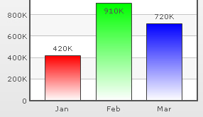
In all the charts, you can specify custom color for each data plot. This is done using the color attribute of <set> element as under. The color has to be in hex code format (RRGGBB) without #.
<chart ....>
    <set label='Jan' value='420000' color='FF0000'/>
    <set label='Feb' value='910000' color='00FF00'/>
    <set label='Mar' value='720000' color='0000FF'/>
    ....
</chart>
{
"chart":{...},
"data":[{
"label":"Jan",
"value":"420000",
"color":"FF0000"
},
{
"label":"Feb",
"value":"910000",
"color":"00FF00"
},
{
"label":"Mar",
"value":"720000",
"color":"0000FF"
}
...
]
}
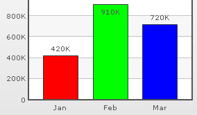
By default, most charts in FusionCharts XT suite have FFFFFF as the plot gradient color. In case you wish to use solid fills for the column (or area), you have to use the plotGradientColor attribute with just a space as attribute value, i.e., plotGradientColor=' '
<chart plotGradientColor=' ' ....>
   <set label='Jan' value='420000' color='FF0000'/>
   <set label='Feb' value='910000' color='00FF00'/>
   <set label='Mar' value='720000' color='0000FF'/>
   ....
</chart>
{
  "chart":{ "plotGradientColor" : " " ...},
  "data":[{
      "label":"Jan",
      "value":"420000",
      "color":"FF0000"
    },
    {
      "label":"Feb",
      "value":"910000",
      "color":"00FF00"
    },
    {
      "label":"Mar",
      "value":"720000",
      "color":"0000FF"
    }
...
  ]
}
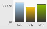
Using the plotGradientColor attribute, you can globally add a gradient color to the entire plot (column, area) of chart by specifying a color as its attribute. For example, if you want to set #333333 as the common gradient color for all the columns in a 2D column chart, your data will be as under:
<chart plotGradientColor='333333' ....>
   <set label='Jan' value='420000' />
   <set label='Feb' value='910000' />
   <set label='Mar' value='720000' />
    ....
</chart>
{
"chart":{
"plotgradientcolor":"333333" ...
},
"data":[{
"label":"Jan",
"value":"420000"
},
{
"label":"Feb",
"value":"910000"
},
{
"label":"Mar",
"value":"720000"
}
...
]
}
The plot gradient properties can be controlled using the following attributes:
| Attribute Name | Range | Description |
| plotFillAngle | 0-360 | If you've opted to fill the plot (column, area etc.) as gradient, this attribute lets you set the fill angle for gradient. |
| plotFillRatio | 0-100 | If you've opted to fill the plot (column, area etc.) as gradient, this attribute lets you set the ratio for gradient. |
| plotFillAlpha | 0-100 | If you've opted to fill the plot (column, area etc.) as gradient, this attribute lets you set the fill alpha for gradient. |
<chart plotGradientColor='333333' plotFillRatio='80,20' plotFillAlpha='95,100' plotFillAngle='45'>
Note that we have specified 2 values for plotFillRatio and plotFillAlpha. This is because one of the values specified is taken by the color specified for the column (or taken by default from the color palette) and the other one by the common gradient color specified using plotGradientColor attribute.
By default, each data plot (column, area, pie etc) shows a border around it. You can hide the same using showPlotBorder='0'.
<chart showPlotBorder='0' ....>
   <set label='Jan' value='420000' />
   <set label='Feb' value='910000' />
   <set label='Mar' value='720000' />
      ....
</chart>
{
"chart":{
"showPlotBorder":"0" ...
},
"data":[{
"label":"Jan",
"value":"420000"
},
{
"label":"Feb",
"value":"910000"
},
{
"label":"Mar",
"value":"720000"
}
...
]
}
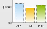
You can make the plot border dashed using plotBorderDashed='1'. The dash length & gap can be customized using the plotBorderDashLen and plotBorderDashGap attributes respectively.
<chart plotBorderDashed='1' plotBorderDashLen='2' plotBorderDashGap='2' ...>
The above data will yield the following chart:
In charts that support 2D Columns or Bars (like column charts, bar charts, 2D combination charts etc.), you can opt to plot columns/bars with rounded edges and glass effect gradients. To do so, you need to add useRoundEdges='1' attribute to <chart> element as under:
<chart caption='Monthly Revenue' xAxisName='Month' yAxisName='Revenue' numberPrefix='$' showValues='0' useRoundEdges='1'>
  <set label='Jan' value='420000' />
  <set label='Feb' value='910000' />
  <set label='Mar' value='800000' />
  <set label='Apr' value='550000' />
  <set label='May' value='810000' />
  <set label='Jun' value='510000' />
</chart>
{
  "chart":{
    "caption":"Monthly Revenue",
    "xaxisname":"Month",
    "yaxisname":"Revenue",
    "numberprefix":"$",
    "showvalues":"0",
    "useroundedges":"1"
  },
  "data":[{
      "label":"Jan",
      "value":"420000"
    },
    {
      "label":"Feb",
      "value":"910000"
    },
    {
      "label":"Mar",
      "value":"800000"
    },
    {
      "label":"Apr",
      "value":"550000"
    },
    {
      "label":"May",
      "value":"810000"
    },
    {
      "label":"Jun",
      "value":"510000"
    }
  ]
}
This will yield the following results:
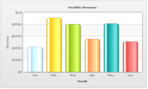
As you can see in the above image, the columns have been rounded at edges and filled with a glass effect gradient. Apart from that, the canvas has also been modified to render the top part as rounded shape.
However, in this mode, the following features will not work:
- When you plot the columns with rounded edges, shadow is applied to them by default and showShadow attribute doesn't work anymore. If you want to remove shadow from this mode, you'll have to over-ride the shadow with a new shadow style (applied to DATAPLOT) with alpha as 0.
- Plot fill properties like gradient color, angle etc. will not work anymore, as the colors for gradient are now calculated by the chart itself.
- Plot border properties also do not work in this mode. Also, you cannot render the border as dash in this mode.
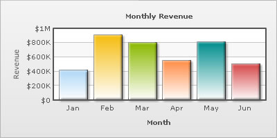
Using Styles, you can apply effects like shadow, glow, bevel and blur to the data plot. In the example given below, we have given a bevel and shadow effect to the columns in a column chart.
The XML/JSON going into the same is:
<chart caption='Monthly Revenue' xAxisName='Month' yAxisName='Revenue' numberPrefix='$' showValues='0'>
   <set label='Jan' value='420000' />
   <set label='Feb' value='910000' />
   <set label='Mar' value='800000' />
   <set label='Apr' value='550000' />
   <set label='May' value='810000' />
   <set label='Jun' value='510000' />
   <styles>
     <definition>
         <style name='myBevel' type='bevel' distance='3'/>
         <style name='myShadow' type='shadow' angle='45' distance='3'/>
     </definition>
     <application>
         <apply toObject='DATAPLOT' styles='myBevel, myShadow' />
     </application>
   </styles>
</chart>
{
"chart":{
"caption":"Monthly Revenue",
"xaxisname":"Month",
"yaxisname":"Revenue",
"numberprefix":"$",
"showvalues":"0"
},
"data":[{
"label":"Jan",
"value":"420000"
},
{
"label":"Feb",
"value":"910000"
},
{
"label":"Mar",
"value":"800000"
},
{
"label":"Apr",
"value":"550000"
},
{
"label":"May",
"value":"810000"
},
{
"label":"Jun",
"value":"510000"
}
],
"styles": {
"definition": [
{
"name": "myBevel",
"type": "bevel",
"distance": "3"
},
{
"name": "myShadow",
"type": "shadow",
"angle": "45",
"distance": "3"
}
],
"application": [
{
"toobject": "DATAPLOT",
"styles": "myBevel, myShadow"
}
]
}
}
You can customize animation of the data plot using Styles. Given below is the XML/JSON which renders fade-in effect for columns, lines etc.
<chart caption='Monthly Revenue' xAxisName='Month' yAxisName='Revenue' numberPrefix='$' showValues='0'>
   <set label='Jan' value='420000' />
   <set label='Feb' value='910000' />
   <set label='Mar' value='800000' />
   <set label='Apr' value='550000' />
   <set label='May' value='810000' />
   <set label='Jun' value='510000' />
   <styles>
     <definition>
        <style name='myAnim' type='animation' param='_alpha' start='0' duration='2'/>
     </definition>
     <application>
        <apply toObject='DATAPLOT' styles='myAnim' />
     </application>
   </styles>
</chart>
{
  "chart":{
    "caption":"Monthly Revenue",
    "xaxisname":"Month",
    "yaxisname":"Revenue",
    "numberprefix":"$",
    "showvalues":"0"
  },
  "data":[{
      "label":"Jan",
      "value":"420000"
    },
    {
      "label":"Feb",
      "value":"910000"
    },
    {
      "label":"Mar",
      "value":"800000"
    },
    {
      "label":"Apr",
      "value":"550000"
    },
    {
      "label":"May",
      "value":"810000"
    },
    {
      "label":"Jun",
      "value":"510000"
    }
  ],
  "styles": {
    "definition": [
      {
        "name": "myAnim",
        "type": "animation",
        "param": "_alpha",
        "start": "0",
        "duration": "2"
      }
    ],
    "application": [
      {
        "toobject": "DATAPLOT",
        "styles": "myAnim"
      }
    ]
  }
}