FusionCharts v3 provides various options when trying to highlight selective data. Here, we'll be discussing some of them, including:
- Highlighting a data set by changing its alpha
- Using dashed border to highlight data
- Using individual anchor properties on a line/area chart to highlight a data
- Using individual color properties on a multi-series chart to highlight a single data
Let's see all of the above one by one.
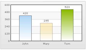
Highlighting data by altering its alpha is one of the simplest methods. Consider the XML below:
Here, we've set the alpha of second column to 50 (on a scale of 0-100). Now, when you see this chart, you'll see that the middle column is semi-transparent making it the visual focus point.
You can also highlight a data by setting it as dashed. Consider the XML below:
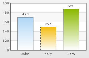 |
 |
When applied on a column chart |
When applied on a line chart |
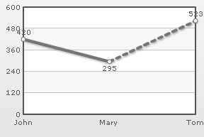
FusionCharts v3 allows you to set individual <set> level anchor properties too. Consider the following XML:
<chart showValues='0'>
   <set label='John' value='420' />
   <set label='Mary' value='295' />
   <set label='Tom' value='523' anchorRadius='6' anchorSides='4' anchorBorderColor='0372AB' anchorBgColor='E1f5ff'/>
   <set label='Hary' value='323' />
</chart>
{
  "chart":{
    "showvalues":"0"
  },
  "data":[{
      "label":"John",
      "value":"420"
    },
    {
      "label":"Mary",
      "value":"295"
    },
    {
      "label":"Tom",
      "value":"523",
      "anchorradius":"6",
      "anchorsides":"4",
      "anchorbordercolor":"0372AB",
      "anchorbgcolor":"E1f5ff"
    },
    {
      "label":"Hary",
      "value":"323"
    }
  ]
}
The above XML gives the following output on a line chart:
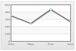
You can clearly see the highlighted anchor on the chart.
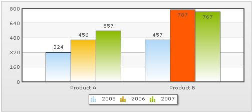
FusionCharts v3 also allows you to specify <set> level color in a multi-series chart. Consider the XML below:
<chart>
    <categories>
        <category label="Product A" />
        <category label="Product B" />
    </categories>
    <dataset SeriesName="2005">
        <set value="324" />
        <set value="457" />
    </dataset>
    <dataset SeriesName="2006">
        <set value="456" />
        <set value="787" color='FF5904'/>
    </dataset>
    <dataset SeriesName="2007">
        <set value="557" />
        <set value="767" />
    </dataset>
</chart>
{
  "chart":{},
  "categories":[{
      "category":[{
          "label":"Product A"
        },
        {
          "label":"Product B"
        }
      ]
    }
  ],
  "dataset":[{
      "seriesname":"2005",
      "data":[{
          "value":"324"
        },
        {
          "value":"457"
        }
      ]
    },
    {
      "seriesname":"2006",
      "data":[{
          "value":"456"
        },
        {
          "value":"787",
          "color":"FF5904"
        }
      ]
    },
    {
      "seriesname":"2007",
      "data":[{
          "value":"557"
        },
        {
          "value":"767"
        }
      ]
    }
  ]
}
In the above code, we've a multi-series XML. We're highlighting a single <set> by setting its color explicitly. When you now see this chart, you'll get the following output: