In our previous example, we had seen how to plot charts from data contained in Excel sheets. Here, we'll see how to create charts from data contained in Microsoft Word Tables. Note that you can convert only tabular data from Microsoft Word to FusionCharts charts. Let's quickly see an example.
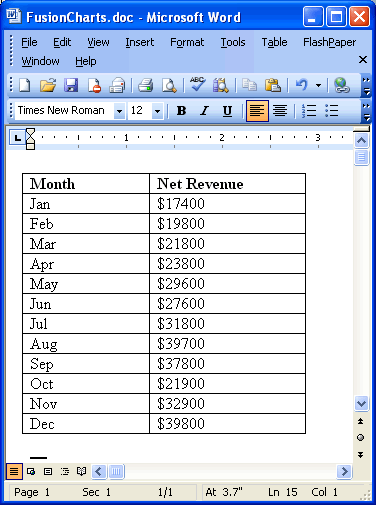
Consider the following table in MS Word where we've our monthly sales data stored:
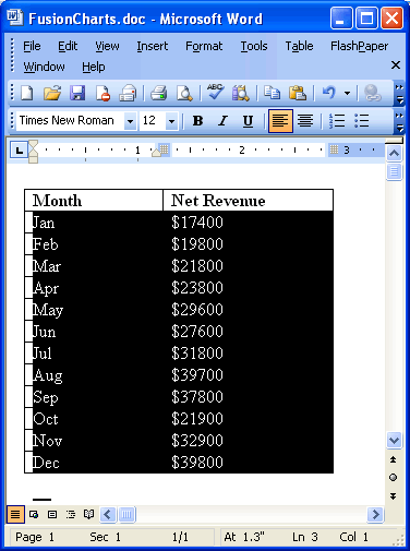
To create a chart from this data, you'll now need to select this data and copy to clipboard. Select only the data rows (and NOT the headers) as under and copy it to clipboard by pressing Ctrl + C.
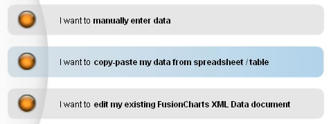
Now, we need to paste this data in our XML Generator Utility. Launch the XML Generator utility and select the second option "I want to copy/paste my data from spreadsheet / table".
In the text area that you now get, paste the data that's in your clipboard. It should look as under:
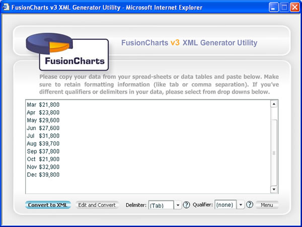
Here, select "Tab" as delimiter.
If your delimiter is different from Tab, you need to judge your delimiter and then set it accordingly. Delimiter is the character that separates two different data items on a single row of data. For example, in our above data, our month names and revenue figures are separated by a Tab character. So, we select Tab as the delimiter.
Now, you've two options to convert it into XML:
- You can directly convert this data into XML without making any changes to it.
- Or, you can edit this data in the grid and then convert it to XML.
To choose option 1, click on "Convert to XML" button. You'll instantly get the XML as under:
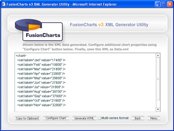
You can now configure the chart properties or generate HTML from here as explained in earlier sections.
Going back to previous step, if you had wished to edit the data before conversion, you can click on "Edit and Convert" button. This lets you edit your data in a grid as under:
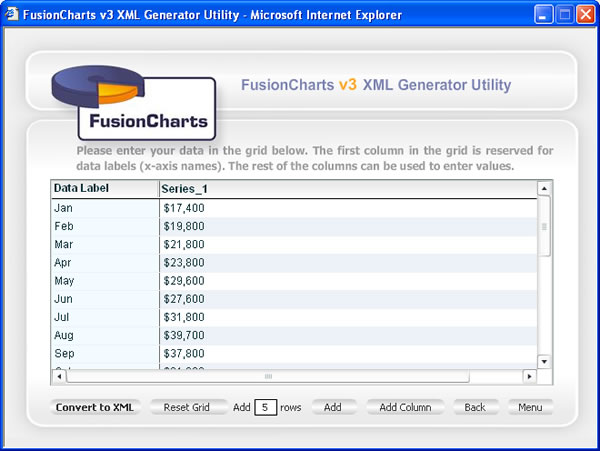
After editing your data, you can now click on "Convert to XML" button to generate the XML and finally chart.