If you've your data stored in Microsoft Excel or other spreadsheets, you can now easily plot charts from it using FusionCharts. Our visual XML Generator lets you do so at just a few clicks. Let's quickly see an example.
Here, we'll see how to plot a Column 3D chart from data stored in a Microsoft Excel spreadsheet. Please note that this is not just limited to Microsoft Excel. You can use data from any spreadsheet - it's just for demo that we're using Microsoft Excel in this example.
For our example, we've our monthly sales data stored in an Excel worksheet as under:
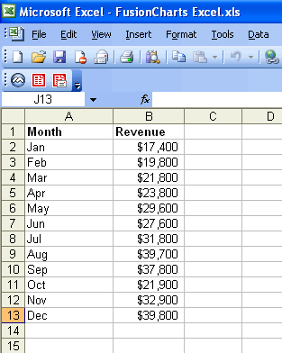
As you can see, we've two columns of data. The first column has the month name which we'll plot on x-axis of the chart. The revenues would be plotted as columns.
To plot this data, you now need to select ONLY the data that you wish to plot. Select the data as under (excluding the header):
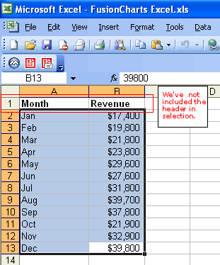
Copy this data in clipboard by pressing Ctrl + C. You'll now see a dashed border around the data.
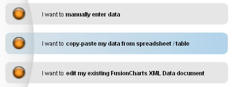
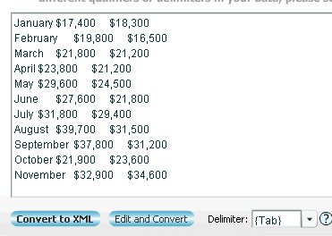
Now, we need to paste this data in our XML Generator Utility. Launch the XML Generator utility and select the second option "I want to copy/paste my data from spreadsheet / table".
In the text area that you now get, paste the data that's in your clipboard. It should look as under:
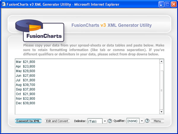
Here, select "Tab" as delimiter if you're copying data from Microsoft Excel.
If you're copying from other sources, you need to judge your delimiter and then set it accordingly. Delimiter is the character that separates two different data items on a single row of data. For example, in our above data, our month names and revenue figures are separated by a Tab character. So, we select Tab as the delimiter.
Now, you've two options to convert it into XML:
- You can directly convert this data into XML without making any changes to it.
- Or, you can edit this data in the grid and then convert it to XML.
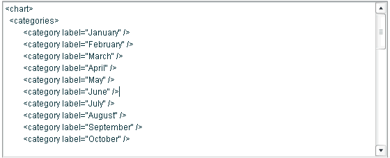
To choose option 1, click on "Convert to XML" button. You'll instantly get the XML as under:
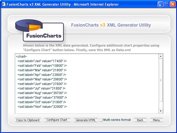
You can now configure the chart properties or generate HTML from here as explained in earlier sections.
Going back to previous step, if you had wished to edit the data before conversion, you can click on "Edit and Convert" button. This lets you edit your data in a grid as under:
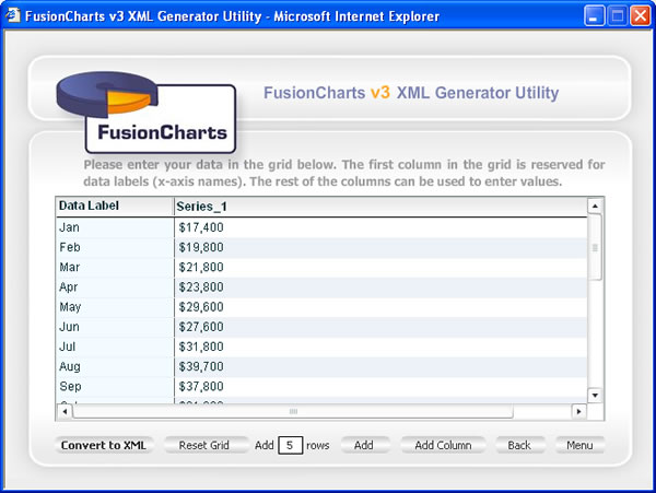
After editing your data, you can now click on "Convert to XML" button to generate the XML and finally chart.
Let's now see how to convert multiple columns of data from Microsoft Excel into charts.
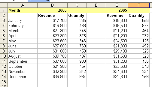
Let's take an example where we've to plot a multi-series chart where we'll compare sales data for two years. Our Excel sheet for the same looks as under:
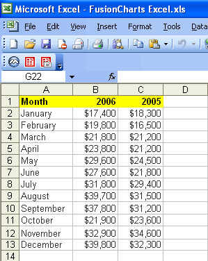
As you can see above, we've sales data for two years in this Excel Sheet. Again to convert this into XML, just select the rows/columns containing data (excluding header again).
Now, paste this data in the XML generator utility as before and select Tab as the delimiter.
Do not worry if your data is looking scattered (unformatted) as shown in the image above. The XML Generator Utility internally recognizes the tab characters and will convert the data perfectly. When you now click on "Convert to XML" button, you'll get the following XML as required:
This proves how easy it is to create multi-series charts too.
As our last example, we'll now see how to plot data contained in scatter rows and columns in your Excel sheets. Till now, all we were plotting was data contained in sequential rows, which we could directly copy from and paste into our Utility.
Let's now consider an example where we've data scattered across multiple rows in a spreadsheet. We'll assimilate them and then plot a chart.
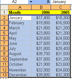
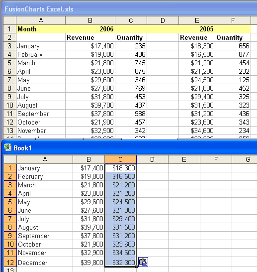
Our Excel sheet looks as under:
Here, you can see that we've sales data and quantity for 2005 and 2006. We just want to plot the revenue data of 2005 and 2006 on a chart.
To do so, you'll have to first bring these two columns next to each other in another Excel sheet. So, open a new Excel sheet and first copy the Month name column to it. After that, copy both the revenue columns next to month column in the new sheet as under.
As you can see above, we now have our data in the normal multi-column format as discussed earlier in this. From here, you can now follow the same steps as previously discussed to build your chart.
So, we just proved how easy it is to build interactive and animated charts from your Excel data sheets in a matter of minutes and just a few clicks. You can easily add these charts to your PowerPoint presentations or website to wow your viewers!
Next, we'll see how to convert data from Microsoft Word into exciting charts.