If you have your data store in Microsoft Access database, but you're not very comfortable with the idea of programming any script to retrieve this data and then plot charts, the XML Generator Utility brings you great relief here. You can now plot charts from Access database without the need to know the ABC of any scripting/programming language. Let's see it in action.
We'll show you how to plot charts from the default Northwind Access database. We'll plot a chart showing the category wise sales for 1997.
The Northwind database is the default database provided with MS SQL Server and MS Access. This database contains the sales data for a fictitious company called Northwind Traders, which imports and exports specialty foods from all around the world.
Open the database in MS Access. Switch to the queries tab and run the default "Category Sales for 1997" query by double clicking on it. If you want to plot data from a table, instead of data returned by the query, still the same method (as discussed below) applies.
Queries are pre-built SQL commands that extract the required data from tables. We wouldn't discuss how to build SQL query here - you can see this in MS Access help.
When you run this query, you'll get the following output:
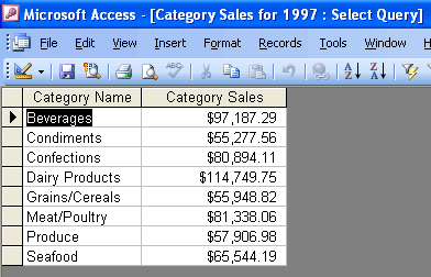
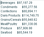
You can see that the query has returned category name and respective sales figure. To plot this data as a chart, we now need to copy-paste this data from the table shown here to our XML Utility. Copy the required data by selecting the rows and then pressing Ctrl + C.
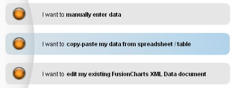
Now, we need to paste this data in our XML Generator Utility. Launch the XML Generator utility and select the second option "I want to copy/paste my data from spreadsheet / table".
In the text area that you now get, paste the data that's in your clipboard. It should look as under:
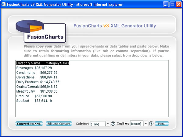
Along with the data, the header of our query has also been pasted. Manually remove this row of information, so that only data appears in this text box as under:
Also, from the Delimiter drop-down, select Tab as delimiter.
If your delimiter is different from Tab, you need to judge your delimiter and then set it accordingly. Delimiter is the character that separates two different data items on a single row of data. For example, in our above data, our category name and respective sales value are separated by a Tab character. So, we select Tab as the delimiter.
Now, you've two options to convert it into XML:
- You can directly convert this data into XML without making any changes to it.
- Or, you can edit this data in the grid and then convert it to XML.
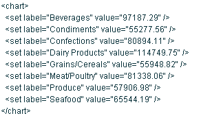
To choose option 1, click on "Convert to XML" button. You'll instantly get the XML as under:
You can now configure the chart properties or generate HTML from here as explained in earlier sections.
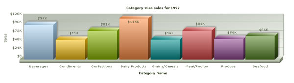
When you now create a column 3D chart from this data, it will look as under: