In scatter charts, dataplots are displayed as a collection of anchors (points) and in bubble charts they are displayed as bubbles. The XML structure of scatter chart is similar to multi series chart except for a few elements and attributes.
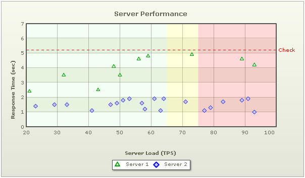
The above chart shows the comparison in performance of two servers. On the x-axis, we've server load and on the y axis we have response time in seconds. We are comparing the performance of two servers here - Server 1 and Server 2.
The XML for the above chart looks as under:
<chart palette='2' caption='Server Performance' yAxisName='Response Time (sec)'
 xAxisName='Server Load (TPS)' xAxisMaxValue='100' xAxisMinValue='20' yAxisMaxValue='7'>

   <categories verticalLineColor='666666' verticalLineThickness='1'>
      <category label='20' x='20' showVerticalLine='1'/>
      <category label='30' x='30' showVerticalLine='1'/>
      <category label='40' x='40' showVerticalLine='1'/>
      <category label='50' x='50' showVerticalLine='1'/>
      <category label='60' x='60' showVerticalLine='1'/>
      <category label='70' x='70' showVerticalLine='1'/>
      <category label='80' x='80' showVerticalLine='1'/>
      <category label='90' x='90' showVerticalLine='1'/>
      <category label='100' x='100' showVerticalLine='0'/>
   </categories>

   <dataset seriesName='Server 1' color='009900' anchorSides='3' anchorRadius='4'
    anchorBgColor='D5FFD5' anchorBorderColor='009900'>
      <set y='2.4' x='21' />
      <set y='3.5' x='32' />
      <set y='2.5' x='43' />
      <set y='4.1' x='48' />
      <set y='3.5' x='50' />
      <set y='4.6' x='56' />
      <set y='4.8' x='59' />
      <set y='4.9' x='73' />
      <set y='4.6' x='89' />
      <set y='4.2' x='93' />
   </dataset>

   <dataset seriesName='Server 2' color='0000FF' anchorSides='4' anchorRadius='4'
    anchorBgColor='C6C6FF' anchorBorderColor='0000FF'>
      <set y='1.4' x='23'/>
      <set y='1.5' x='29'/>
      <set y='1.5' x='33'/>
      <set y='1.1' x='41'/>
      <set y='1.5' x='47'/>
      <set y='1.6' x='49'/>
      <set y='1.8' x='51'/>
      <set y='1.9' x='53'/>
      <set y='1.6' x='57'/>
      <set y='1.2' x='58'/>
      <set y='1.9' x='61'/>
      <set y='1.1' x='63'/>
      <set y='1.9' x='64'/>
      <set y='1.7' x='71'/>
      <set y='1.1' x='77'/>
      <set y='1.3' x='79'/>
      <set y='1.7' x='83'/>
      <set y='1.8' x='89'/>
      <set y='1.9' x='91'/>
      <set y='1.0' x='93'/>
   </dataset>

   <vTrendlines>
      <line startValue='20' endValue='65' alpha='5' color='00FF00' />
      <line startValue='65' endValue='75' alpha='15' color='FFFF00' />
      <line startValue='75' endValue='100' alpha='15' color='FF0000' />
   </vTrendlines>

   <trendlines>
      <line startValue='5.2' displayValue='Check' lineThickness='2' color='FF0000'
       valueOnRight='1' dashed='1' dashGap='5'/>
   </trendlines>

</chart>
In scatter chart, the <set> element (child element of the
<set y='2.4' x='21' />
The x and y here are actual values from your data (and not pixel points). Based on the entire set of x and y values, the limits for x-axis and y-axis are calculated by the chart.
Then we have the <vTrendlines> element that helps display vertical trend lines in the chart to either highlight a specific value or build a trend zone to indicate grouping of data. In the above example, we have three vertical trend lines defined in the chart which have been rendered as trend zones denoting different levels of server load.
Next, we have the <trendLines> element which has already been discussed in multi-series charts. Using this function of the chart, you could draw custom horizontal lines on the chart to represent a trend. For example, in our above XML, we have defined a line at 5.2 with a display value check on the right side of the canvas.
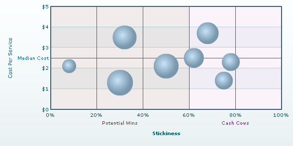
In Bubble chart, each data item (bubble) has three parameters - x,y and size (in relative value, not pixels). A simple Bubble Chart is shown below:
The XML for the above chart is given below:
<chart palette='3' numberPrefix='$' is3D='1' xAxisMaxValue='100' showPlotBorder='0'
 xAxisName='Stickiness' yAxisName='Cost Per Service' chartRightMargin='30'>

   <categories>
      <category label='0%' x='0' />
      <category label='20%' x='20' showVerticalLine='1'/>
      <category label='40%' x='40' showVerticalLine='1'/>
      <category label='60%' x='60' showVerticalLine='1'/>
      <category label='80%' x='80' showVerticalLine='1'/>
      <category label='100%' x='100' showVerticalLine='1'/>
   </categories>

   <dataSet showValues='0'>
      <set x='30' y='1.3' z='116'  name='Traders'/>
      <set x='32' y='3.5' z='99' name='Farmers'/>
      <set x='8' y='2.1' z='33' name='Individuals'/>
      <set x='62' y='2.5' z='72' name='Medium Business Houses'/>
      <set x='78' y='2.3' z='55' name='Corporate Group A'/>
      <set x='75' y='1.4' z='58' name='Corporate Group C'/>
      <set x='68' y='3.7' z='80' name='HNW Individuals'/>
      <set x='50' y='2.1' z='105' name='Small Business Houses'/>
   </dataSet>

   <trendlines>
      <line startValue='2.5' isTrendZone='0' displayValue='Median Cost' color='0372AB'/>
   </trendlines>

   <vTrendlines>
      <line startValue='0' endValue='60' isTrendZone='1' displayValue='Potential Wins'
            color='663333' alpha='10'/>
      <line startValue='60' endValue='100' isTrendZone='1' displayValue='Cash Cows'
            color='990099' alpha='5'/>
   </vTrendlines>

</chart>
The position of a bubble plot is defined on the basis of the numeric values of x and y axis and the radius of the plot depends on the magnitude of the third numeric value (and not pixels).
The basic XML structure for a scatter chart is again very similar to that of a multi-series chart. But a few additional features which are not present in a typical multi-series chart are as follows:
A <set> element of a bubble chart would look like:
<set x='30' y='1.3' z='116' name='Traders'/>
Next, we have the <trendLines> element which has already been discussed in multi-series charts. Using this function of the chart, you could draw custom horizontal lines on the chart to represent a trend. For example, in our above XML, we have defined a line at 2.5 to represent the Median Cost.
Then we have the <vTrendlines> element which helps you display vertical lines in your chart to represent visual grouping of data. In our example we have two trend lines defined in the chart which have been rendered as zones. The first zone covers 60 percent from the starting position which is referred as Potential Wins and other one covering the rest is referred as Cash Cows.