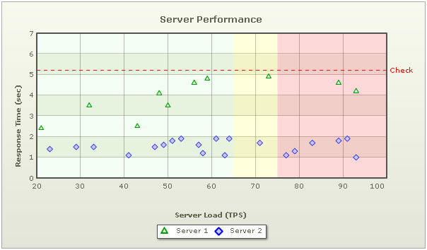
JSON data format for Scatter or Bubble charts is same as multi-series chart with some exceptions. In dataset Array, instead of value property there would be 2 properties named x and y in Scatter chart and 3 properties - x, y and z in Bubble chart. Moreover, Scatter and Bubble charts support vTrendlines.
Shown below is a scatter chart and JSON for the same
{
  "chart":{
    "palette":"2",
    "caption":"Server Performance",
    "yaxisname":"Response Time (sec)",
    "xaxisname":"Server Load (TPS)",
    "xaxismaxvalue":"100",
    "xaxisminvalue":"20",
    "yaxismaxvalue":"7"
  },
  "categories":[{
      "verticallinecolor":"666666",
      "verticallinethickness":"1",
      "category":[{
          "label":"20",
          "x":"20",
          "showverticalline":"1"
        },
        {
          "label":"30",
          "x":"30",
          "showverticalline":"1"
        },
        {
          "label":"40",
          "x":"40",
          "showverticalline":"1"
        },
        {
          "label":"50",
          "x":"50",
          "showverticalline":"1"
        },
        {
          "label":"60",
          "x":"60",
          "showverticalline":"1"
        },
        {
          "label":"70",
          "x":"70",
          "showverticalline":"1"
        },
        {
          "label":"80",
          "x":"80",
          "showverticalline":"1"
        },
        {
          "label":"90",
          "x":"90",
          "showverticalline":"1"
        },
        {
          "label":"100",
          "x":"100",
          "showverticalline":"0"
        }
      ]
    }
  ],
  "dataset":[{
      "seriesname":"Server 1",
      "color":"009900",
      "anchorsides":"3",
      "anchorradius":"4",
      "anchorbgcolor":"D5FFD5",
      "anchorbordercolor":"009900",
      "data":[{
          "y":"2.4",
          "x":"21"
        },
        {
          "y":"3.5",
          "x":"32"
        },
        {
          "y":"2.5",
          "x":"43"
        },
        {
          "y":"4.1",
          "x":"48"
        },
        {
          "y":"3.5",
          "x":"50"
        },
        {
          "y":"4.6",
          "x":"56"
        },
        {
          "y":"4.8",
          "x":"59"
        },
        {
          "y":"4.9",
          "x":"73"
        },
        {
          "y":"4.6",
          "x":"89"
        },
        {
          "y":"4.2",
          "x":"93"
        }
      ]
    },
    {
      "seriesname":"Server 2",
      "color":"0000FF",
      "anchorsides":"4",
      "anchorradius":"4",
      "anchorbgcolor":"C6C6FF",
      "anchorbordercolor":"0000FF",
      "data":[{
          "y":"1.4",
          "x":"23"
        },
        {
          "y":"1.5",
          "x":"29"
        },
        {
          "y":"1.5",
          "x":"33"
        },
        {
          "y":"1.1",
          "x":"41"
        },
        {
          "y":"1.5",
          "x":"47"
        },
        {
          "y":"1.6",
          "x":"49"
        },
        {
          "y":"1.8",
          "x":"51"
        },
        {
          "y":"1.9",
          "x":"53"
        },
        {
          "y":"1.6",
          "x":"57"
        },
        {
          "y":"1.2",
          "x":"58"
        },
        {
          "y":"1.9",
          "x":"61"
        },
        {
          "y":"1.1",
          "x":"63"
        },
        {
          "y":"1.9",
          "x":"64"
        },
        {
          "y":"1.7",
          "x":"71"
        },
        {
          "y":"1.1",
          "x":"77"
        },
        {
          "y":"1.3",
          "x":"79"
        },
        {
          "y":"1.7",
          "x":"83"
        },
        {
          "y":"1.8",
          "x":"89"
        },
        {
          "y":"1.9",
          "x":"91"
        },
        {
          "y":"1.0",
          "x":"93"
        }
      ]
    }
  ],
  "vtrendlines":{
    "line":[{
        "startvalue":"20",
        "endvalue":"65",
        "alpha":"5",
        "color":"00FF00"
      },
      {
        "startvalue":"65",
        "endvalue":"75",
        "alpha":"15",
        "color":"FFFF00"
      },
      {
        "startvalue":"75",
        "endvalue":"100",
        "alpha":"15",
        "color":"FF0000"
      }
    ]
  }
}
Scatter chart has the same JSON format as the other multi-series charts. The differences can be noted down as follows:
- Each category element in categories Array contains an additional property x which denotes the location of the label in X Axis or X scale. Additionally, there is another property, showVerticalline that allows a line to be drawn vertically over the label.
- Each data element in a dataset contains two new properties - x and y.
- We have a new Object, vTrendlines. This defines vertical trendzones and trendlines over the chart. The properties of this object are same as the properties of trendlines object in multiseries chart.
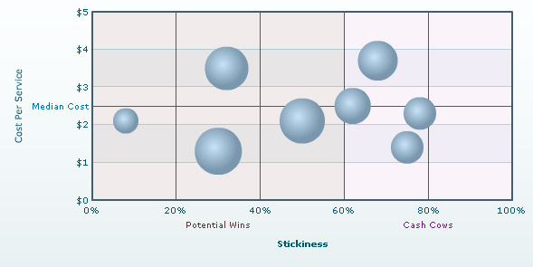
The JSON for the chart is as under
{
  "chart":{
    "palette":"3",
    "numberprefix":"$",
    "is3d":"1",
    "xaxismaxvalue":"100",
    "showplotborder":"0",
    "xaxisname":"Stickiness",
    "yaxisname":"Cost Per Service",
    "chartrightmargin":"30"
  },
  "categories":[{
      "category":[{
          "label":"0%",
          "x":"0"
        },
        {
          "label":"20%",
          "x":"20",
          "showverticalline":"1"
        },
        {
          "label":"40%",
          "x":"40",
          "showverticalline":"1"
        },
        {
          "label":"60%",
          "x":"60",
          "showverticalline":"1"
        },
        {
          "label":"80%",
          "x":"80",
          "showverticalline":"1"
        },
        {
          "label":"100%",
          "x":"100",
          "showverticalline":"1"
        }
      ]
    }
  ],
  "dataset":[{
      "showvalues":"0",
      "data":[{
          "x":"30",
          "y":"1.3",
          "z":"116",
          "name":"Traders"
        },
        {
          "x":"32",
          "y":"3.5",
          "z":"99",
          "name":"Farmers"
        },
        {
          "x":"8",
          "y":"2.1",
          "z":"33",
          "name":"Individuals"
        },
        {
          "x":"62",
          "y":"2.5",
          "z":"72",
          "name":"Medium Business Houses"
        },
        {
          "x":"78",
          "y":"2.3",
          "z":"55",
          "name":"Corporate Group A"
        },
        {
          "x":"75",
          "y":"1.4",
          "z":"58",
          "name":"Corporate Group C"
        },
        {
          "x":"68",
          "y":"3.7",
          "z":"80",
          "name":"HNW Individuals"
        },
        {
          "x":"50",
          "y":"2.1",
          "z":"105",
          "name":"Small Business Houses"
        }
      ]
    }
  ],
  "trendlines":{
    "line":[{
        "startvalue":"2.5",
        "istrendzone":"0",
        "displayvalue":"Median Cost",
        "color":"0372AB"
      }
    ]
  },
  "vtrendlines":{
    "line":[{
        "startvalue":"0",
        "endvalue":"60",
        "istrendzone":"1",
        "displayvalue":"Potential Wins",
        "color":"663333",
        "alpha":"10"
      },
      {
        "startvalue":"60",
        "endvalue":"100",
        "istrendzone":"1",
        "displayvalue":"Cash Cows",
        "color":"990099",
        "alpha":"5"
      }
    ]
  }
}
Bubble chart's JSON format is almost similar to that of Scatter. The only difference is that in each data there is an additional property - z.