Marimekko charts are used mainly for marketing analysis, they are essentially stacked column charts with columns of variable width. You can represent 3 dimensions of marketing data using a marimekko chart, these are - total value of a market segment, combined share of all competitors in a particular market segment, individual share of competitors in each of the market segments.
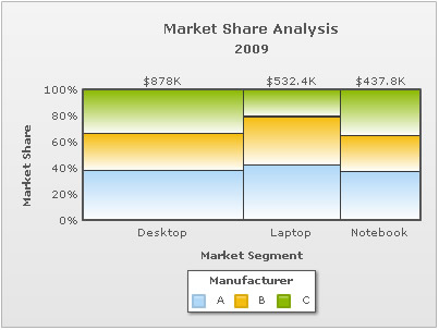
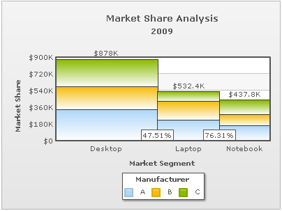
Shown below is a simple Marimekko chart that shows market share of three manufacturers (namely A, B and C) in three segments (Desktop, Laptop, Notebook):
The chart helps you instantly figure out the following:
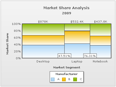
- Desktops have a total market share of 47.51% and Desktop & Laptops Combined together 76.31%. This is deduced from the horizontal width of the stacked columns.
- Within each segment, there are three manufacturers A, B, C whose share in a market segment is indicated by partitions in the stacked column.
The XML/JSON data for this chart is as under:
<chart showvalues="0" caption="Market Share Analysis" subcaption="2009" numberprefix="$"
 xaxisname="Market Segment" yaxisname="Market Share" legendcaption="Manufacturer" >

 <categories>
   <category label="Desktop"/>
   <category label="Laptop"/>
   <category label="Notebook"/>
 </categories>

 <dataset seriesName="A">
   <set value="335000"/>
   <set value="225100"/>
   <set value="164200"/>
 </dataset>

 <dataset seriesName="B">
   <set value="245000"/>
   <set value="198000"/>
   <set value="120000"/>
 </dataset>

 <dataset seriesName="C">
   <set value="298000"/>
   <set value="109300"/>
   <set value="153600"/>
 </dataset>

</chart>
{
"chart":{
"showvalues":"0",
"caption":"Market Share Analysis",
"subcaption":"2009",
"numberprefix":"$",
"xaxisname":"Market Segment",
"yaxisname":"Market Share",
"legendcaption":"Manufacturer"
},
"categories":[{
"category":[{
"label":"Desktop"
},
{
"label":"Laptop"
},
{
"label":"Notebook"
}
]
}
],
"dataset":[{
"seriesname":"A",
"data":[{
"value":"335000"
},
{
"value":"225100"
},
{
"value":"164200"
}
]
},
{
"seriesname":"B",
"data":[{
"value":"245000"
},
{
"value":"198000"
},
{
"value":"120000"
}
]
},
{
"seriesname":"C",
"data":[{
"value":"298000"
},
{
"value":"109300"
},
{
"value":"153600"
}
]
}
]
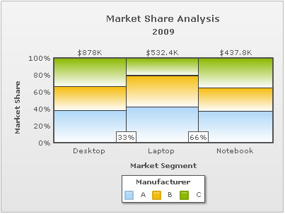
}As you can see in the data, actual sales/quantity data has been provided. FusionCharts Marimekko chart automatically converts these values into percent values based on the size of each market segment and the percentage share held by competitors in each of the segments.
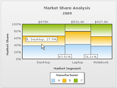
The percent share of each manufacturer within a segment can be seen by hovering over the column - the values are shown as tool-tips, as shown below:
If you do not wish to show total value of market segments at the top of each column, you can set:
<chart showSum='0' ...>
This results in:
If you do not want to use percentage distribution within segments and show actual values, you can set:
<chart ... usePercentDistribution="0" >
This results in:
As you can see above, each of the stacked columns is now rendered using actual values, and not % values. So, the height of column can now be used to compare the TAM (Total Available Market) per market segment. The horizontal distribution (column width) is still % based.
The chart automatically calculates the horizontal width of columns by summing up the market share of competitors in each of the market segments. Following which, the width of each segment is determined by calculating the ratio of its sum to the total sum. However, if you wish - you can customize the width of the columns as shown below:
<chart showvalues="0" caption="Market Share Analysis" subcaption="2009" numberprefix="$" xaxisname="Market Segment" yaxisname="Market Share" legendcaption="Manufacturer" >

<categories>
   <category label="Desktop" widthPercent="33"/>
   <category label="Laptop" widthPercent="33"/>
   <category label="Notebook" widthPercent="34"/>
 </categories>

 <dataset seriesName="A">
   <set value="335000"/>
   <set value="225100"/>
   <set value="164200"/>
 </dataset>

 <dataset seriesName="B">
   <set value="245000"/>
   <set value="198000"/>
   <set value="120000"/>
 </dataset>

 <dataset seriesName="C">
   <set value="298000"/>
   <set value="109300"/>
   <set value="153600"/>
 </dataset>

</chart>
{
  "chart":{
    "showvalues":"0",
    "caption":"Market Share Analysis",
    "subcaption":"2009",
    "numberprefix":"$",
    "xaxisname":"Market Segment",
    "yaxisname":"Market Share",
    "legendcaption":"Manufacturer"
  },
  "categories":[{
      "category":[{
          "label":"Desktop",
          "widthpercent":"33"
        },
        {
          "label":"Laptop",
          "widthpercent":"33"
        },
        {
          "label":"Notebook",
          "widthpercent":"34"
        }
      ]
    }
  ],
  "dataset":[{
      "seriesname":"A",
      "data":[{
          "value":"335000"
        },
        {
          "value":"225100"
        },
        {
          "value":"164200"
        }
      ]
    },
    {
      "seriesname":"B",
      "data":[{
          "value":"245000"
        },
        {
          "value":"198000"
        },
        {
          "value":"120000"
        }
      ]
    },
    {
      "seriesname":"C",
      "data":[{
          "value":"298000"
        },
        {
          "value":"109300"
        },
        {
          "value":"153600"
        }
      ]
    }
  ]
}
This result is:
The width of each stacked column is defined as per the values provided in the data.
While setting the width of each segment manually, the values of each category must be specified such that the sum of all categories equals 100 percent. If the sum of all categories doesn't equals 100 percent, then the chart will calculate the width of columns based on actual values.
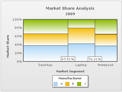
To remove the percent label on x-axis (between two stacked columns), you can set
<chart showXAxisPercentValues='0' ...>
This results in: